

Corridor Evaluation Tutorial
You have modeled a corridor — the biologically best route between your wildland blocks. This tutorial covers what comes next: evaluating that corridor statistically, and comparing it honestly against the alternatives. It is adapted from the workshops Paul Beier, Dan Majka and Jeff taught with the original CorridorDesigner Evaluation Tools, now rebuilt as the Evaluate Corridors tools in this add-in.
The evaluation rests on four general metrics, each with its own tool, plus the ancillary helpers. A single caution applies throughout: statistics describe whatever polygon you give them, so evaluate the same corridor polygon consistently when comparing alternatives.
Metric 1: Patch-to-patch distances
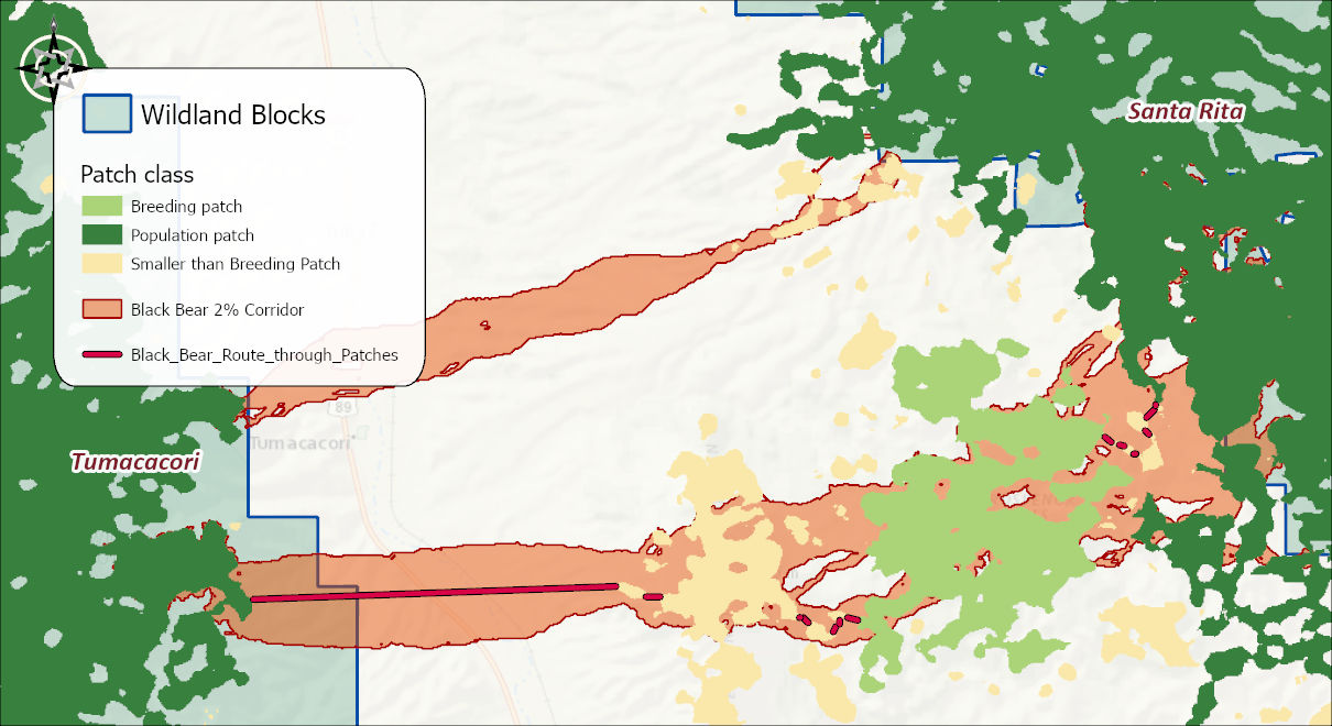
A corridor is rarely composed entirely of good habitat, so the species may have to cross regions of poor habitat on the way through. Can it? Is there a gap longer than the species will cross? Patch Analysis shows you what gaps the animal will have to cross if it uses this corridor: it finds the route through the corridor that minimizes the longest hop between patches of high-quality habitat — the patches serving as refuges and stepping stones, the inter-patch matrix as the threat — and reports the gaps that remain. Restrict the analysis to patches large enough to matter (the patch map's breeding- and population-patch classes serve exactly this purpose), then compare the longest required gap against the species' known dispersal behavior.
The original ArcMap version of this analysis took 1.5 hours on a real corridor and bent its connectors to 45° increments whenever they left the corridor; the Pro tool's visibility-graph engine draws true straight-line hops and finishes most runs in seconds. A genuinely complex corridor with many patches can still take real minutes — see the timing below — but even that is a fraction of 1.5 hours, and the Advanced options let you trade a little precision for a lot of speed when the boundary has more detail than the question needs. The output includes the minimax route, the hop table, and per-segment lengths ready for reporting.
The example below picks up where the corridor tutorial left off, with two choices already made: the 2% slice of the black bear corridor (one of the eleven percentile bands Least-Cost Corridor produced), and the black bear patch map built earlier. Every statistic below describes that specific combination; picking a different slice, or a different species, would change the numbers.
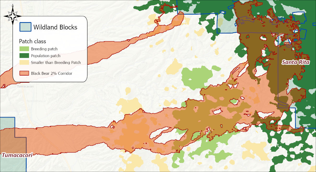
Open Patch Analysis and give it the corridor, the termini, and the patch polygons. The patch selection expression is optional; leave it blank and every patch feature is used. The dialog below builds a selection anyway, with three OR'd clauses covering breeding patches, population patches, and the too-small class — which is every class in the patch map, so it selects exactly the same features an empty expression would have. That was done here only to show the query builder in action; if you actually want every patch considered, the simpler and faster choice is to leave the expression empty.
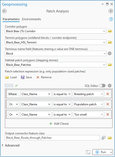
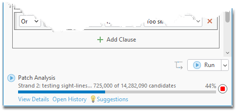
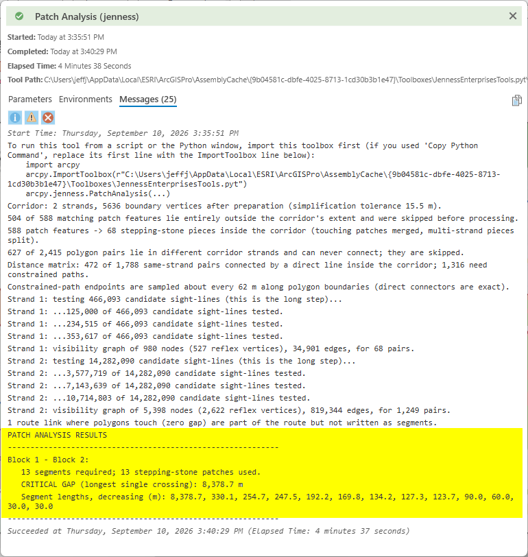
Run it, and the tool reports its progress as it goes: which strand of the corridor it is working on, and how many of the candidate sight-lines between patches it has tested so far. On a corridor with many patches and a detailed boundary, that candidate count can run into the millions — this run tested 14,282,090 candidate sight-lines on its larger strand alone, and took 4 minutes 38 seconds start to finish. Still a fraction of the original tool's 1.5 hours, but if a run like this is more time than you want to spend, the dialog's Advanced section offers a simplification tolerance for the corridor boundary: simplifying a many-vertex polygon before analysis sharply cuts the number of candidate sight-lines, trading a little boundary precision for real speed. Left at its default, the tool chooses a sensible tolerance automatically, as it did here (15.5 m, visible in the report below).
Reading the report
This is the tool's best feature, and worth reading in full at least once. The messages are a complete, narrated audit trail of how the answer was derived, not just what the answer is: how the corridor was prepared (how many strands, how many boundary vertices, what simplification tolerance was chosen), which patches were kept and which were discarded as lying entirely outside the corridor, how the remaining patches were merged and split into stepping-stone pieces per strand, how many polygon pairs could connect by a direct line versus needed a constrained path around the corridor's own boundary, and finally the sight-line testing itself, strand by strand, ending in a visibility graph of nodes, reflex vertices and edges. A reader who wants to trust the answer can follow every step that produced it.
The report closes with the result highlighted in its own box: the number of stepping-stone patches actually used, the critical gap — the single longest crossing the animal must make, the number that answers whether the corridor works at all — and every segment length in the route, listed longest to shortest. Those same segment lengths, along with each crossing's endpoints and rank, are also written to the output feature class's attribute table, one row per segment, so you are not limited to reading them off the report.
Metric 2: Bottleneck analysis
Some species need distance from developed edges; every species needs the corridor to stay usable at its narrowest point. You can spot a few potential bottlenecks by eye, or measure one with the Measure tool — but what you really want is the locations and extent of every region narrower than a threshold. Bottleneck Analysis computes the corridor's width continuously along its length via the medial axis, then lets you adjust the width threshold interactively — the statistics, graph, and map update as you drag — so you can see how much of the corridor falls below any width that matters, and where. Outputs include the width profile graph (placeable on a layout), tables, and the bottleneck features themselves.
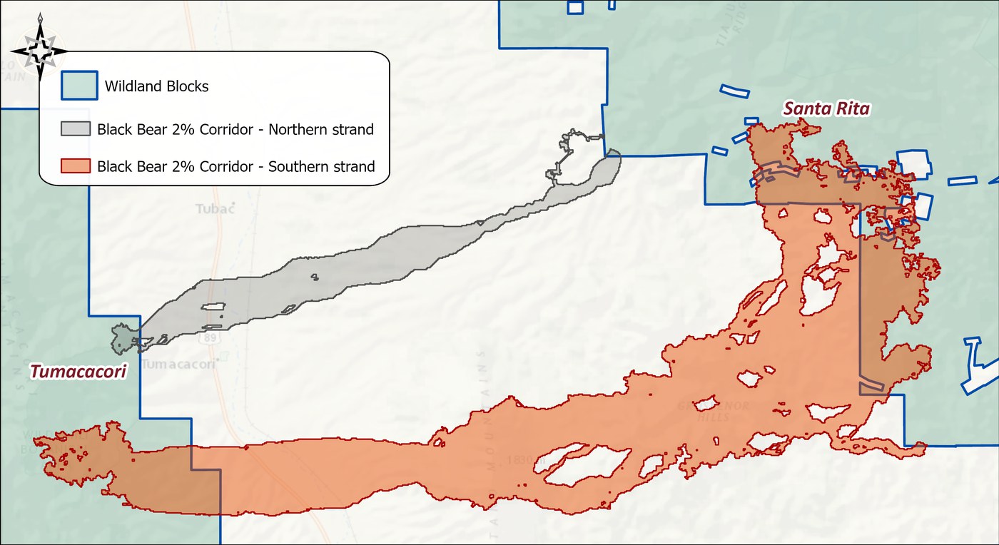
The example picks up the 2% black bear corridor again. The tool needs a single polygon, and a corridor slice is not always one connected piece — the 2% slice here is a case in point, so we pick the larger of its strands, the one running south through Tumacacori, and leave the rest out of this run. We also assume, for the sake of the example, that 2,000 m is the width at which this corridor would be experiencing a bottleneck for black bear; a real threshold would come from the species expert. The regions above and below that threshold are visible in both the tool window and on the map, colored the same way in both places.
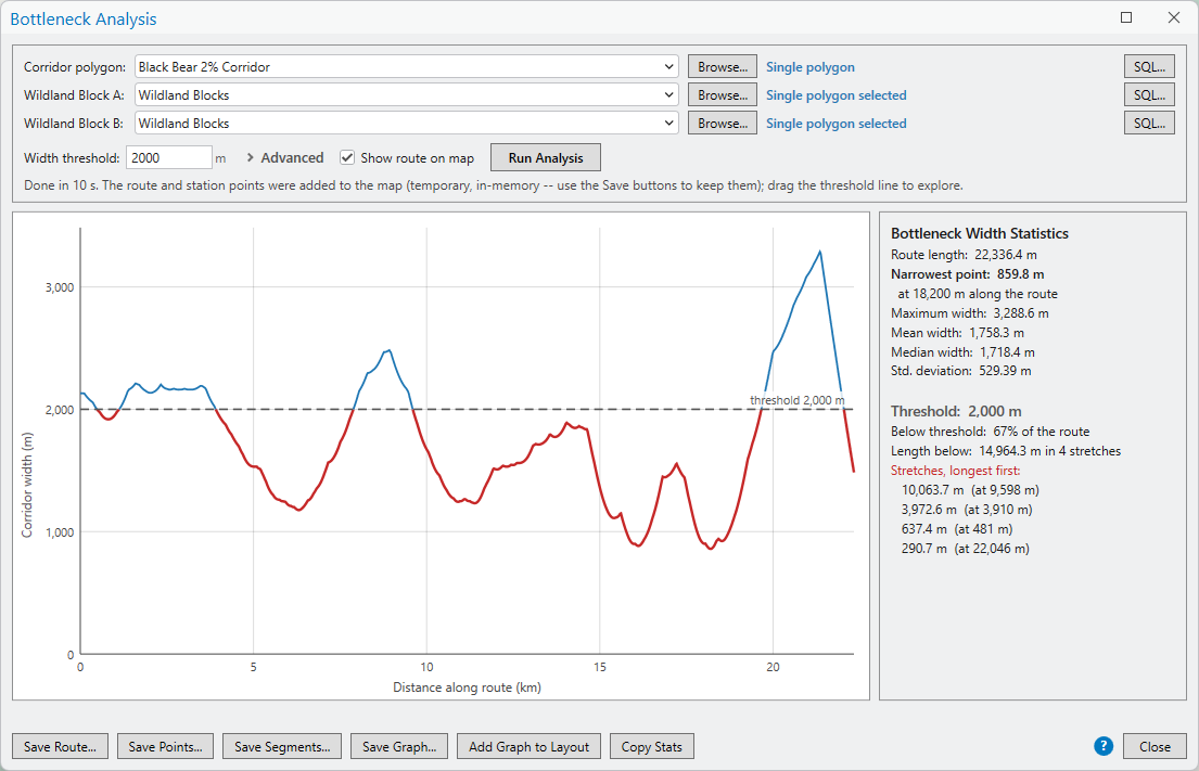
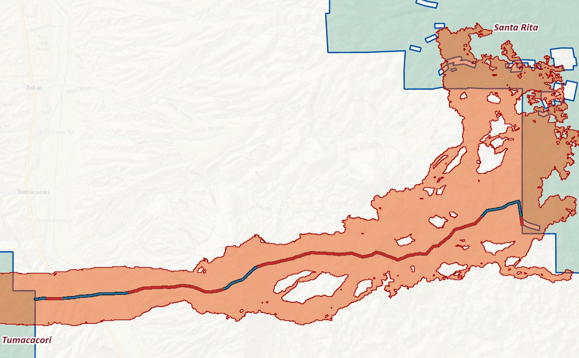
Changing the threshold is as easy as typing a new number or dragging the dashed threshold line up and down on the graph — both the map and the statistics update immediately. From here you can export the above- and below-threshold stretches of the centerline as their own feature class, and add a graphic of the current graph, with its statistics, straight onto a layout.

Metric 3: General statistics inside the corridor
What does the corridor actually contain? Weighted
Summary Statistics and Histograms
and Statistics
summarize any background dataset within the corridor polygon
— land cover composition, elevation distributions,
distance-to-road profiles — with geodesic
area-weighting. The workshops' favorite non-wildlife example:
run the corridor polygon against a parcel map to learn exactly
who owns the land inside a proposed linkage, and how many
acres each owner holds — the kind of table that turns a
map into a conservation conversation. (The
sample data includes
such a parcel map, Parcels_in_Region, with the
owners' names replaced by anonymous labels and an
Owner_Type field — individual, corporate,
trust, nonprofit, government — so you can try exactly
this.)
Cross-Tab Statistics
extends this to two variables at once (land cover by
ownership, suitability by slope class). Tables export to
geodatabase, dBASE, or CSV for further graphing in Excel or
R.
Clip the parcels to the corridor first
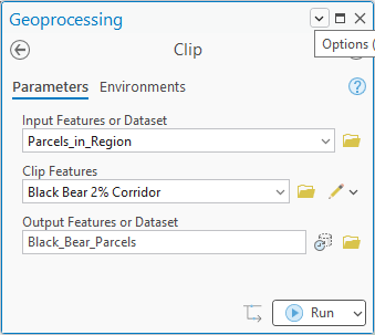
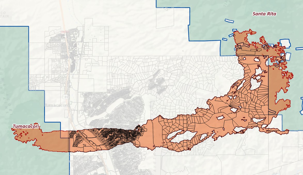
Weighted Summary Statistics weights every record by its geodesic area as drawn, and a parcel is drawn whole. Hand the tool the full parcel map and a 2,800-acre ranch that pokes forty acres into the corridor casts a 2,800-acre vote, while a subdivision lot that sits entirely inside it casts a one-acre vote — the statistics would describe the neighborhood, not the corridor. So cut the parcels to the corridor polygon first. ArcGIS Pro's standard Clip tool is all it takes (or Clip Data to Analysis Area when you have several datasets to cut at once). Every record is now exactly the piece of a parcel that lies inside the corridor, and its area is exactly how much of the corridor that parcel accounts for.
One thing clipping does not change is the attribute
table. A clipped piece still carries its parent parcel's
Acreage and Full Cash Value, so the
statistics below answer “what kind of parcel does a
typical acre of corridor belong to?”, not “what is
the corridor land itself worth?” That is usually the
question you want: you negotiate with an owner over their
parcel, not over the sliver of it inside the line.
Add a suitability score to each parcel
The parcel map carries two numbers about each parcel, its
Acreage and its Full Cash Value, and
we will summarize both. But to see what the tool is really for,
the parcels also need a number that describes the land
rather than the deed: the habitat suitability of the ground
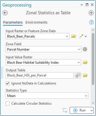
inside each one. Esri's Zonal Statistics as Table
(Spatial Analyst) gives every parcel piece the mean of the black
bear suitability model within it. Use the clipped pieces
as the zones, so the mean describes only the ground inside the
corridor, and set the Zone Field to the parcel number.
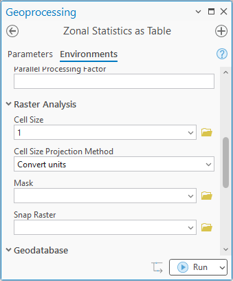
One setting matters. Zonal Statistics rasterizes the zones at the analysis cell size, and a cell belongs to whichever zone its center falls in. At 5 m the smallest Rio Rico lots contained no cell centers at all and the tool reported “zones not rasterized” — parcels silently missing from the output. Setting the Cell Size environment to 1 m gives every lot cells of its own (the 30 m suitability raster is simply resampled finer; the means are not distorted), and all 1,564 pieces come through.
The output table has one row per parcel, keyed by the parcel
number, with the mean suitability in a field called
MEAN. Join it back to the parcels: open the parcel
layer's attribute table, click the menu at the top right, and
choose Joins and Relates ▸ Add Join.
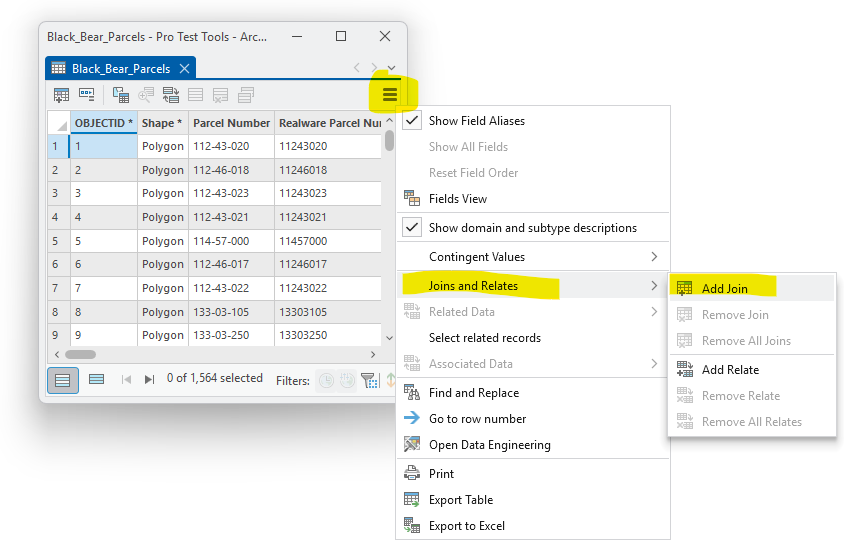
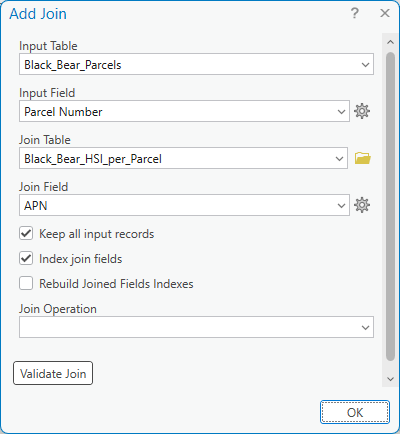
APN is the
field's actual name in both tables; Parcel Number is
an alias — a friendlier display label stored with
the parcel feature class, which ArcGIS Pro shows in
dialogs and table headings whenever a field has one. Zonal
Statistics wrote its output with the real name and no alias,
so the same field appears under two labels. (You can switch
any attribute table to real names with the menu's Show
Field Aliases toggle.) The join is on
APN = APN, whatever the
labels say.
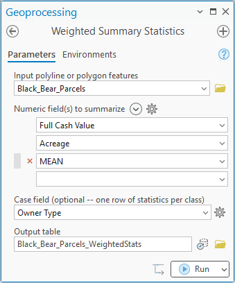
Weighted Summary Statistics by owner type
Now the joined parcels go into Weighted Summary Statistics
with three fields to summarize — Full Cash Value,
Acreage, and the joined MEAN suitability —
and Owner Type as the case field, so the tool writes one
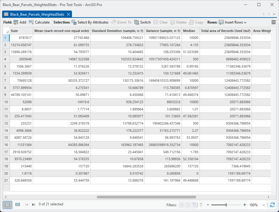
row of statistics per field per owner type: twenty-one rows.
Because the parcels now carry a join, the output's
Attribute Field column names each field the way Pro does
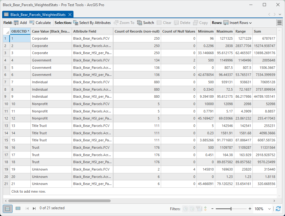
for joined data, Black_Bear_Parcels.FCV,
Black_Bear_Parcels.Acreage and
Black_Bear_HSI_per_Parcel.MEAN, so there is never
any doubt which table a value came from.
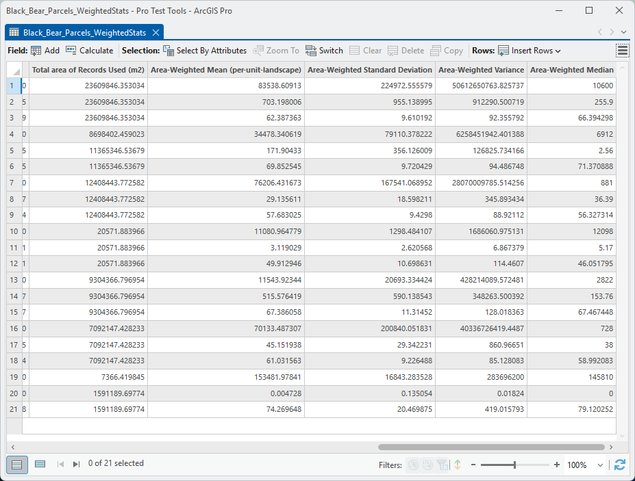
The output table is wide, so it is shown here in three scrolled views of the same twenty-one rows. Reading left to right: the owner type and field, the count of records used and the count of nulls, minimum, maximum, range and sum; then the ordinary record statistics, where each parcel piece casts one equal vote (mean, standard deviation, variance, median); then the total area of the records used, in square meters, and the area-weighted versions of the same four statistics, where each piece votes in proportion to its area inside the corridor.
What to take away
Who owns the corridor. The Total area of Records Used column already answers the workshop question. Converted from square meters to acres, the 16,159 acres of parcels inside the 2% corridor break down like this:
| Owner type | Pieces | Acres | Share |
|---|---|---|---|
| Corporate | 250 | 5,834 | 36% |
| Individual | 880 | 3,066 | 19% |
| Government | 136 | 2,808 | 17% |
| Title trust | 111 | 2,299 | 14% |
| Trust | 176 | 1,753 | 11% |
| Unknown | 6 | 393 | 2% |
| Nonprofit | 5 | 5 | <1% |
| Total | 1,564 | 16,159 | 100% |
More than a third of the corridor is in corporate hands and another seventh is in title-company land trusts — the holdings that read as “Title Trust #1” in this anonymized data are a developer's lot inventory in the real thing. Individuals own the most pieces by far, 880 of them, but only a fifth of the ground.
Two kinds of attribute, two kinds of statistic. The
table offers both record and area-weighted statistics for every
field, and the right one to quote depends on what the field
measures. Acreage and Full Cash Value
are totals for a whole parcel: split a parcel in two and each
half has half the acreage. For fields like these the
record statistics describe the parcels — the median
individually owned parcel in the corridor is 0.87 acres and
assessed at $10,000, a Rio Rico Ranchettes lot — and the
Sum column describes the whole (880 individual parcels totaling
3,758 acres, of which 3,066 lie inside the corridor). The
area-weighted columns for such a field answer a stranger
question, “how big is the parcel that a randomly chosen
acre of corridor belongs to?” (36 acres, for individually
owned ground); it is a real answer, but not usually the one you
are after.
The suitability mean is different in kind. It describes a property of each acre — split a parcel in two and each half keeps its own suitability — and that is exactly the case the area-weighted statistics were built for. Here the two columns tell two different stories, and the gap between them is the point of the tool:
| Owner type | Parcels | Record mean | Weighted mean |
|---|---|---|---|
| Corporate | 250 | 54.8 | 62.4 |
| Individual | 880 | 50.9 | 57.7 |
| Government | 136 | 53.9 | 69.9 |
| Title trust | 111 | 54.8 | 67.4 |
| Trust | 176 | 54.4 | 61.0 |
| Nonprofit | 5 | 51.1 | 49.9 |
| Unknown | 6 | 53.4 | 74.3 |
| All parcels | 1,564 | 52.5 | 63.6 |
Ask “what is the suitability of the average parcel in the corridor?” and the answer is 52 out of 100. Ask “what is the suitability of the average acre?” and it is 64. The difference is the small lots: hundreds of them crowd the western end of the corridor near the highway, they score poorly (the individually owned minimum is 9), and each one counts as much as a ranch in the record mean while covering almost nothing. The bear does not cross parcels; it crosses acres, and the acres are better habitat than the parcel count suggests.
Why does every class shift the same way? A fair question — six of seven owner types have a weighted mean above the record mean, and you might have expected more variety. There is no arithmetic reason the weighted mean must come out higher; it is higher only when the big parcels happen to hold the better habitat. So the uniformity is telling you something about this landscape, and it is easy to check. Across all 1,564 pieces, parcel size and suitability go together: pieces under an acre average a score of 50, pieces of 5 to 40 acres average 59, and pieces over 40 acres average 67. The same relationship holds inside every owner type of any size — corporate, individual, trust, title trust, government — with the sub-acre pieces averaging 46 to 52 in each class and the 40-acre-and-up pieces 65 to 75. The reason is the map, not the math. The small pieces are the subdivision lots at the west end near the highway, exactly where the roads and houses the suitability model penalizes are, and the big pieces are the undeveloped ranch and state land through the middle, where the model scores well. Every owner type holds some of each, so every class shifts in the same direction, and the size of the shift just tracks how lopsided that class's mix is: Government's 54 to 70 is the county's hundreds of tiny vacant lots against the state's big blocks. An owner type that kept its large parcels in poor habitat would show the reverse, and none does here. The one exception, Nonprofit, is five parcels on five acres, too little ground for the two statistics to differ. In another corridor the pattern could easily run the other way — big ranches on flat, cleared valley floor and small lots up in the forested foothills — and then the weighted means would sit below the record means. The lesson is not that weighting raises the number; it is that the two statistics answer different questions, and when they disagree the landscape is telling you which parcels carry the habitat.
Read the count and null columns before you quote a
number. The Government FCV row used 134 records and reports
two nulls, and its total area (8.7 million m²) is smaller
than the Government Acreage row's (11.4 million m²). Those
two nulls are the Arizona Game and Fish parcels, tax-exempt and
so carrying no cash value — and a record with a null value
drops out of that field's statistics and its area total.
Likewise the Unknown rows: six placeholder parcels the assessor
lists with no owner, an Acreage of zero, and, per
the geometry, 393 real acres. The tool faithfully summarizes
what the attribute says; only you know when the attribute is
wrong. A minimum of zero or a null count above zero is the
table's way of asking you to look. (The suitability rows show
zero nulls in every class — the 1 m cell size did
its job; at 5 m the skipped lots would have shown up
here.)
Cross-Tab Statistics: land cover by owner type
Weighted Summary Statistics answered one question per row: how much, and how suitable, for each owner type. Cross-Tab Statistics crosses two categorical variables at once, so the question becomes “how much of each owner type's ground is which kind of land cover?” — the table the workshops always ended on. It needs no clipping first: you hand it the two layers and the corridor polygon, and it does the intersection itself.
Choose Two data sources. Variable #1, the
columns, is the parcel layer and its Owner_Type
field. Variable #2, the rows, is the land-cover raster
— and here a raster offers a choice a feature class does
not. The land-cover raster in the sample data carries two name
columns in its attribute table: Vegetation, the 26
detailed classes, and Nlcd, the ten broad groups
they roll up into. (The groups follow an older version of the
National
Land Cover Database, NLCD, the standard land-cover
classification for the United States; if you need land-cover
classes for a study area in the U.S., the current NLCD is one
good option.) Leave the second box at (raster cell
values), or select the attribute field
Vegetation, and each of the 26 vegetation classes
becomes a row, named from the table; pick Nlcd
instead and the raster is
regrouped on the fly into its ten groups. We take the groups
— a table that fits on a page — leave the statistic
at Cell Values, and restrict the analysis to the 2%
corridor polygon.
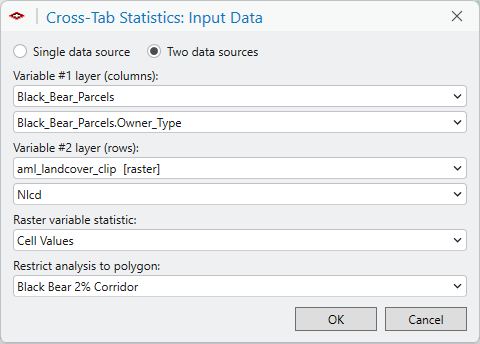
Nlcd column — inside the
corridor.The table opens in hectares (the window picks a sensible unit; acres, square kilometers and percentages are a click away). It is wider than the panel, so it scrolls; Copy Image or Save Image gives you the whole thing at once, which is what is shown below the window.
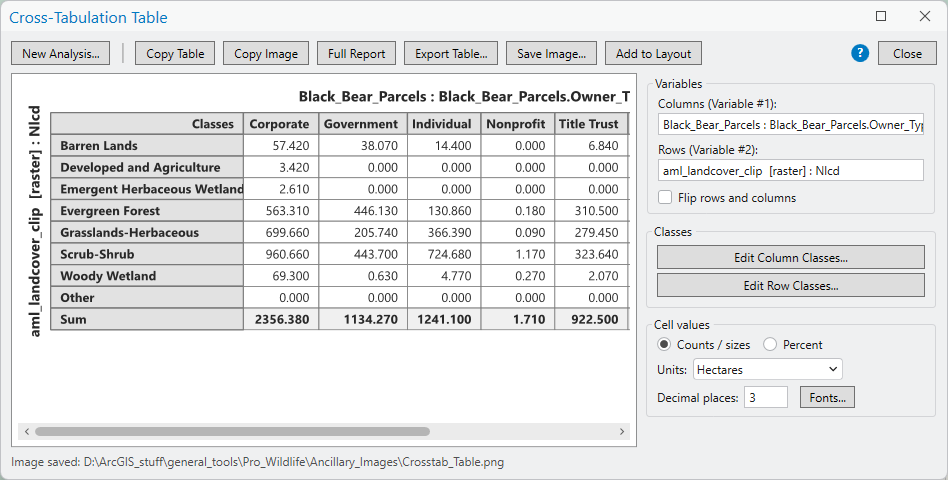
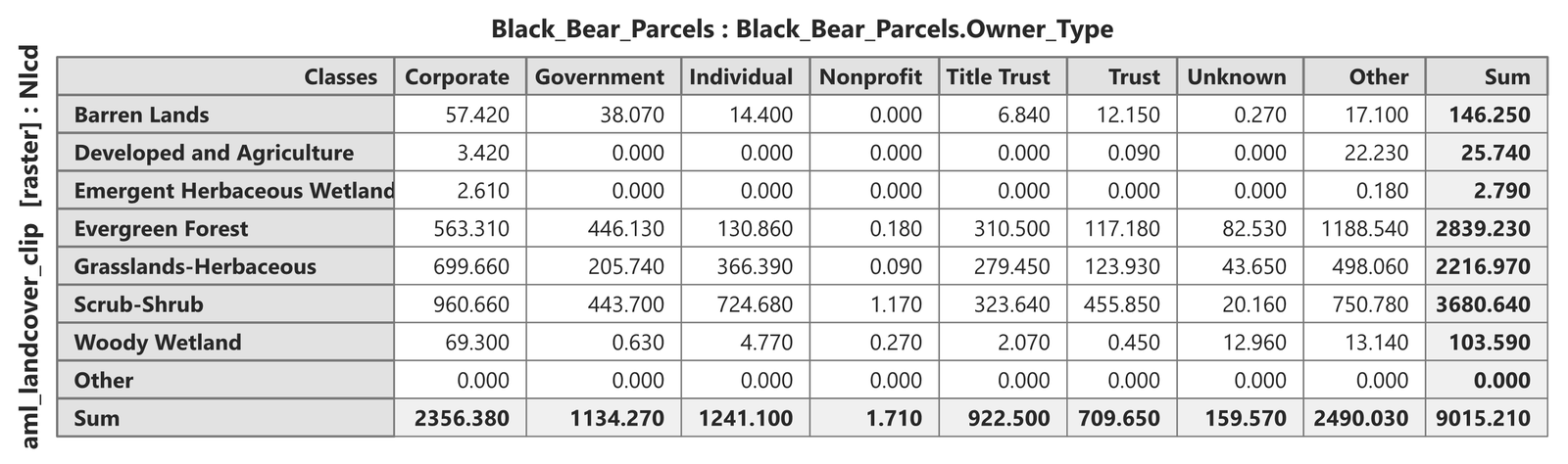
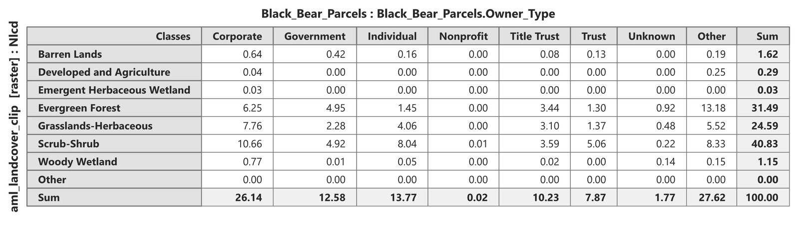
Reading it. The corridor is 9,015 hectares, and three groups account for almost all of it: scrub-shrub 41%, evergreen forest 31%, grassland 25%. Developed and agricultural land is 26 hectares — under a third of one percent — which is the single most reassuring number in this tutorial, and one you could not have read off the parcel table. Down the columns, the owner types differ in kind, not just in amount. These shares come from the hectare table, each cell divided by its column's Sum: individually owned ground is 58% scrub (725 ha out of 1,241 total individually owned ha) and only 11% forest (131 of those 1,241 ha) — the lots at the low western end; government ground splits evenly between forest and scrub at 39% each (446 and 444 ha of 1,134); and title-trust ground is the most balanced of all, a third each of forest, scrub and grass (311, 324 and 279 ha of 923). Family trusts hold the scrubbiest ground, 64% (456 of 710 ha).
Then there are the two Other lines, which the tool always includes and which are worth understanding. The Other row is zero: every cell of the raster has an NLCD group. The Other column is 2,490 hectares — 28% of the corridor — and it is the corridor ground that lies inside no parcel at all: public land outside the county's parcel fabric (the national forest at the Santa Rita end, most likely) and road rights-of-way. It is also the most heavily forested column in the table, 48% evergreen. Anyone planning a linkage here would want to know that the best forest in the corridor is not on anybody's tax roll. The arithmetic checks against the parcel run above: 9,015 hectares of corridor less the 6,539 hectares (16,159 acres) inside parcels leaves 2,476, within a raster cell's rounding of the Other column.
Histograms and Statistics: the shape behind the numbers
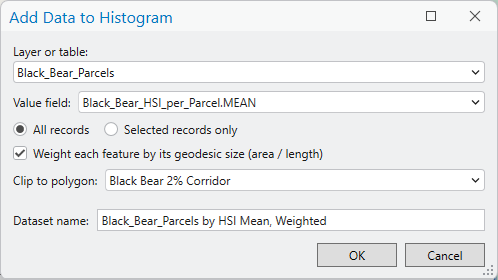
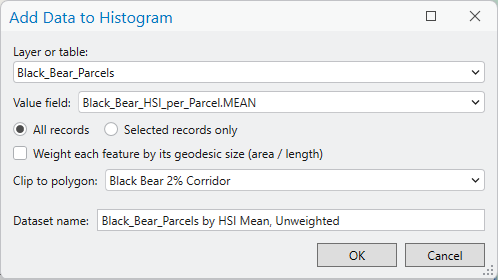
The weighted-statistics table said that the average parcel in the corridor scores 52 for suitability while the average acre scores 64. Histograms and Statistics shows why, by drawing both distributions on the same axes. Add the parcel layer's joined suitability mean twice with Add Data...: once with Weight each feature by its geodesic size checked, once with it clear, both clipped to the corridor polygon, and named so the legend says which is which.
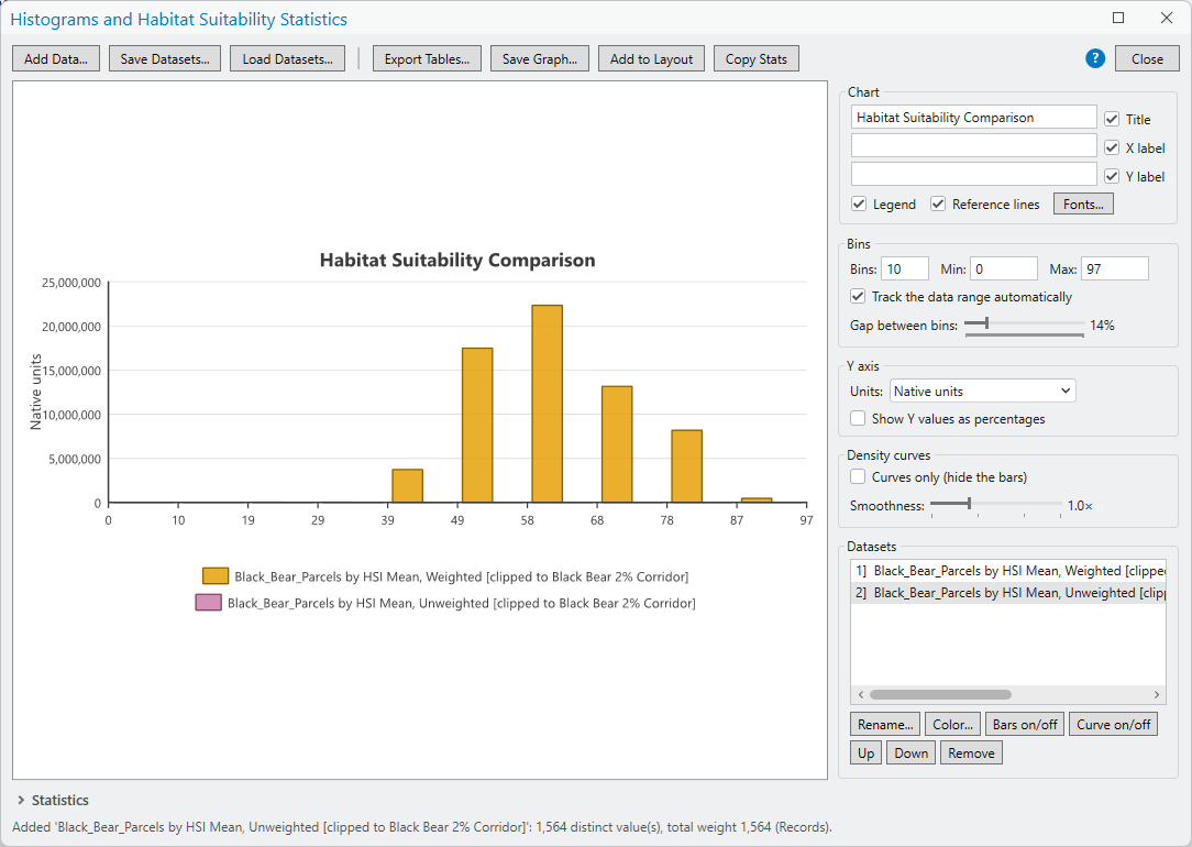
The first thing you see is one histogram, not two. The Y axis is in native units — square meters for the weighted dataset, whose total weight is the corridor's 65 million m² of parcels, and plain record counts for the unweighted one, whose total is 1,564. On an axis that reaches 25 million, bars 1,564 high are invisible. Whenever datasets are weighted differently, or simply differ greatly in size, tick Show Y values as percentages under Y axis: every dataset is then drawn as a share of its own total, and both histograms fill the chart.
Two more clicks finish the figure. Select each dataset in the Datasets list and click Curve on/off to draw its kernel-density curve over the bars — a smoothed version of the same distribution, which makes the two shapes easy to compare even where the bars interleave. The Smoothness slider widens or narrows the kernel; Curves only hides the bars when the curves alone say it best.
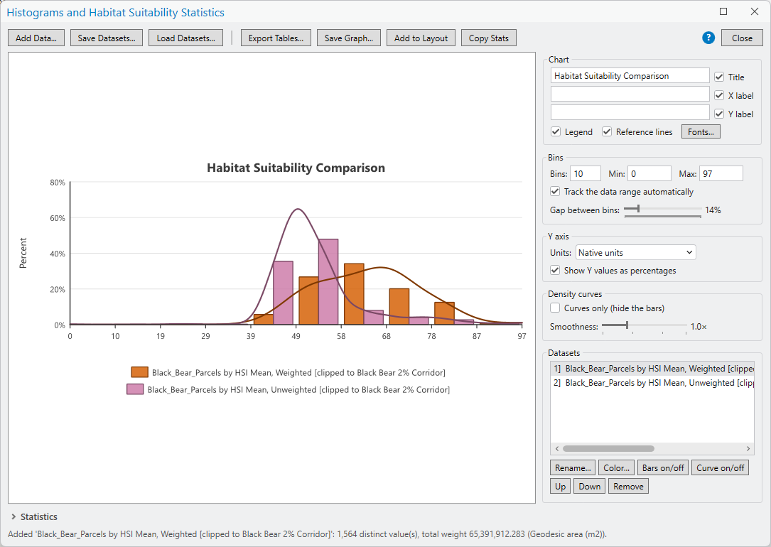
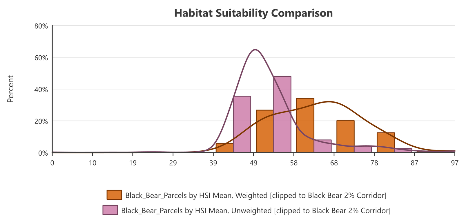
Now the table's two numbers are two shapes. The unweighted distribution — one vote per parcel — is a tall, narrow peak between 49 and 58, with almost nothing above 68: that is the 880 small lots, all scoring about the same middling value. The weighted distribution — one vote per square meter — is broader and sits well to the right, peaking between 58 and 68 with a long shoulder out past 80: the big ranch and state parcels that hold most of the ground and most of the good habitat. The statistics panel below the chart puts numbers on it (weighted mean 63.6, median 63.6; unweighted mean 52.5, median 50.3), and they agree with the weighted-statistics table to the decimal, as they should, since both tools are reading the same field with the same weights.
Why don't the two histograms match? They are built from the very same 1,564 parcels and the very same field; the only difference is how much each parcel counts. If parcel size had nothing to do with suitability — if big and small parcels were scattered evenly across the scores — weighting would change the height of every bar by the same factor and the two histograms would coincide. They do not coincide, and the way they differ is itself the finding: the parcels piled up in the 49–58 bars are small (each casts a big vote by count and a tiny one by area), while the parcels out at 68–87 are large (a small vote by count, a big one by area). The unweighted histogram describes the parcels; the weighted one describes the ground. Whenever the two disagree, parcel size and the variable are correlated — here, because the subdivided lots sit in the poorest habitat and the big undivided holdings in the best — and the direction of the disagreement tells you which way. When they agree, size does not matter and either one will do. Save the figure with Save Graph..., or put it and its statistics on a layout with Add to Layout — the tool page shows both.
Metric 4: Comparing habitat suitability statistics with alternatives
Everything so far has described the biological optimum. Now comes the reality that the optimum is rarely the only proposal on the table. The land a corridor crosses is valued by other people for other things — economic (development potential, land prices, grazing and farm income, water and mineral rights), social (existing communities and the people living in them, private property rights, public access and recreation, cultural and historic sites), and administrative (jurisdiction boundaries, which owners are willing to sell or grant an easement, land-use plans already adopted, roads and utilities already planned, and the timing of the money) — and a developer, a county, or a land trust will often come back with an alternative corridor that fits those constraints better. It may be a band drawn along parcels that are for sale, or along a right-of-way that is already public, or simply to avoid land someone intends to build on. The question is no longer “where is the best route?” but “is this route good enough?” — and that is a question the same four metrics can help to answer, run once on each polygon and compared side by side.
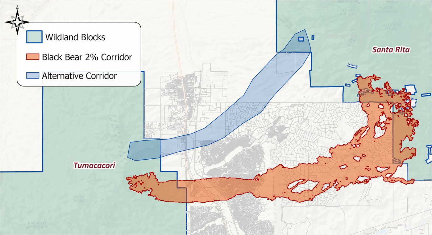
Three things can come out of the comparison, and it is worth naming them before looking at any numbers. The alternative may prove good enough — not the best, but adequate for the species, and far more likely to be conserved. It may prove not good enough, and the numbers then become the argument for changing it. Or the comparison may show that the biological optimum itself falls short on some metric, which is just as useful to know.
Bottleneck Analysis on the alternative
Run Bottleneck Analysis on the alternative exactly as on the optimum, with the same 2,000 m threshold, so the two reports line up.
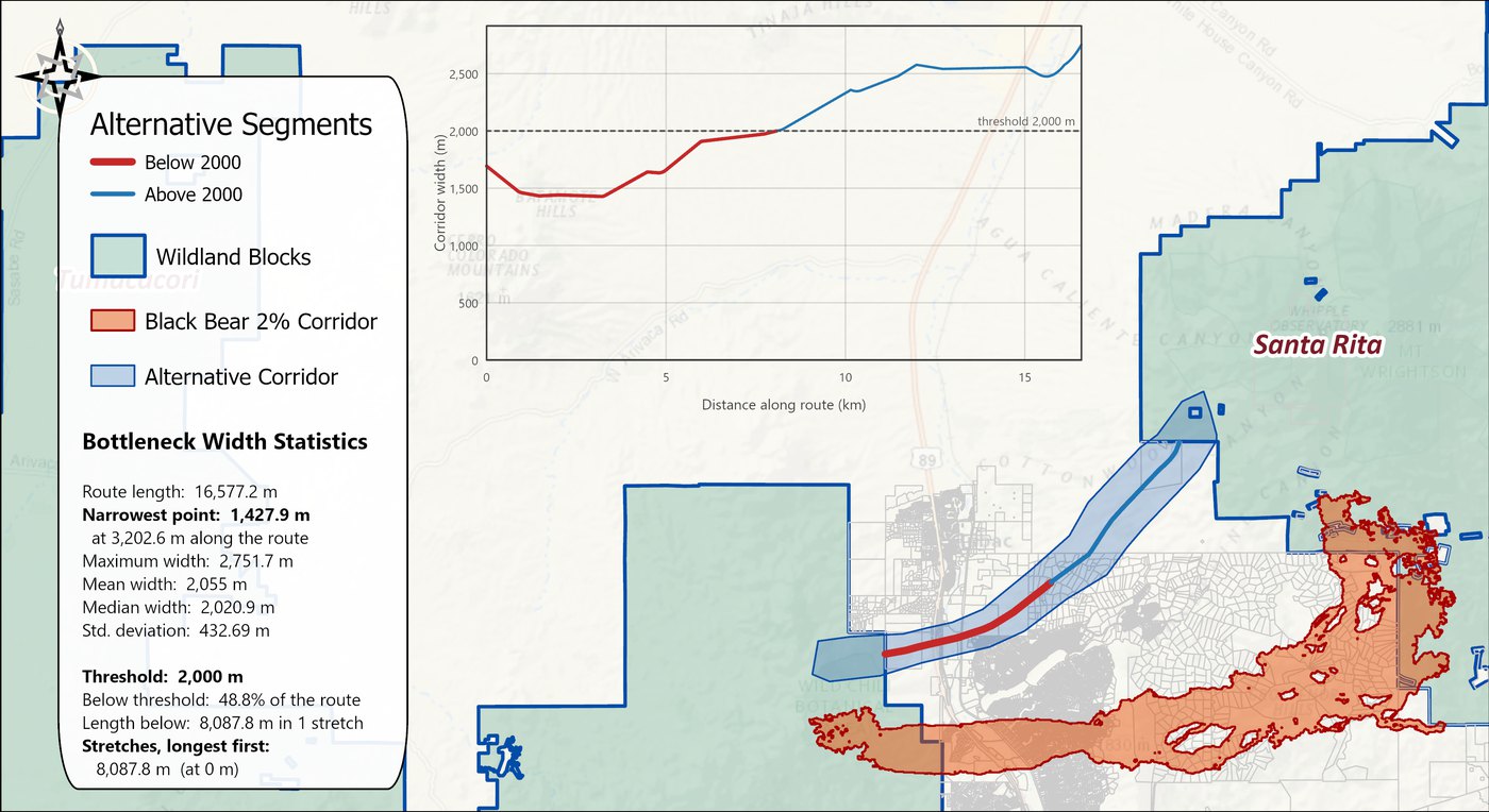
| Black bear optimum | Alternative | |
|---|---|---|
| Route length | 22,336 m | 16,577 m |
| Narrowest point | 860 m | 1,428 m |
| Mean width | 1,758 m | 2,055 m |
| Maximum width | 3,289 m | 2,752 m |
| Below threshold | 67% of the route | 48.8% of the route |
| Stretches below | 4 (longest 10,064 m) | 1 (8,088 m) |
On this metric the alternative is the better corridor, and it is not close: its narrowest point is 1,428 m against the optimum's 860, its mean width is 300 m greater, and less than half of it runs below the threshold, in one stretch at the Tumacacori end, where the optimum has four stretches adding up to two thirds of its length. This is the third kind of finding — the optimum has a real weakness, a pinch to 860 m near the Santa Rita end that a bear must pass through. It is also worth remembering what the metric measures. A polygon somebody drew as a smooth band will always score well on width, because width is the one thing its author controlled; the least-cost corridor pinches where the habitat pinches. Bottleneck Analysis describes the shape of the polygon, and the remaining metrics describe what is inside it.
Patch Analysis on the alternative
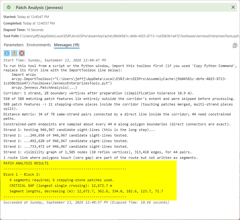
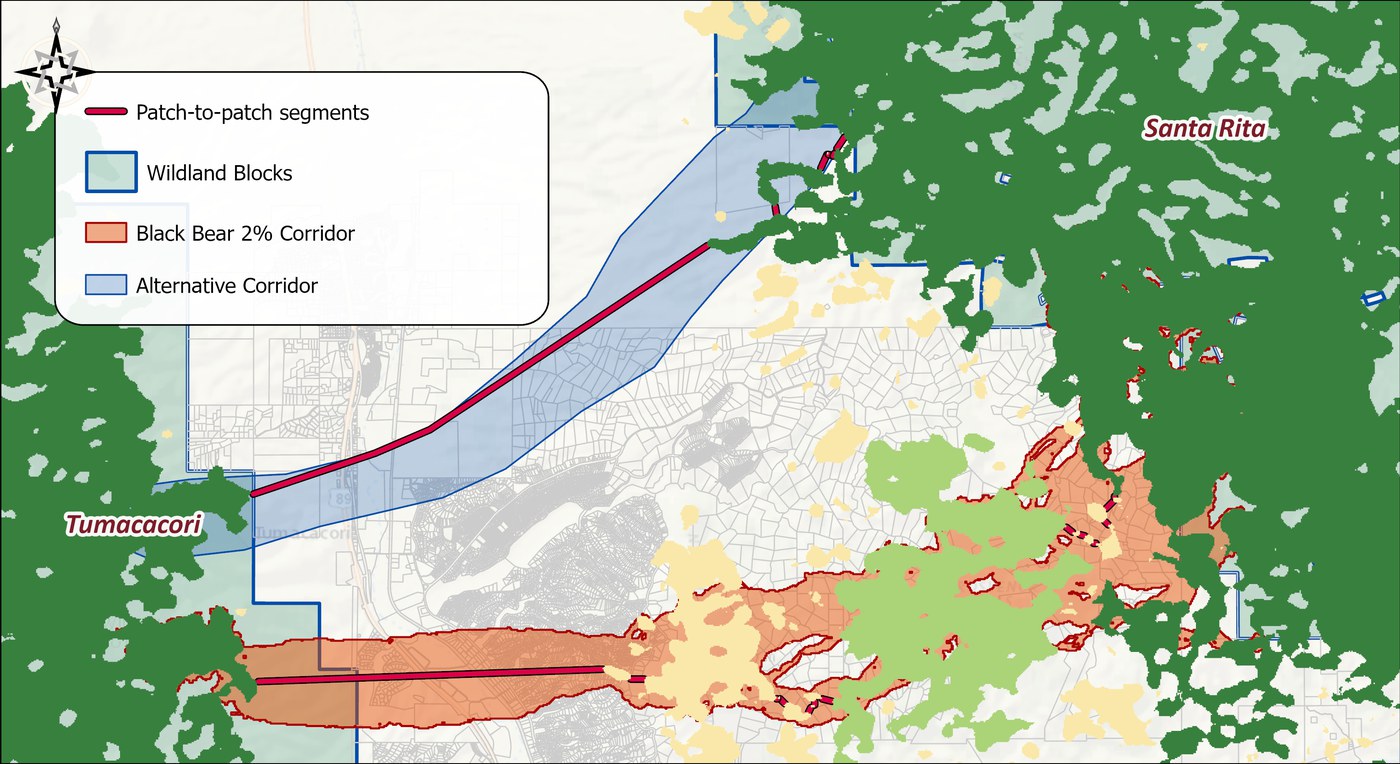
Patch Analysis is where the alternative starts to lose. The optimum's route needed 13 crossings between stepping-stone patches, the longest 8,379 m. The alternative has only six patches to work with — 550 of the 588 patches in the patch map lie entirely outside it — and its critical gap is 12,673 m, a single crossing of open matrix half again as long as the optimum's worst, running from the Tumacacori block most of the way to the Santa Rita foothills before the first patch of usable habitat.
Land cover and ownership in the alternative
The same Cross-Tab Statistics run, restricted to the alternative polygon, describes the ground itself.
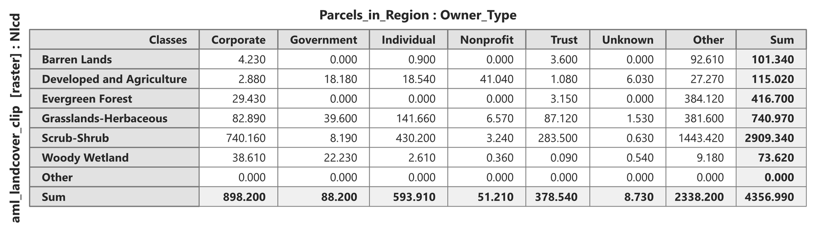
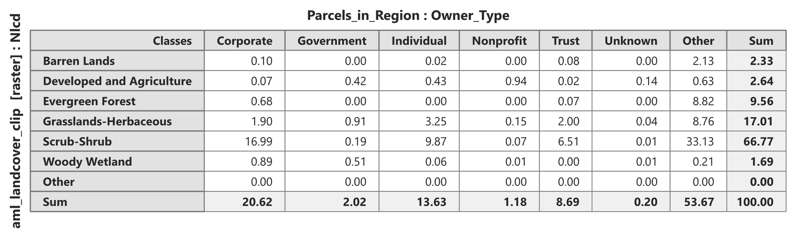
Set against the optimum's table in Metric 3, the differences are large and all point the same way. The alternative is two-thirds scrub (67% against 41%) and has less than a third of the optimum's share of evergreen forest (9.6% against 31.5%), which for a species whose model weights land cover at 75 is most of the story by itself. It carries nine times the share of developed and agricultural land (2.6% against 0.3%): it crosses Highway 89, the river valley and the edge of Tubac, which is precisely why someone would propose it. It has a little more woody wetland, the Santa Cruz River bosque, which is the one thing to be said for it ecologically. And more than half of it — 54%, the Other column — lies in no parcel at all: the two ends of the band sit inside the public land of the wildland blocks themselves, so the private ground the proposal actually puts at stake is the 2,019 hectares in the middle, mostly corporate (899 ha), individual (594) and trust (379) holdings, with almost no state land (88) and no title-company trusts at all.
Weighted statistics in the alternative
Clip the parcels to the alternative, give them a suitability mean with Zonal Statistics as before, and run Weighted Summary Statistics by owner type.
The tool's output is another 18-row table like the one in Metric 3, and rather than reproduce it, the table below pulls out the habitat suitability rows, which are the ones that matter, alongside the same rows for the optimum. Every number in it is a mean habitat suitability index (HSI) on the model's 0–100 scale: the area-weighted mean HSI of all the parcels of one owner type, and the mean HSI of the single best parcel of that type.
| Owner type | Parcels | Area-weighted mean HSI | Mean HSI of best parcel | |||
|---|---|---|---|---|---|---|
| O | A | O | A | O | A | |
| Corporate | 250 | 36 | 62.4 | 50.5 | 95.6 | 55.6 |
| Individual | 880 | 201 | 57.7 | 48.1 | 95.6 | 56.1 |
| Trust | 176 | 32 | 61.0 | 48.9 | 89.9 | 55.1 |
| Government | 136 | 25 | 69.9 | 47.3 | 96.4 | 54.6 |
| Title trust | 111 | – | 67.4 | – | 91.8 | – |
| Nonprofit | 5 | 9 | 49.9 | 45.5 | 69.0 | 49.3 |
Two things in this table say more than the rest. First, the habitat suitability of every owner type's ground is lower in the alternative, by ten to twenty HSI points on the area-weighted mean: corporate land averages 62 in the optimum and 50 in the alternative, state land 70 against 47. Second, and more telling, the best single parcel in the alternative, of any owner, has a mean habitat suitability of 56, while the optimum holds parcels whose mean HSI is in the nineties. The alternative does not merely have less good habitat; it has none. Its habitat suitability is uniformly middling — the area-weighted standard deviation of HSI is 3 to 5 points for most owner types, against 9 to 11 in the optimum — and where it does vary, it varies downward: some parcels in every private owner class have a mean HSI of zero, developed lots the model rules out entirely, which is why the Individual and Trust record means of habitat suitability (38 and 39) sit ten points below their medians (48). The acreage rows, meanwhile, repeat Metric 3's lesson in miniature: 201 individually owned pieces with a median of 1.2 acres — the Tubac lots — make up 594 hectares of the corridor between them.
The full cash value rows deserve a closer look than the tool's own statistics give them. Full cash value is assessed per parcel, so its means mostly measure parcel size: the alternative's corporate parcels average $172,000 against $84,000 in the optimum simply because they are bigger. The fair comparison is value per acre, which the output supplies directly — divide the Sum of full cash value by the Sum of acreage for each owner type (both are whole-parcel attributes, so the ratio is consistent).
| Owner type | Black bear optimum | Alternative |
|---|---|---|
| Individual | $18,800 | $8,800 |
| Trust | $3,900 | $1,600 |
| Government | $1,300 | $1,100 |
| Corporate | $440 | $760 |
| Title trust | $60 | – |
| Nonprofit | $5,900 | $37,700 |
| All parcels | $3,300 | $4,600 |
Three things stand out. Individually owned land in the biological optimum is worth twice as much per acre as in the alternative, and the reason is the same one as before: the optimum's 880 individual parcels are subdivision lots with a median under an acre, and full cash value includes the houses on them. The optimum crosses more built residential land, acre for acre, than the alternative does, even though it has far less developed land cover overall, because those lots are so small. Second, the big holdings — corporate ranch land and trust land, the ground a land deal would actually be built on — are cheap in both corridors, a few hundred to a few thousand dollars an acre, and cheaper in the alternative for trusts. And third, the alternative's overall figure is carried by a single parcel: the nonprofit class holds one property assessed at $6.4 million, and without it the two corridors cost almost exactly the same per acre, roughly $3,300 to $3,600. So the money does not decide between them either way. The optimum is dearer where it touches subdivisions, the alternative is dearer because of one holding, and the working land in between costs about the same in both.
The distributions, side by side
Histograms and Statistics makes the comparison directly: add the same raster twice, clipped once to each corridor. Three continuous rasters tell most of the story, and two categorical ones finish it.
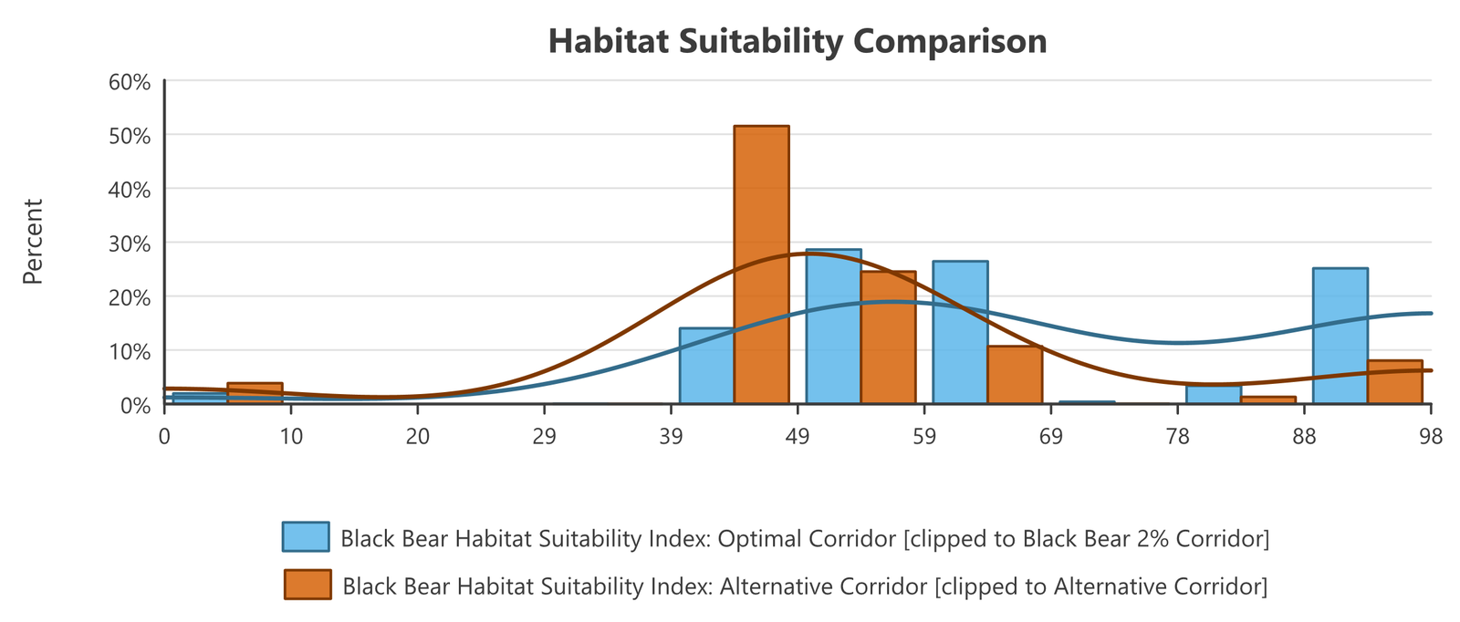
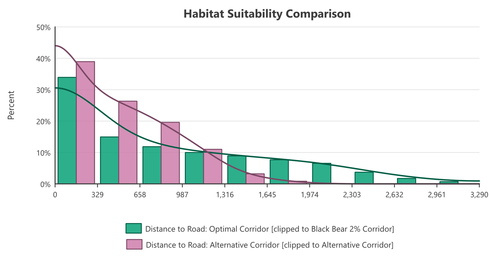
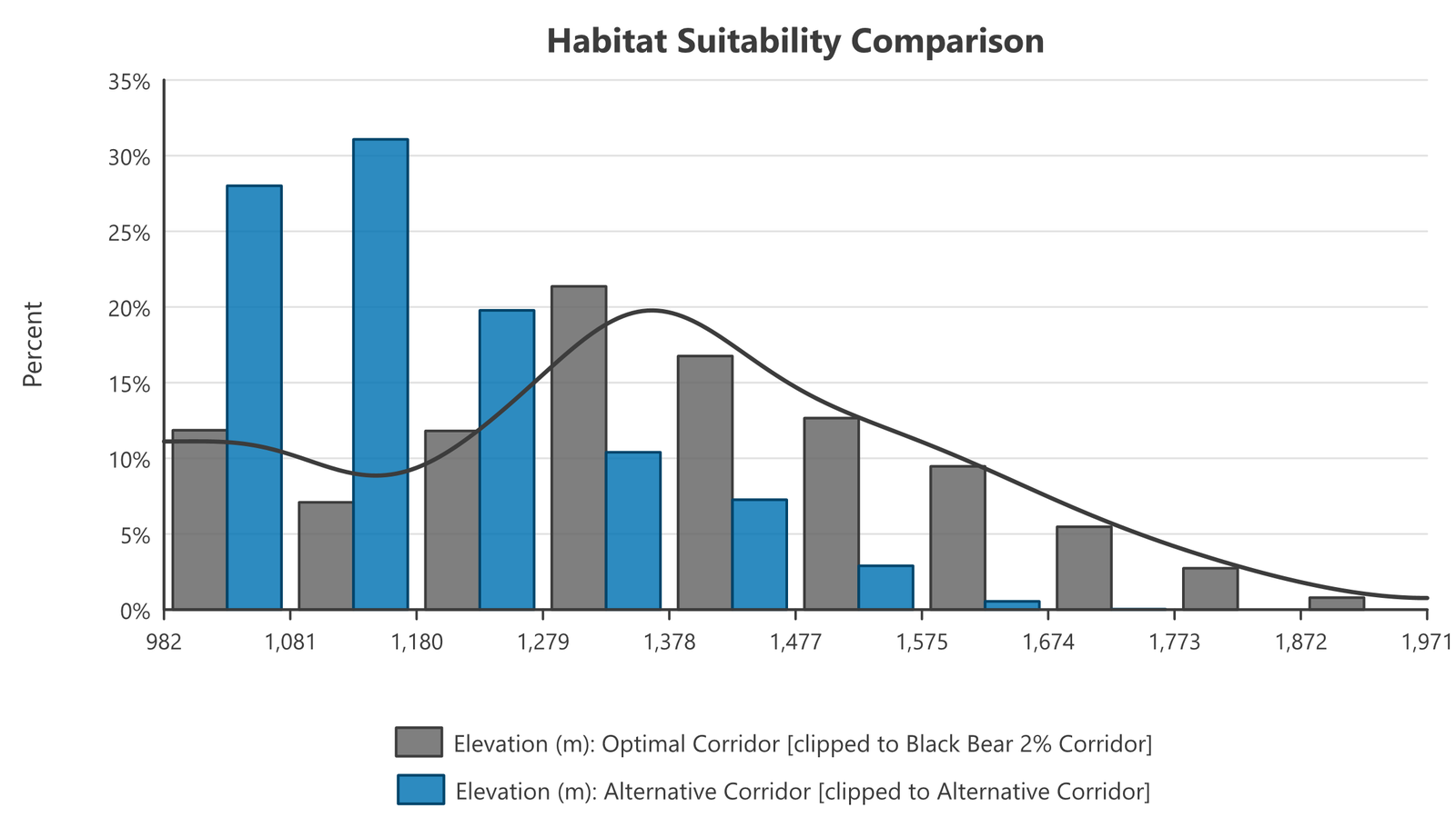
The tool also takes categorical rasters and text fields, one bar per class, and two of the model's own inputs are worth comparing that way. Slope class, the model's terrain factor, barely separates the two corridors: half of each is steep slope, and although the alternative trades some canyon bottom and ridgetop for flat and gentle ground, the differences are a few percentage points. Land cover, the factor the model weights most heavily, separates them completely.
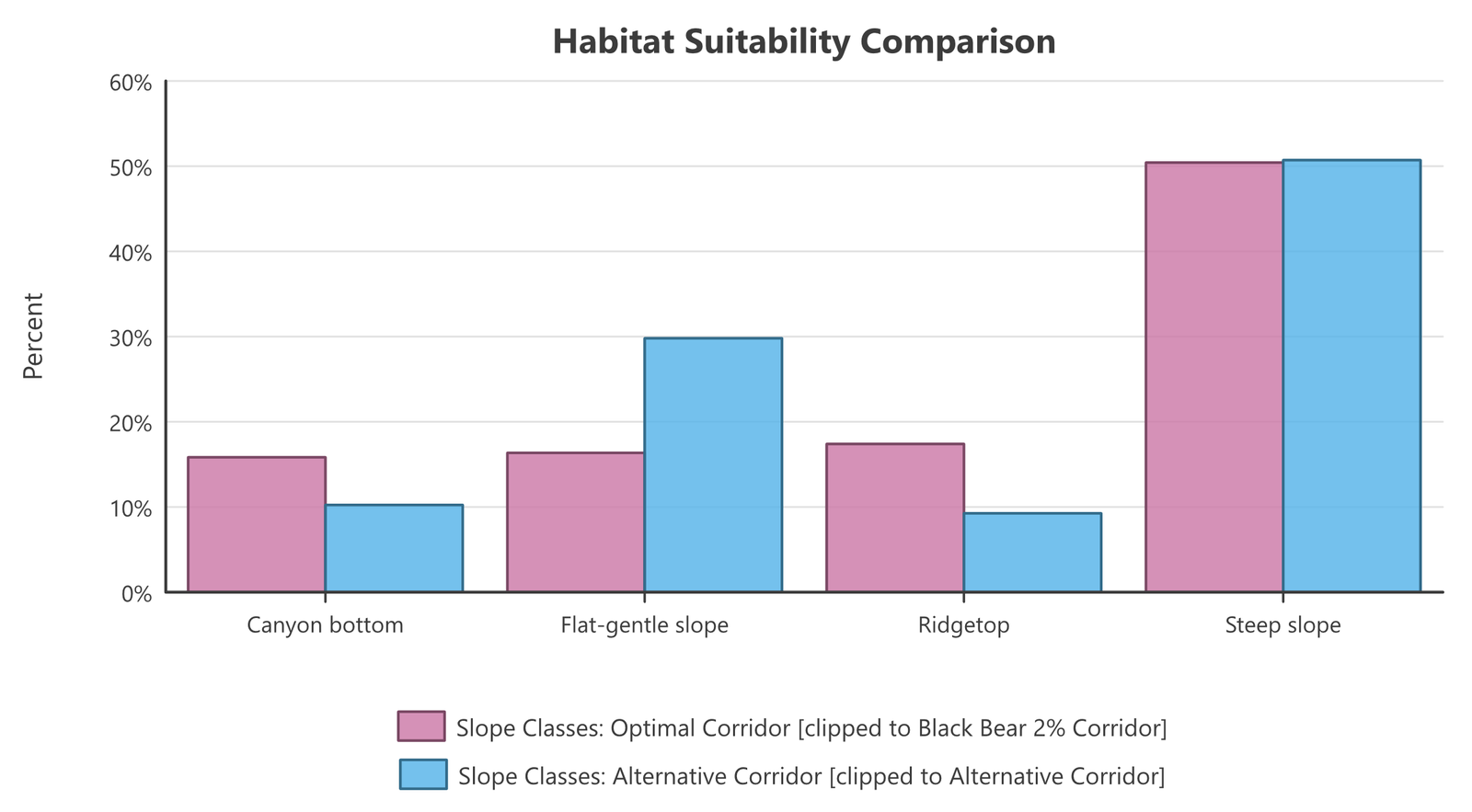
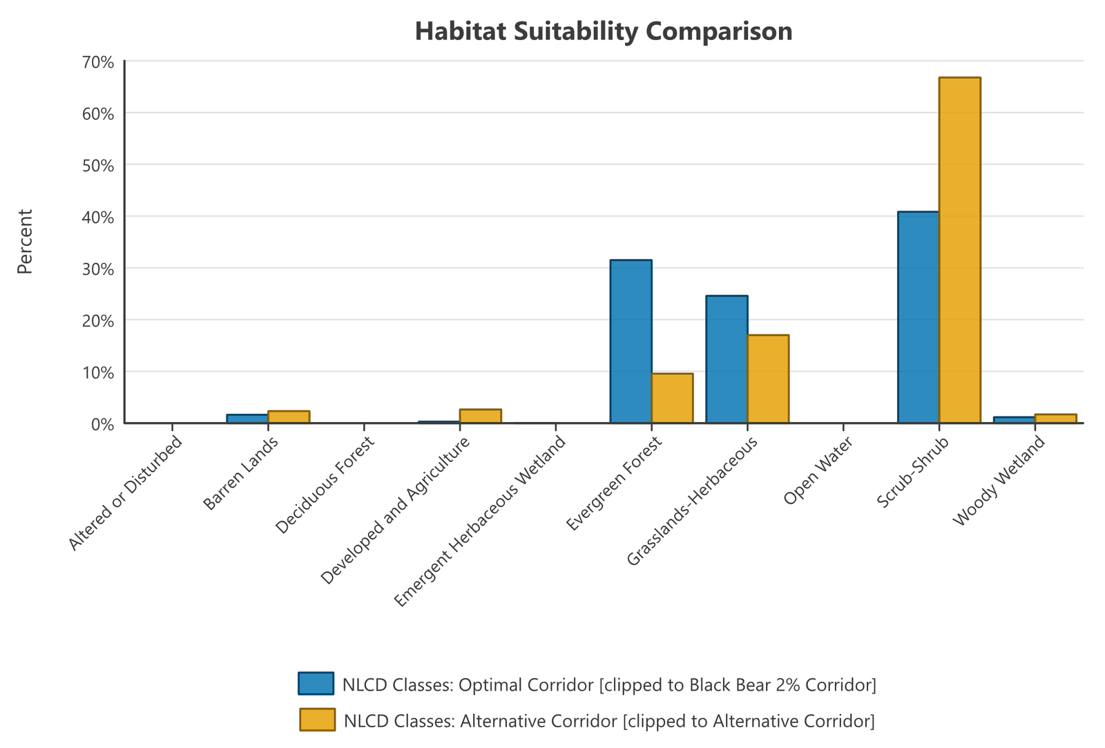
Read together, the histograms explain the tables. The alternative is a valley-floor route close to roads, and for a black bear model that scores land cover, elevation, topographic position and distance from roads, valley floor near roads is the middling ground the suitability histogram shows: adequate almost everywhere, excellent nowhere. The optimum is worse shaped and pinches to 860 m, but it climbs into forest, away from roads, and its bears would have a quarter of the corridor at the top of the suitability scale to rest and feed in on the way across.
So is the alternative good enough? For black bear, the numbers lean hard toward no: a 12.7-kilometer crossing of uniformly mediocre habitat with no refuge in it is a different kind of corridor from an 8.4-kilometer worst gap inside a route that also contains excellent habitat, and the alternative's one clear advantage, its width, is an advantage of drafting rather than of ground. But that is a reading of the numbers, not the decision. The decision is, and should be, the responsibility of the people making it: the biologist applying professional judgment about what this species can actually tolerate, together with the landowners, agencies, developers and community who have their own priorities and their own knowledge of what can be conserved, at what cost, and when. Someone weighing the alternative's far better prospects of ever being protected might reasonably accept it, or propose a third route that keeps the alternative's ends and bends south into the forest in the middle. These metrics and comparisons do not make that call. They are meant to guide it, by putting the same numbers, from the same tools, in front of everyone at the table.
The ancillary helpers
Clip Data to Analysis Area prepares consistent inputs (the old workshops' loudest warning — “Important! Must clip grid to polygon first” — is now handled gracefully, but clipping is still the tidy way to work). Cumulative Surface answers “how many of my layers occur in this cell?” — stack the single-species corridors and see instantly which ground serves many species and which serves one. Invert Raster, Diversity Indices, and the Corridor Analysis Data Report round out the kit.
Putting it together
A complete evaluation, per alternative: clip the background data → run all four metrics on the corridor polygon → assemble the tables. Then set the alternatives side by side: longest required gap, length and severity of bottlenecks, habitat composition, and suitability statistics. The numbers will not make the decision — they make the decision defensible, whichever way it goes. These tools were conceived as ways of thinking about corridor quality, and the team's invitation from the original workshops stands: new evaluation ideas are always welcome.
Recommended citation
Credits and references
The CorridorDesigner Evaluation Tools are by Jeff Jenness, Dan Majka and Paul Beier (corridordesign.org, archived copy at the Internet Archive); this tutorial follows the training workshops Paul Beier, Dan Majka and Jeff taught with the original ArcMap tools.
- Beier, P., D. Majka, and J. Jenness. 2007, revised 2026. Designing wildlife corridors with ArcGIS: ArcGIS Pro edition. Workshop book, revised by J. Jenness for the Corridor Designer Tools of the Wildlife and Forestry Tools add-in. Available at: CorridorDesigner_WorkshopBook_2026_ArcGISPro.pdf (5 MB)
- Jenness, J., D. Majka, and P. Beier. 2014. CorridorDesigner Evaluation Tools. Available at: corridordesign.org (archived copy at the Internet Archive)
Related tools and pages
- About Corridor Design and the Corridor Design Tutorial — how the corridors being evaluated were built.
- Bottleneck Analysis and Cross-Tab Statistics — tool pages available now; the remaining evaluation tool pages are on their way.