

Histograms and Statistics
Summary
An interactive window for exploring the distributions behind the summary numbers: histograms and statistics of one or several datasets at once — attribute fields of features (weighted by geodesic length or area where that is the honest weighting), raster cell values, or categorical data such as land-cover classes and owner types — drawn as grouped bars with smooth weighted kernel-density overlays. Where Weighted Summary Statistics gives you the numbers in a table, this window shows the shapes: is the suitability inside the corridor high-and-narrow or a bimodal mix of excellent and awful that happens to average well? Its most powerful use is comparing a biologically optimal corridor with a proposed alternative: the same habitat factor or suitability model clipped to each, drawn on one chart as percentages, shows at a glance where the alternative falls short and by how much.
Comparing a corridor with its alternatives
A corridor model produces the biologically best route, and sooner or later someone proposes a different one: a route that avoids a landowner, follows a planned easement, or costs less to conserve. The question is what the species gives up, and this window answers it directly. Load the same field from two or more corridor polygons — or the habitat suitability values, or any habitat factor, clipped to each corridor — and their distributions sit side by side in one chart. Two corridors can share a mean while one hides a long tail of near-zero habitat; the histogram shows it instantly, and shown as percentages the comparison is fair even when one corridor is several times the size of the other. The chart places onto a layout via the suite's standard layout-first Add-to-Layout, and the binned tables export for further work, so the comparison goes into the report as evidence rather than as a claim.
A tour of the window
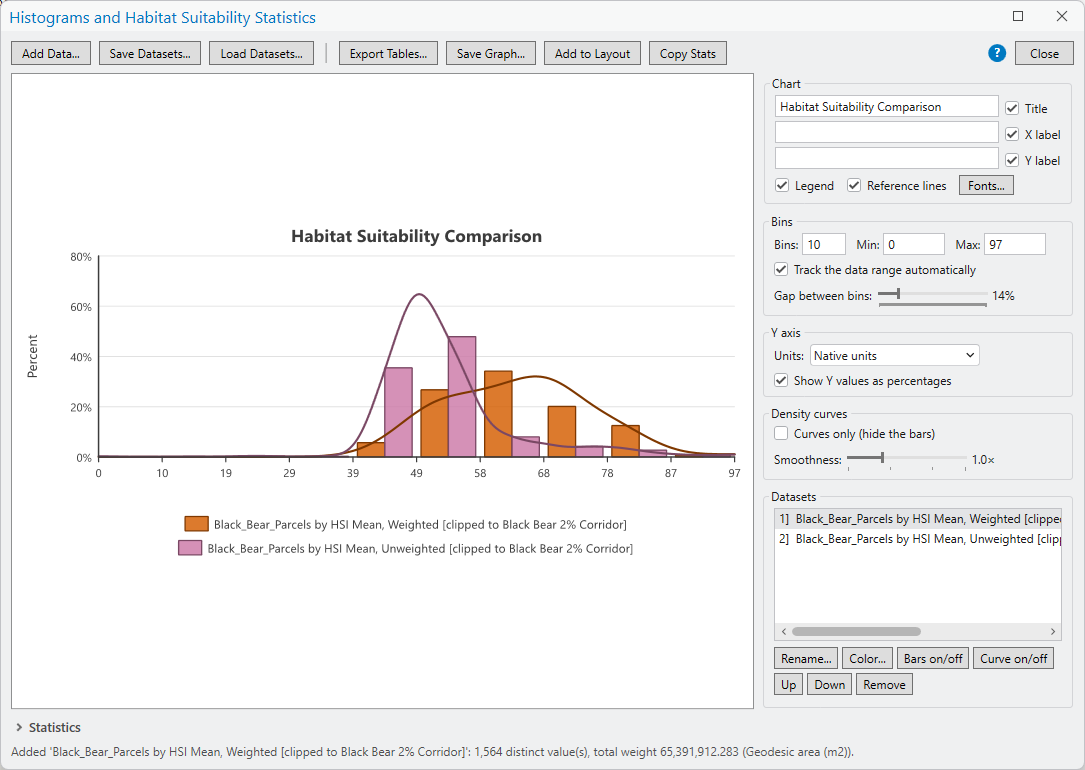
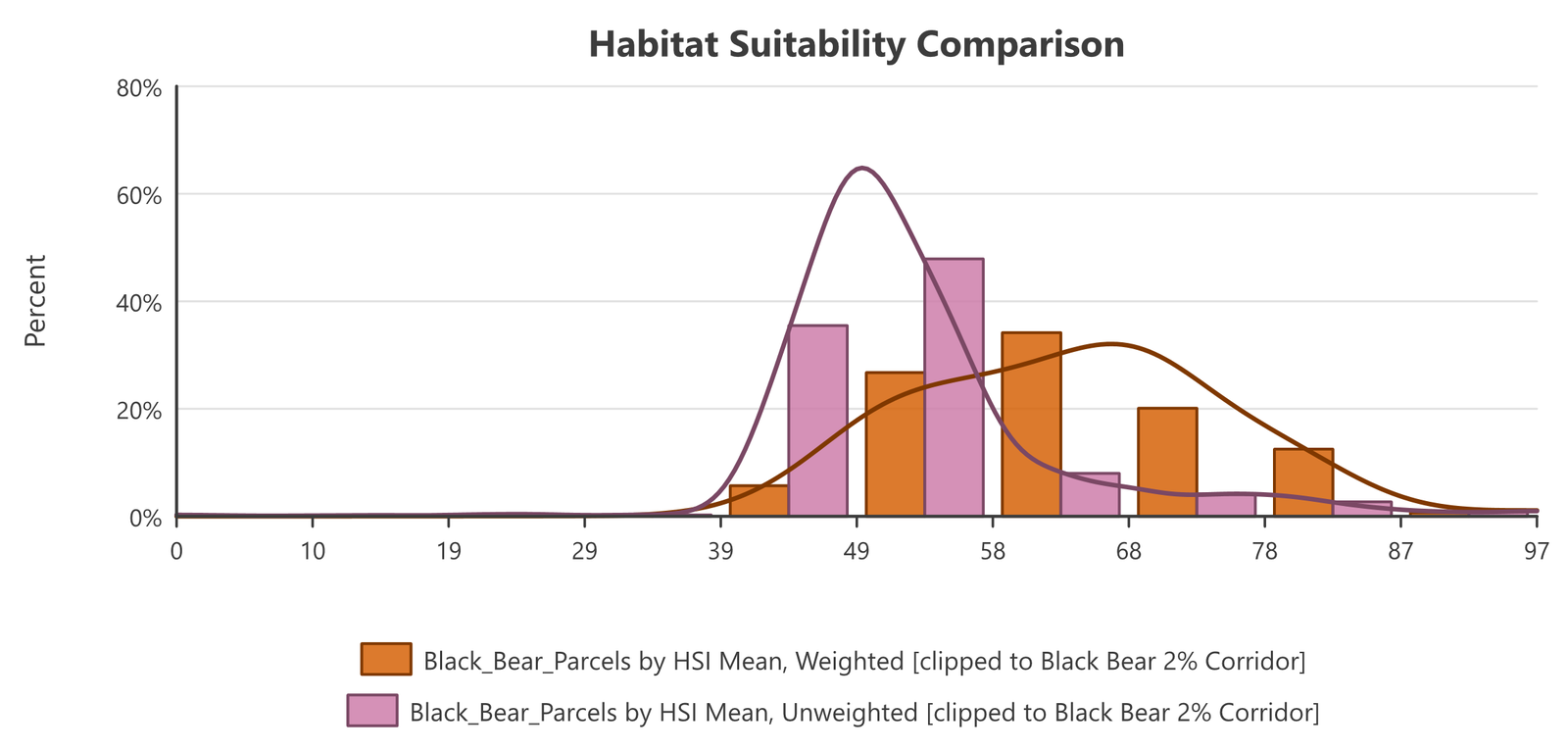
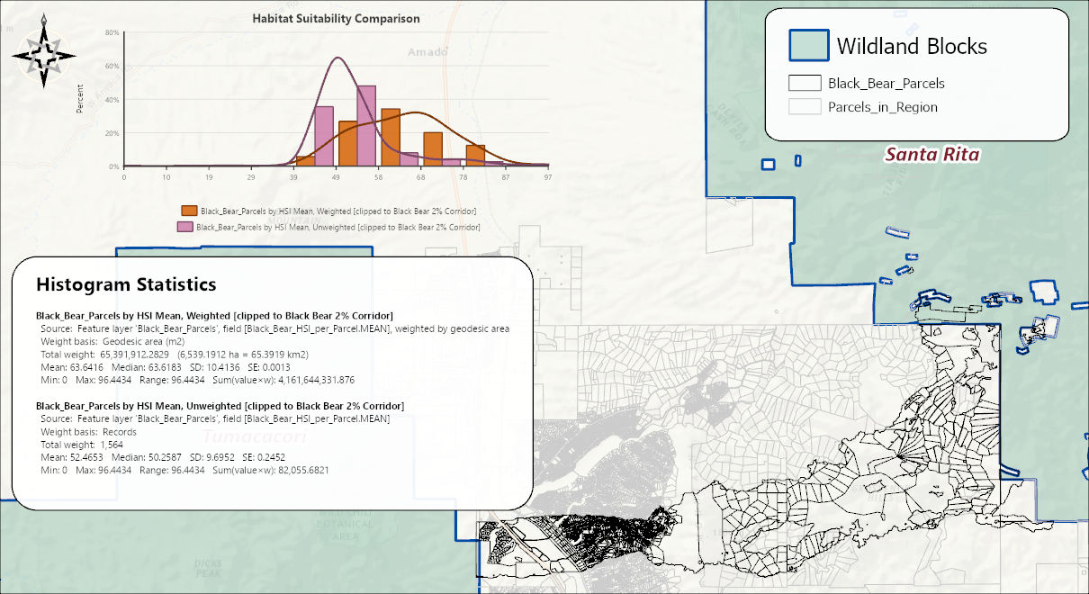
The example is the suitability comparison from the Corridor Evaluation Tutorial: one attribute field of a parcel layer added twice, once weighted by parcel area and once with each parcel counting equally, so the two distributions can be compared on the same axes. That page walks through adding the datasets, the native-units trap, and how to read the result; this page covers the rest of the window.
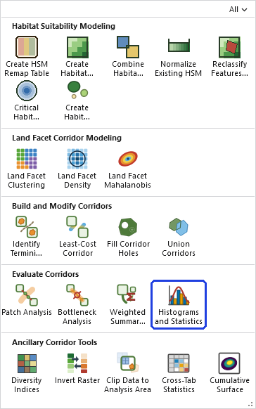
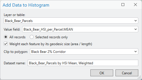
A definition query on a layer or table is always honored. The window reads the records the layer shows, so all records means all of those, and a selection is taken from among them. The clip polygon layer is read the same way.
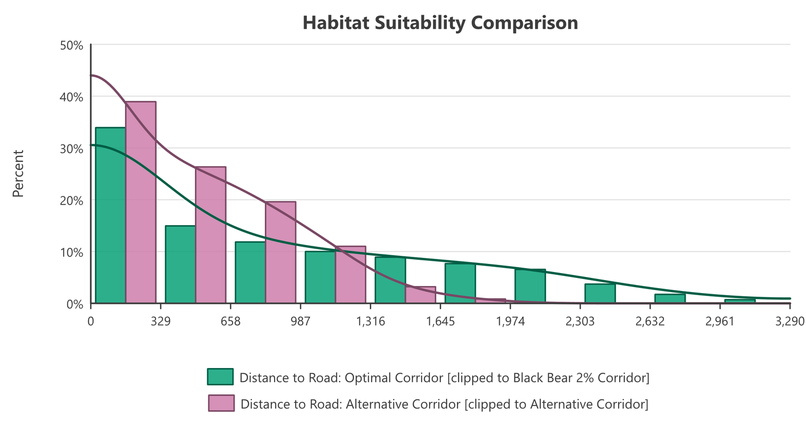
The comparison of a biologically optimal corridor with a proposed alternative is the window's most powerful use, and it is the case Metric 4 of the Corridor Evaluation Tutorial works through. Load the same raster clipped to each corridor as two datasets, switch the Y axis to percentages so that corridors of different sizes can be read against each other, and the two distributions sit on one chart. Here the raster is distance to the nearest road: the alternative corridor keeps nearly all of its ground within 1.3 km of a road, while the optimal corridor's cells reach 3 km from one, a difference that a pair of mean values would understate and that the chart makes plain.
Categorical data
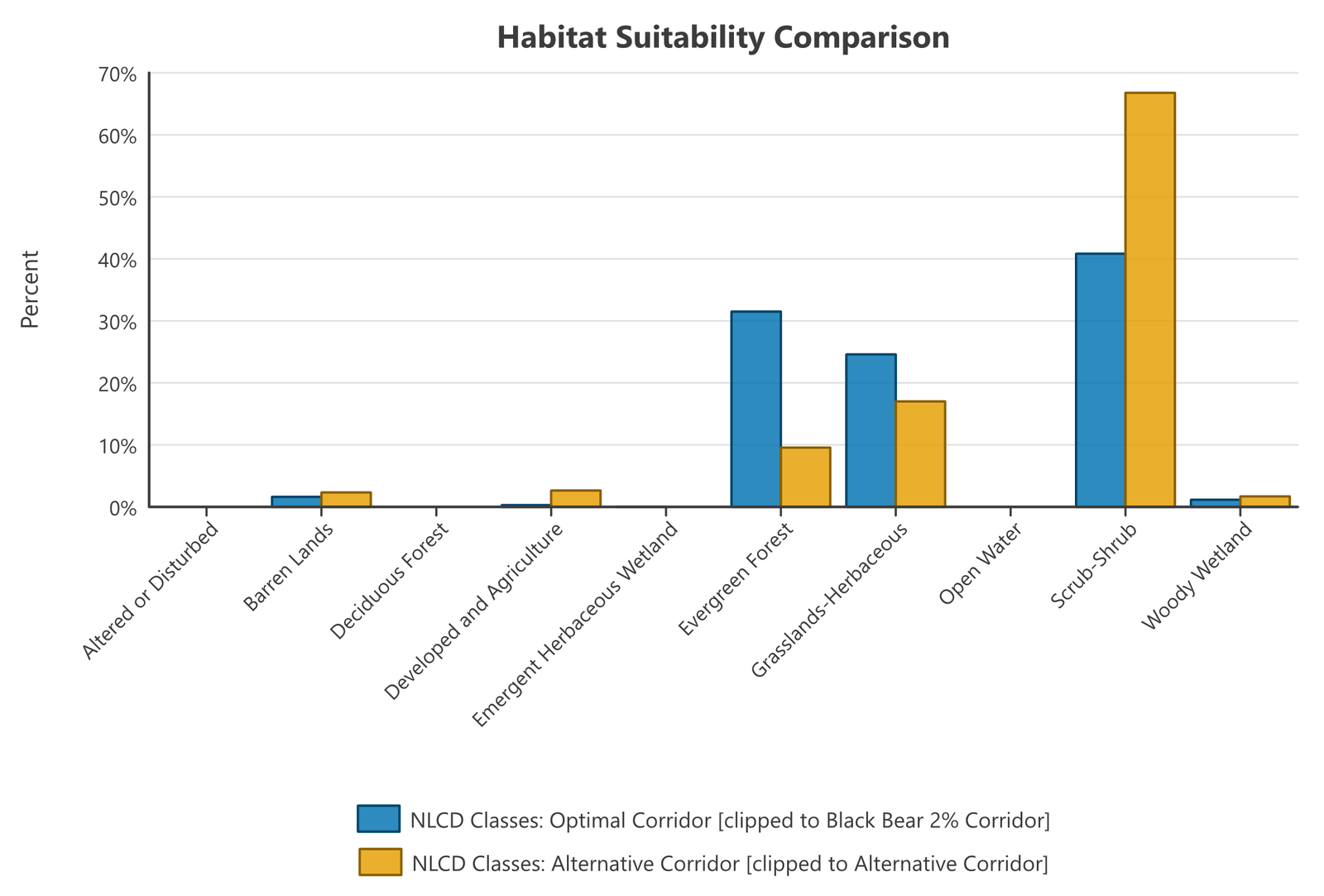
The window also takes categorical data: a text field of a feature layer or table (owner type, vegetation class), or a classified raster such as land cover, using either the layer's unique-value symbology labels or any text column of its attribute table as the class names. The chart then shows one bar per class instead of one per bin, and classes are matched between datasets by name, so a land-cover raster clipped to two corridors lines up class for class. Bins, axis range and density curves do not apply to classes and are disabled while categorical data is loaded; percentages and area units still work. A categorical dataset cannot share a chart with a numeric one, and if the loaded datasets do not all carry the same classes the window says which classes each one lacks, since an empty slot is only a real finding when both were classified the same way.
Colors and fonts
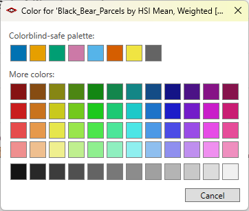
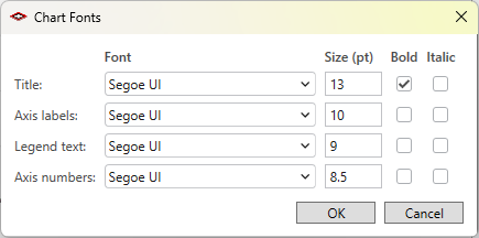
Select a dataset in the list and click Color... to choose its color from a colorblind-safe palette or the larger grid below it; the bars and the density curve follow. Rename... changes the legend text, Bars on/off and Curve on/off show or hide either element per dataset, and Up/Down set the drawing and legend order. Fonts... in the Chart group sets the face, size, bold and italic for the title, the axis labels, the legend and the axis numbers separately.
Getting the chart out
Save Graph... writes the chart as a PNG image at 300 dpi or as an SVG vector file, exactly as drawn, for a report or a slide.
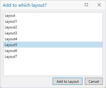
Add to Layout places the chart on an ArcGIS Pro layout as native graphic elements — every bar, curve, tick and label individually editable — together with the statistics report as a text element named Histogram Statistics. If a layout is the active view it goes there; otherwise the window asks which of the project's layouts to use, and if the project has none yet it points you to Insert ▸ New Layout.
The remaining buttons cover the numbers rather than the picture: Copy Stats puts the statistics report on the clipboard as text; Export Tables... writes the general-statistics table and the per-bin table to a geodatabase, dBASE or CSV; and Save Datasets... / Load Datasets... keep a whole comparison — every dataset, its weighting, clip and color — in a small JSON file, so it can be reopened or rebuilt on new data without adding the datasets one by one.
Recommended citation
Credits and references
By Jeff Jenness, Jenness Enterprises (www.jennessent.com), in the lineage of the CorridorDesigner Evaluation Tools by Jenness, Majka and Beier.
- Beier, P., D. Majka, and J. Jenness. 2007, revised 2026. Designing wildlife corridors with ArcGIS: ArcGIS Pro edition. Workshop book, revised by J. Jenness for the Corridor Designer Tools of the Wildlife and Forestry Tools add-in. Available at: CorridorDesigner_WorkshopBook_2026_ArcGISPro.pdf (5 MB)
- Jenness, J., D. Majka, and P. Beier. 2014. CorridorDesigner Evaluation Tools. Available at: corridordesign.org (archived copy at the Internet Archive)
Licensing information
Works at every ArcGIS Pro license level (Basic, Standard, Advanced). No extension licenses are required.
Related tools and pages
- Cross-Tab Statistics — two categorical variables crossed in one table, where this window shows one variable's distribution.
- Corridor Evaluation Tutorial — Metric 3's graphical half.
- Weighted Summary Statistics — the tabular half.