
Polar Plots
Summary
Draws the distribution of a set of directions as a circular plot, and reports the circular statistics that describe it. The directions can be compass azimuths in a numeric field of a feature layer or table, the direction of each polyline from its first vertex to its last, or the cells of an entire aspect raster of any size. Nine plot types are available, from the familiar rose diagram to a smoothed density curve and a dot plot, with optional overlays for the mean direction and its 95% confidence interval. Everything updates live in a preview, and the finished plot can be saved as a PNG image or an SVG file, or placed on a layout as a group of ordinary, editable graphic elements. A statistics report is one click away.
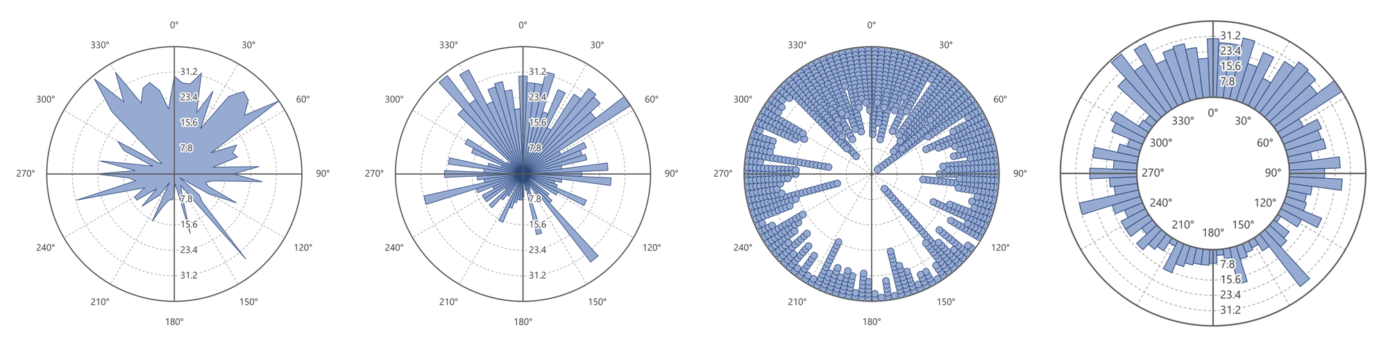
A plot is usually the first thing to look at with directional data, before computing anything. A mean direction and a mean resultant length describe a set of directions with two numbers, and two numbers can hide a great deal: a set of directions that clusters in two opposite groups, such as an animal commuting between a roost and a foraging area, has a mean resultant length near zero, exactly like a set scattered evenly around the compass (Jenness 2012). The plot shows the difference at a glance.
Where it comes from
The tool is a modernized recreation of the Jenness Enterprises Polar Plots extension for ArcMap (Jenness 2014), which drew Peaks and Valleys, Circular Bins, Shade by Density, the two External variants and Bearings plots on the ArcMap layout from the directions in a feature class or table, and reported basic circular descriptive statistics: the mean direction, resultant and mean resultant length, circular variance and standard deviation, angular variance and deviation, and the von Mises concentration. The ArcGIS Pro version keeps those six plot types and their statistics, and adds the Wind Rose, Smoothed Density and Dot Plot types, the mean-direction and confidence overlays, equal-area scaling, aspect rasters as a source, the median direction, circular range, 95% confidence interval of the mean direction and Rayleigh test in the report, a live preview, PNG and SVG output and reusable style presets.
The plot types
Most plot types divide the circle into bins, 72 by default, so each bin covers 5°. Each bin is centered on its azimuth, so the bin for 0° runs from 357.5° to 2.5°, and the value of a bin is the count, or the total weight, of the directions that fall in it.
| Plot type | What it draws | Rasters |
|---|---|---|
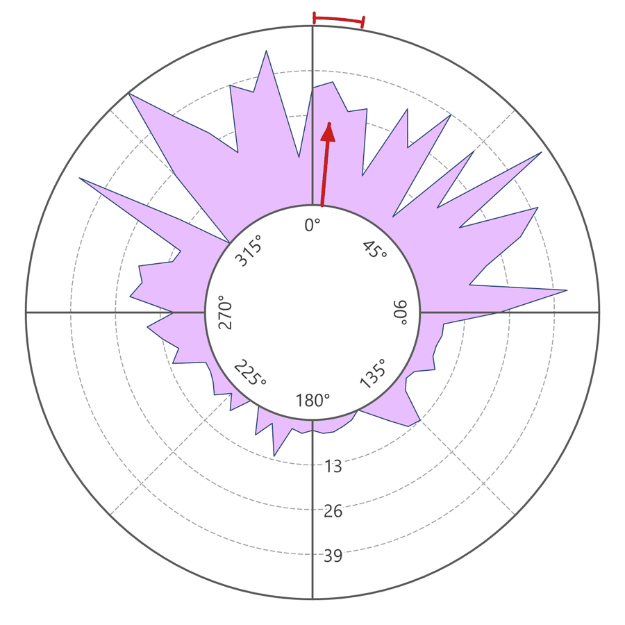
| Peaks and Valleys | A filled silhouette whose distance from the center follows the bin values around the circle. | Yes |
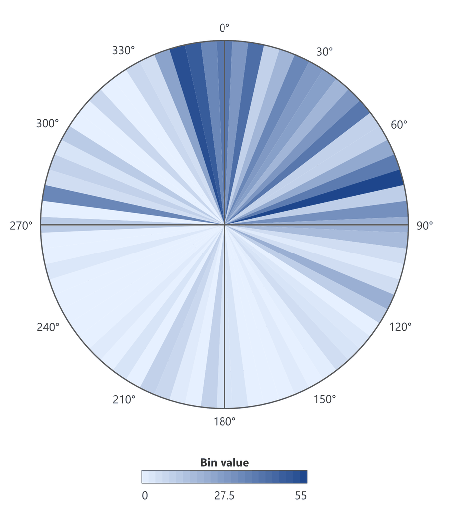
| Circular Bins (Rose) | The rose diagram: a wedge-shaped bar for each bin, reaching out as far as the bin value. The default. | Yes |
| Shade by Density | Full-length wedges, each shaded between a low-density and a high-density color by its bin value. | Yes |
| External Peaks and Valleys | The Peaks and Valleys silhouette riding outward from an inner circle, with the azimuth labels inside that circle. | Yes |
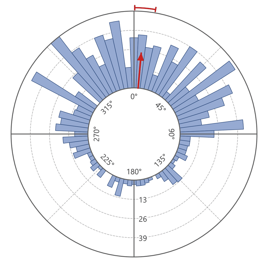
| External Bins | The rose wedges riding outward from an inner circle. | Yes |
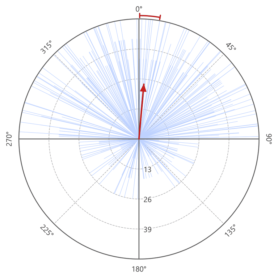
| Bearings | One line from the center for every direction; with weights, the lines vary in length. Best for fewer than a few hundred values. | No |
| Wind Rose (stacked bands) | Rose petals divided into stacked, colored bands by a second numeric field, classically wind speed, with a legend. | No |
| Smoothed Density (kernel) | A smooth silhouette fitted with a von Mises kernel (Fisher 1993), with no arbitrary bin edges. Best for large samples. | Yes |
| Dot Plot | One dot for every direction, stacked inward from the circle (Fisher 1993; Batschelet 1981). Weights are ignored. Best for small samples. | No |
Bearings, Wind Rose and Dot Plot need the individual observations or a second field, which an aspect raster does not supply, so they are listed only for feature layers and tables.
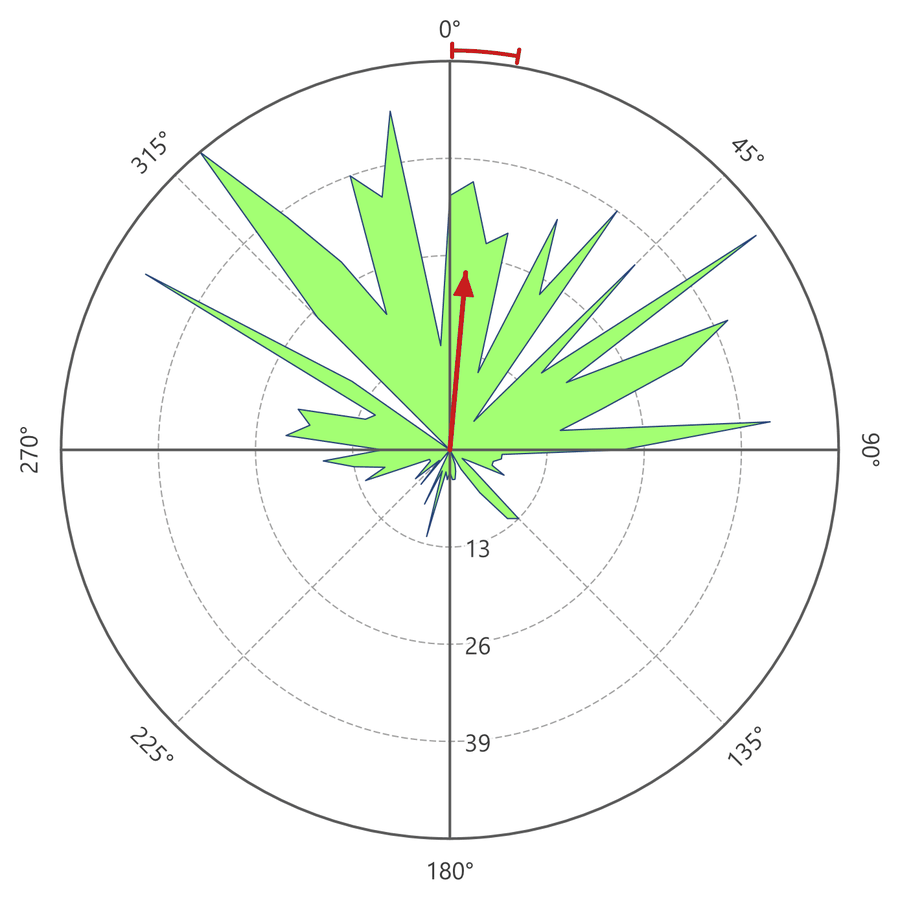
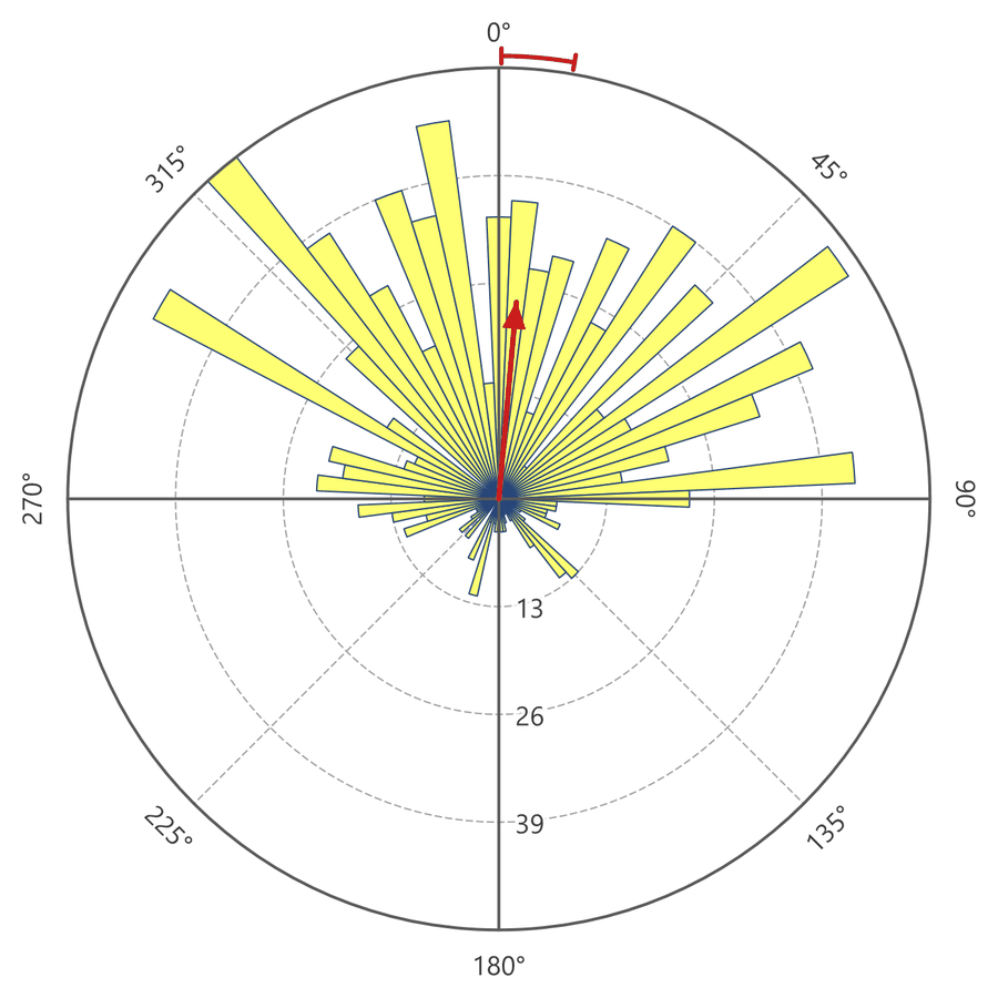
The figures below show every type, drawn from the aspect of the ground (the compass direction the slope faces) at bald eagle roost locations, the night-time locations of seven birds. They come from several runs with different settings: some use all the locations, some a selection, and some weight each location, so compare the shape of one figure with the next rather than its numbers. The red arrow and the arc above the circle, where they appear, are the mean direction and its 95% confidence interval, described under Overlays and scaling.
Dot plots and smoothed density
A Dot Plot draws every direction as a dot, stacked inward from the circle in narrow columns, so nothing is summarized away: each dot is one location. The Smoothed Density curve is an answer to a common complaint about rose diagrams, that the picture changes with the bin width and with where the bin edges fall. It replaces the bins with a smooth curve. Each direction is replaced by a small bell-shaped bump centered on it, a von Mises kernel (Fisher 1993), and the curve is the sum of all the bumps around the circle. The one setting, Smoothing (degrees), from 1 to 90 and 20 by default, sets how wide each bump is. It is close to the standard deviation of the bump: at 20°, about two-thirds of each direction's weight is spread within 20° on either side of it. The match is close for small settings and looser for large ones; a setting of 60° gives a bump whose standard deviation is nearer 76°. A small setting keeps the curve close to the data, and a large one smooths it more. The Number of bins setting is ignored for both types; the column width of a Dot Plot follows the dot size instead.
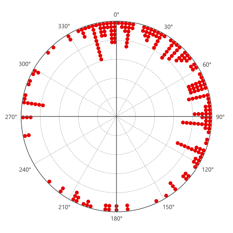
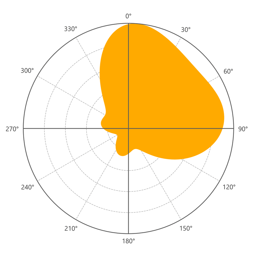
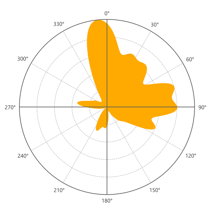
The three figures show the same 219 roost locations. At 20° the smoothed curve is one broad lobe from about north-northwest round to about east-southeast, with little to the south and west: the overall shape, and nothing more. At 7° the same locations break into separate peaks, the tallest just west of north, a shoulder to the northeast, a broad peak to the east and a smaller lobe to the east-southeast, along with narrow spikes to the west and the south-southwest. The dot plot shows where each of those comes from. The peaks to the north and east rest on many columns of dots; the spikes to the west and south-southwest rest on a few short columns, yet at 7° they look nearly as solid as the rest. A small smoothing follows the data closely and shows real structure along with the noise of a few locations; a large one hides the detail but shows only what is well supported. Of course, neither value is more “correct” than the other. They just tell different stories about the distribution of data. Drawing the curve at two or three settings, and checking any peak worth reporting against the dot plot or a rose, is how to tell structure from noise.
Reading a wind rose
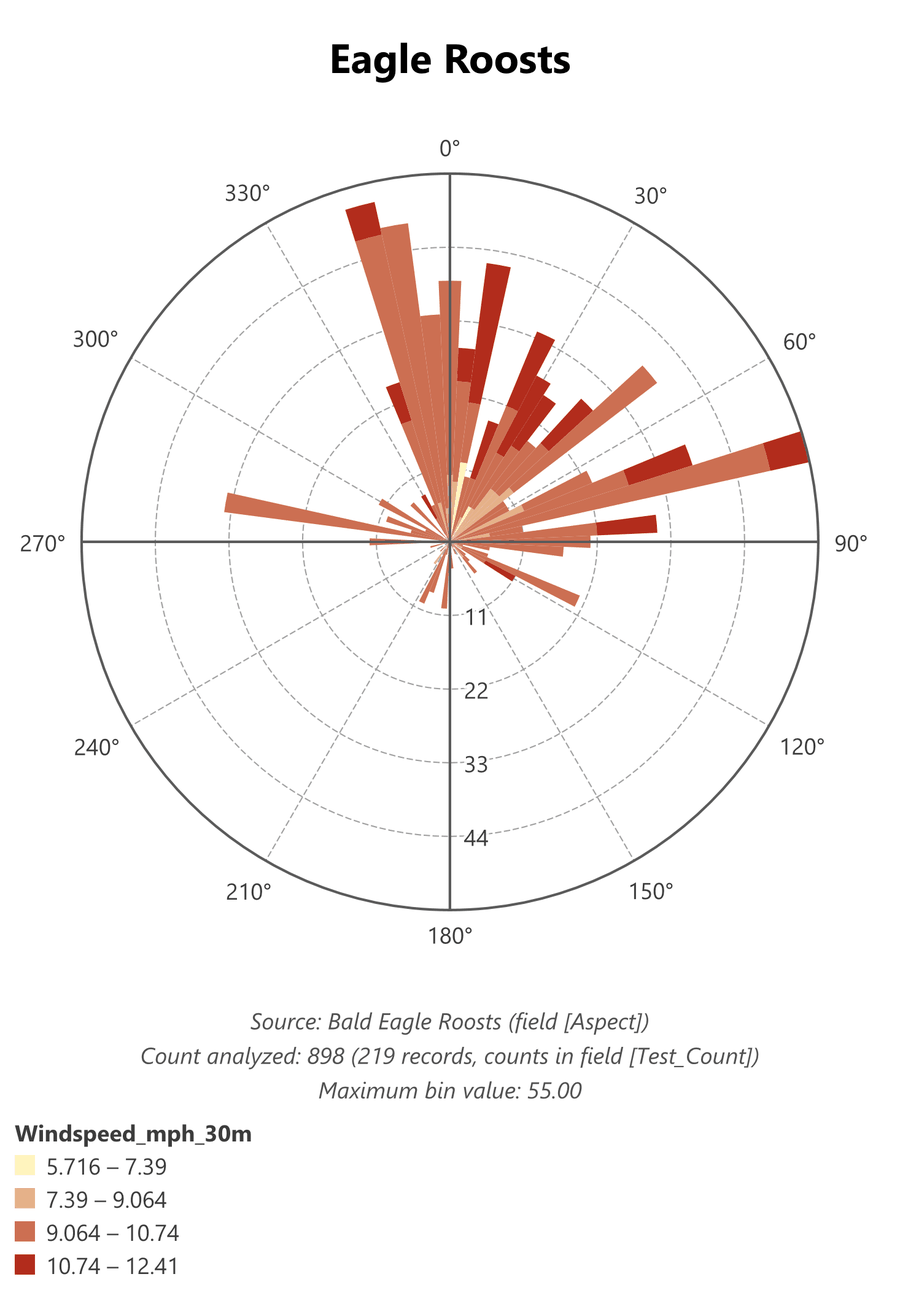
A Wind Rose adds a second measurement to each direction. Every petal is a rose wedge, as long as the number of locations (or the total weight) in its bin, and it is divided into stacked bands by a second numeric field, the Band by field: the smallest class innermost (i.e. the slowest wind speed in this example), the largest (fastest) at the tip. Each band is as long as the number of locations (or their total weight) in that bin that fall in that class, so the ring labels read in locations or weight, not in the units of the band field; in the example the records are weighted by a count field, so they read in observations. The classes divide the range of the field, from its smallest to its largest value among the locations plotted, into equal intervals, and the legend below the plot gives their limits.
In the classic meteorological wind rose, the direction is the direction the wind blows from and the bands are its speed. The tool does not require that pairing: any direction and any number will do. In this example the direction is the aspect of each eagle roost, and the band field is the wind speed, in miles per hour, at 30 m above the ground at that roost. The figure therefore answers a different question from a weather station's rose: do roosts on slopes facing one way sit where the wind is faster or slower than roosts facing another?
Read it one petal at a time. The length of a petal says how many observations come from roosts facing that way; the colors within it say how windy those roosts are. Here nearly every petal is mostly the third class, 9.06 to 10.74 mph, so most roosts, whichever way they face, share much the same wind. The dark tips of the fastest class, 10.74 to 12.41 mph, fall mostly on petals from north round to east, and the two slowest classes appear only as short bands on a few petals. Compare the proportions of the colors within petals, not the lengths of the bands: a long petal carries more of every color simply because it holds more observations. And because the classes are equal slices of the range, a few values far from the rest can leave the outer classes nearly empty; here the two slowest classes together hold only a small share of the observations.
Overlays and scaling
The mean direction arrow runs from the center along the mean direction, and its length is the mean resultant length times the plot radius, so a long arrow means the directions are concentrated and a short one means they are dispersed (Mardia and Jupp 2000; Zar 1999). On the External types the arrow starts at the inner circle, and its length is the mean resultant length times the distance from the inner circle to the outer one. The 95% confidence arc sits just outside the circle and spans the 95% confidence interval of the mean direction, from the von Mises standard error (Fisher 1993, equations 4.42 and 4.43). It is drawn only with the arrow, and it is left off when the interval is undefined; the directions are then too dispersed for a mean direction to mean much.
Equal-area (square-root) scaling draws each petal with a radius proportional to the square root of its bin value, so that the petal's area, rather than its length, is proportional to the frequency. On an ordinary rose the area of a petal grows as the square of its length, which makes the common directions look more dominant than they are (Sanderson and Peacock 2020). The option applies to the Peaks and Valleys, Rose, External, Wind Rose and Smoothed Density plots, and the ring value labels account for the scaling, so they still read true. The Smoothed Density and Dot Plot types draw their rings without value labels, because their radii are not bin values. Neither does Shade by Density, whose wedges all reach the circle: its value labels are a color legend below the plot instead, a bar shaded from the lowest bin value to the highest, controlled by the same Show inner ring-value labels box.
Where the directions come from
The Dataset list holds every feature layer, standalone table and raster layer in the active map; rasters are marked [raster]. The list is filled when the window opens, from the map in the active map view, so open the window from a map view, not a layout. The list keeps itself current while the window is open: a layer or table added to or removed from the map appears in or leaves the list, with the current dataset kept, and a layer renamed in the Contents pane is renamed in the list and in the secondary title as soon as the name changes. Clicking the ribbon button again also brings the list up to date. With Use selected records only checked, changing the selection on the map reads the data again, so the plot follows the selection.
A feature layer or table supplies its directions in one of two ways. From attribute field reads compass azimuths, 0° at north and increasing clockwise, from a numeric field. Derive from polyline direction uses the bearing from each polyline's first vertex to its last; on latitude/longitude data this is the geodesic (great-circle) starting azimuth, and on projected data it is the bearing on the map, measured from grid north, which differs from true north by the convergence angle of the projection. Polylines whose first and last vertices coincide have no direction and are skipped. Each record can be weighted: not at all, by polyline length, or by any numeric attribute; records with a missing, zero or negative weight are skipped. A weight can mean two different things, and the Weights are counts of observations box says which. Checked, each weight is the number of identical observations the record stands for, as in the attribute table of a raster, which has one row for each value and a Count of the cells that hold it. The sample size is then the total count, and every statistic, including the median, the range and the Rayleigh test, is computed on the full distribution, and the status line under the preview reports the observations plotted and the records they came from. The box is checked for you when the weight field's name contains Count. Unchecked, the weights are weights of importance, such as length or area, and the sample size is the number of records. Use selected records only restricts the analysis to the current selection, and uses every record when nothing is selected. A definition query on the layer or table is always honored, so “every record” means every record the layer shows.
Add reverse azimuths adds the opposite of every direction, for things that run both ways, such as geologic fracture lines, where a line at 30° is the same line as one at 210°; the plot then becomes symmetric. It also cancels every direction against its opposite, so the resultant length is zero by definition, and the mean direction, the mean resultant length, the measures of dispersion, the concentration, the confidence interval and the Rayleigh test describe the added reverses rather than the data. The option is for the picture only. For the statistics of lines that run both ways, check Axial data (lines run both ways) instead. It draws the same symmetric plot, and computes the statistics the standard way, which Batschelet (1981, section 1.6) describes: every angle is doubled before they are computed. Doubling turns the two ends of a line into the same direction, since 30° becomes 60° and 210° becomes 420°, which is 60° again, so the doubled angles form one cluster with a real mean direction and mean resultant length instead of two opposite clusters that cancel. Halving the mean of the doubled angles then gives the mean axis of the lines, which, like the lines, also runs the opposite way. The report labels it Mean Axis and gives both ends, and it treats the median axis, the circular range, the confidence interval and the angular deviation the same way, halved back to the scale of the lines (the angular deviation of the axes is Batschelet's equation 2.3.5). The mean resultant length, the variances, the circular standard deviation, κ and the Rayleigh test describe the doubled angles, as they do in Batschelet's treatment, and the report says so. The mean arrow is drawn at both ends of the axis, with the confidence arc at each.
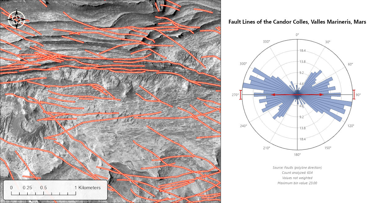
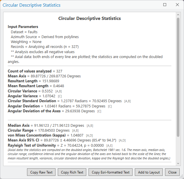
The faults come from a 1:18,000-scale geologic and structural map of the western Candor Colles, a group of low conical hills on the southeast flank of Ceti Mensa in west Candor Chasma, part of the Valles Marineris canyon system of Mars (Okubo 2014). The map was drawn from a stereo pair of HiRISE images at 1 m per pixel, and its Faults feature class holds the mapped faults and fractures as polylines, in a Mars transverse Mercator projection. A fault has no direction of its own, so the bearing from its first vertex to its last is an axis, and the plot treats it as one. The 327 faults cluster tightly about an east–west axis: the mean resultant length of the doubled angles is 0.46, the Rayleigh test leaves no doubt that the axes are not spread evenly (Z = 70.6), and the 95% interval on the mean axis is under 5° either side.
Exclude negative values, on by default, skips negative azimuths, and a narrower option skips only the value −1, the flat-cell code of an aspect raster, and reads other negative values as angles measured counterclockwise from north.
An aspect raster must hold compass degrees, with −1 for flat cells, as Esri's Aspect tool writes them. Leave Exclude negative values on for an aspect raster: with it off, each −1 flat cell is read as 359°. NoData cells are skipped and not counted. A raster is always analyzed over its entire extent. To plot the aspect of a study area or a management unit, clip the aspect raster to that area first, for example with Clip Data to Analysis Area, and add the clipped raster to the map. As the raster is read, the cell values are counted into 0.1° classes, each represented by the mean of the values in it, so the plot and the statistics are exact for the cells read when a class holds a single value, as with a raster of whole degrees or one read from its attribute table, and within 0.05° otherwise; the read never holds the whole raster in memory. A raster with a value attribute table is read from the table's values and counts instead, which is much faster; this shortcut is taken with Auto and Every cell sampling. Cell sampling controls how much of a large raster is read: Auto reads every cell up to about 100 million, then reads every 2nd, 4th, 8th or coarser cell in each direction as needed to stay under that number, and the sampling used is reported in the status line below the preview. You can also choose every cell, or every 2nd, 4th, 8th or 16th cell, explicitly. Pyramid levels are never used, because they are built by averaging, and an average of aspect values is not a direction: the average of 359° and 1° is 180°. A raster that has already been read is remembered while the window stays open.
A D-infinity flow-direction raster is not a compass raster. It measures angles counterclockwise from east (see About Aspect), and Polar Plots reads every raster as compass degrees, so a D-infinity raster needs converting to compass degrees first. Jenness (2012, p. 10) gives the rule: if the mathematical direction is greater than 90°, the compass aspect is 450° minus the direction; otherwise it is 90° minus the direction. Convert only the cells whose value is 0 or more: run through the rule, a flat cell's −1 becomes 91°. The same rule converts the output of a two-argument arctangent, which runs from −180° to 180°.
A tour of the window
The two figures show the same Dot Plot of 219 roost locations, with different groups of settings open on the left.
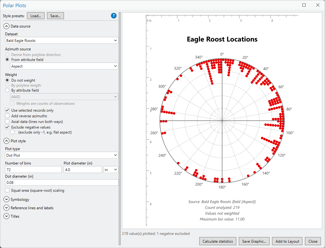
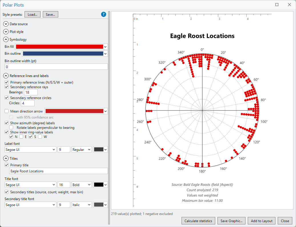
The settings sit on the left in collapsible groups, Data source, Plot style, Symbology, Reference lines and labels and Titles, with the Style presets buttons and the blue ? button that opens this page above them, and the preview fills the right side, with rulers in inches or centimeters; the rulers are for the preview only and are not exported. Only the settings that apply to the chosen plot type are shown, so, for example, the low and high density colors appear only for Shade by Density. A progress bar and a status line below the preview report the raster read, the count of values analyzed, any excluded values and any sampling. The buttons along the bottom open the statistics report, save the plot as a PNG or SVG file, and add it to a layout.
The statistics report
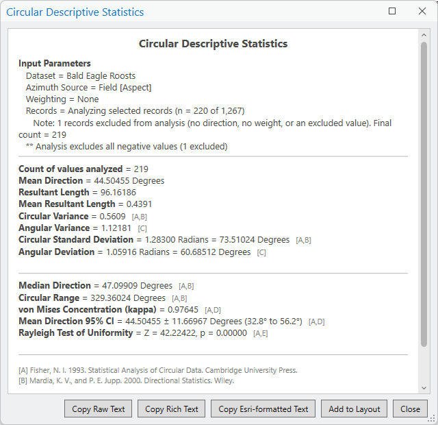
Calculate statistics opens a separate, resizable report, Circular Descriptive Statistics, listing the input parameters and then the count of values analyzed (and the total weight, when the records are weighted), the mean direction, the resultant length and mean resultant length, the circular variance, angular variance, circular standard deviation and angular deviation (the deviations in both radians and degrees), the median direction, the circular range, the von Mises concentration κ (Best and Fisher 1981; Fisher 1993), the 95% confidence interval of the mean direction (Fisher 1993), and the Rayleigh test of uniformity (Zar 1999). The dispersion, concentration and test lines carry bracketed tags pointing to their sources in the reference list at the bottom of the report: Fisher (1993), Mardia and Jupp (2000), Batschelet (1981), Best and Fisher (1981) and Zar (1999). What each one means is explained on the About Aspect page.
When the records are weighted and the weights are not counts, the median, the range and the Rayleigh test are computed on the unweighted directions, and the report says so. The concentration and the confidence interval then take n as the effective sample size of the weighted records, (Σw)² / Σw² (Kish 1992, p. 191, eq. 4.3), which equals the number of records when the weights are all equal and is smaller when a few records carry most of the weight. When the weights are counts, every statistic is computed on the full distribution, and the count of values is the total count. For a raster, the statistics are computed on the counts in each 0.1° class, and the count of values is the number of cells.
The input parameters at the top of the report state what was analyzed: the dataset, the source of the directions, the weighting, whether all the records or only the selected ones were used and how many, how many records were left out, and whether negative values or only values of −1 were excluded.
The report adds a line of its own in three cases. With 15 or fewer directions, κ carries the small-sample correction of Best and Fisher (1981), as it did in the ArcMap tool, and the report says so. When the concentration and the sample size fall outside the range Fisher (1993, Table 4.3) recommends for the confidence interval, the interval is still reported, with a caution that Fisher advises a bootstrap interval there. That range is a table of the smallest sample size the interval needs at each level of concentration, from any sample size when κ is 2 or more to at least 25 directions when κ is between 0.4 and 1, with no interval recommended below 0.4; the About Aspect page spells it out. And when Add reverse azimuths is on, the input parameters at the top of the report carry a note that the statistics describe the added reverses rather than the data.
For the roosts in the figure, the mean direction is 44.5°, toward the northeast, and the median, 47.1°, agrees. The mean resultant length of 0.44 says the aspects are clustered only moderately: the dot plot has dots on almost every side of the circle, and the circular range covers 329° of it. Even so, the Rayleigh test finds a clear preferred direction (Z = 42.2, p < 0.00001), and the 95% confidence interval places the mean between 32.8° and 56.2°. With 219 locations and κ of about 1, the sample is well inside the range where Fisher (1993, Table 4.3) recommends this interval.
The Rayleigh test and the confidence interval assume that every direction is an independent observation. Neighboring cells of an aspect raster are not: they face nearly the same way, so with thousands of cells almost any set of aspects tests significant, and the interval is far narrower than the real uncertainty. On a raster, read both as lower bounds. Directions from features spread far apart, such as survey plots, can be independent, and then the test and the interval mean what they say. Repeated locations of the same animals sit in between: if a bird returns night after night to the same roost, each night adds the same aspect again, and those repeats are not independent of one another. The Aspect Zonal Statistics as Table page discusses this in more detail.
Nothing reaches the clipboard until one of the buttons along the bottom is clicked, and each click shows a brief confirmation above its button.
| Button | What it produces | Where it goes |
|---|---|---|
| Copy Raw Text | The report as plain text: one statistic on each line, with its bracketed source tags and the reference list, and no formatting. | Email, a text file, a spreadsheet cell, a script, or anywhere formatting is unwanted. |
| Copy Rich Text | The report exactly as the window shows it, in Rich Text Format: the bold statistic names, the gray source tags and the lines between sections. A program that cannot take Rich Text receives the plain text instead. | Word, PowerPoint, Outlook and other programs that paste formatted text. |
| Copy Esri-formatted Text | The report as text carrying ArcGIS text formatting tags (<BOL> for bold, <CLR> for color, <FNT> for size, <ITA> for italics), which ArcGIS Pro turns into the formatting when it draws the text. | The text of a text element on a layout: insert a text element, open its text, and paste. |
| Add to Layout | The same tagged text, placed directly as a new text element at the center of a layout page, with the layout chosen the same way as for the plot. | A layout, in one click. |
Saving and placing the plot
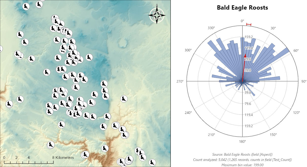
Save Graphic writes the plot, exactly as previewed, to a PNG image at 300 dots per inch on a white background, or to a scalable SVG vector file; the format is chosen in the Save as type list of the save dialog. The PNG opens at the plot's true size in Word or PowerPoint, and the SVG can be scaled to any size without losing sharpness. Add to Layout places it on a layout as a grouped graphic, centered on the page and sized exactly as previewed. If a layout is the active view, that layout is used; otherwise the plot goes to the project's only layout, or you choose one from a list when the project has several. A project with no layout gets a message asking you to create one first, with New Layout on the Insert tab. The plot and a statistics text element both land at the center of the page, so drag one of them aside. A plot drawn on a layout keeps its fonts and line widths at their true sizes, which a graphic in a map would not. Every piece remains an ordinary graphic element, with the text elements named for their text, so the group can be ungrouped and any part restyled or moved by hand.
A style, meaning every setting that affects appearance except
the title text, and none that affects the data, can be saved as a
named preset and loaded again later with the Style presets
buttons at the top of the window. Presets are JSON files kept in
your user profile, under
JennessEnterprises\WildlifeTools\polar_plot_styles in
the local application data folder.
Controls
| Control | Effect |
|---|---|
| Style presets: Load / Save | Loads or saves the appearance settings as a named JSON preset. |
| Dataset | The feature layer, table or aspect raster holding the directions. |
| Cell sampling (rasters) | Auto (recommended), Every cell, or every 2nd, 4th, 8th or 16th cell. |
| Azimuth source (tables and features) | Derive from polyline direction, or From attribute field (the default) with a field to choose. |
| Weight | Do not weight (the default), By polyline length, or By attribute field with a field to choose. Weights are counts of observations treats each weight as a number of identical observations; checked automatically for a field whose name contains Count. |
| Use selected records only | Analyzes the current selection; all records when nothing is selected. A definition query is always honored. |
| Add reverse azimuths | Adds the opposite of every direction to the plot; off by default. For the picture only. |
| Axial data (lines run both ways) | Off by default. Plots both ends of every line and computes the statistics on the doubled angles, reporting the mean axis and its companions; Add reverse azimuths is implied and grayed out. |
| Exclude negative values | On by default; a second box limits the exclusion to −1, the flat-cell code. |
| Plot type | One of the nine types; Circular Bins (Rose) by default. Six are listed for rasters. |
| Number of bins | 72 by default (5° bins); 180 gives 2° bins. |
| Plot diameter | The diameter of the data circle, 4.0 inches by default, in inches or centimeters; switching units converts the values. For the External types this is the outer diameter. |
| Inside circle diameter | External types only: the inner circle the bins ride outward from, 1.5 inches by default. |
| Band by field, Bands | Wind Rose only: the magnitude field and the number of equal-interval classes (1 to 9, 4 by default). |
| Smoothing (degrees) | Smoothed Density only: how wide a bump each direction is spread into, in degrees, close to the bump's standard deviation; 20 by default, 1 to 90. |
| Dot diameter | Dot Plot only: 0.08 inches by default. |
| Equal-area (square-root) scaling | Off by default. |
| Symbology | Bin fill and outline colors and outline width; low and high density colors (Shade by Density); lowest and highest band colors (Wind Rose); bearing line color and width (Bearings). |
| Primary reference lines | Rays at north, east, south and west and the outer circle at the maximum bin value; on by default. |
| Secondary reference rays and circles | On by default: 12 rays (every 30°) and 4 value rings. The degree labels go at the ray bearings, which always start at 0°, so a count such as 13 labels 0°, 28°, 55° and so on, and leaves east, south and west unlabeled; with the rays off, only north, east, south and west are labeled. |
| Mean direction arrow, with 95% confidence arc | Off by default. The arc is drawn only with the arrow, and its box is available only while the arrow is on. |
| Azimuth and ring-value labels | On by default; the degree labels can be rotated to follow the circle, the ring values can be labeled along any of the N, E, S and W axes (not on Smoothed Density or Dot Plot; on Shade by Density the same box shows a color legend below the plot), and the label font, size, style and color can be set. Each degree label is placed from its measured size, the same small gap from the circle at any plot diameter and font size. |
| Primary title | Off by default; the text and its font, size, style and color. |
| Secondary titles | Off by default; automatic lines giving the source, the count analyzed, the weighting and the maximum bin value, and their font. |
| Calculate statistics | Opens the statistics report. |
| Save Graphic | Saves the plot as a PNG image (300 dpi) or an SVG vector file. |
| Add to Layout | Places the plot on a layout: the active layout if a layout is showing, the only layout if the project has one, or, from a map, the layout you pick when asked. |
Polar Plots is an interactive window and has no geoprocessing or Python interface. For circular statistics of aspect in a script or a model, use Aspect Zonal Statistics as Table, which computes the same statistics by zone.
Recommended citation
Credits and references
By Jeff Jenness, Jenness Enterprises (www.jennessent.com). The tool follows the Jenness Enterprises Polar Plots extension for ArcMap.
- Batschelet, E. 1981. Circular Statistics in Biology. Academic Press, London. ISBN 0-12-081050-6.
- Best, D. J., and N. I. Fisher. 1981. The bias of the maximum likelihood estimators of the von Mises-Fisher concentration parameters. Communications in Statistics – Simulation and Computation 10:493–502. doi.org/10.1080/03610918108812225
- Fisher, N. I. 1993. Statistical Analysis of Circular Data. Cambridge University Press, Cambridge. doi.org/10.1017/CBO9780511564345
- Jenness, J. 2012. Issues with directional data. Remotely Wild, newsletter of the Spatial Ecology and Telemetry Working Group of The Wildlife Society. PDF
- Jenness, J. 2014. Polar plots for ArcGIS. Jenness Enterprises. jennessent.com/arcgis/polar_plots.htm
- Kish, L. 1992. Weighting for unequal Pi. Journal of Official Statistics 8:183–200. scb.se. Accessed on 29 September 2026.
- Mardia, K. V., and P. E. Jupp. 2000. Directional Statistics. Wiley, Chichester. doi.org/10.1002/9780470316979
- Okubo, C. 2014. Bedrock geologic and structural map through the western Candor Colles region of Mars. U.S. Geological Survey Scientific Investigations Map 3309, scale 1:18,000. doi.org/10.3133/sim3309
- Sanderson, D. J., and D. C. P. Peacock. 2020. Making rose diagrams fit-for-purpose. Earth-Science Reviews 201:103055. doi.org/10.1016/j.earscirev.2019.103055
- Zar, J. H. 1999. Biostatistical Analysis, 4th edition. Prentice Hall, Upper Saddle River, New Jersey. (Chapter 27, circular statistics; equation 27.4, the Rayleigh test p value.)
Licensing information
Works at every ArcGIS Pro license level (Basic, Standard, Advanced). No extension licenses are required; aspect rasters are read and the statistics computed inside the window, without Spatial Analyst.
Related tools and pages
- About Aspect — why directions need circular statistics, and what each number in the report means.
- Aspect Zonal Statistics as Table — the same circular statistics, per zone, as a table.
- Aspect Focal Statistics — circular statistics in a moving window.
- Extract Aspect Values to Points — aspect at point locations, a field this window can plot.
- Aspect Transformation — aspect as linear variables, such as northness and eastness, for ordinary statistics.
- Split Lines into Topography Segments — per-segment line attributes, including a Bearing field this window can plot.
- Slope Graphic — the companion graphic for slope.
- Vector Ruggedness Measure — the mean resultant length moved from a circle onto a sphere, as a measure of terrain roughness.