

Slope Graphic
Summary
Draws a picture of the slope in an area. The Slope Graphic is a quarter circle with the horizontal along the bottom and the vertical up the left side, and on it a line inclined at the mean slope, a wedge spanning one standard deviation either side of the mean, a wider wedge spanning the full range from the gentlest to the steepest value, an optional percentile wedge, a dashed median line, a protractor scale, an arc marking the 95% confidence interval of the mean, small value labels on the elements, and a legend at the upper right naming each element drawn. The slope values come from a numeric field on a feature layer or table, or from an entire slope raster of any size, in degrees, percent slope, rise:run ratio or gradians. Everything updates live in a preview, and the finished graphic can be saved as a PNG image or an SVG file, or placed on a layout as a group of ordinary, editable graphic elements. A statistics report with the same numbers is one click away.
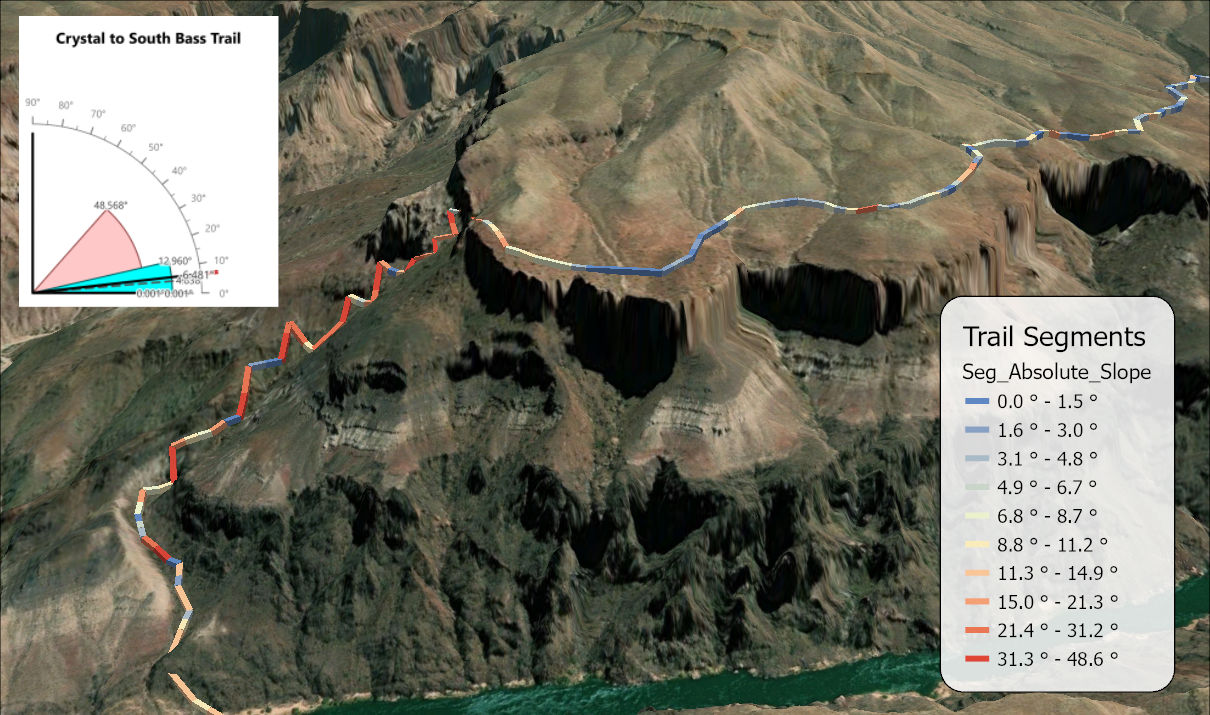
A table of slope statistics might tell you, for example, that the mean slope of an area is 24° with a standard deviation of 9°. The graphic shows you: the mean line leans at 24°, and the wedge around it is wide or narrow as the ground is varied or uniform, so the steepness of a place and its variability can be read at a glance and compared between areas without reading a single number.
Where it comes from
The Slope Graphic is a modernized recreation of the graphic of the same name in the Jenness Enterprises Grid Tools extension for ArcView 3.x (Jenness 2006), which drew the mean slope line, the standard deviation wedge and the range wedge from a slope grid in degrees, over the whole grid or only inside selected polygons or graphics, and reported slope statistics beside the graphic. The ArcGIS Pro version keeps those three elements and their layered geometry, and adds the percentile wedge, the median line, the protractor, the value labels and the confidence arc, along with fields of feature layers and tables as sources, weights, units other than degrees with the statistics always computed on the slope angles, a live preview, PNG and SVG output and style presets. It reads a raster over its whole extent, so an area of interest is clipped first, as described below.
The elements of the graphic
Every element is drawn from the origin at the lower left, and each one reaches a little farther out than the one behind it, which is what keeps the layers readable where they overlap. The distances in the table are fractions of R, the length of the mean line, which is the graphic size you set.
| Element | What it spans | Drawn out to |
|---|---|---|
| Range wedge | The minimum to the maximum slope value. | 0.70 R |
| Percentile wedge | The lower to the upper percentile you choose, 5th to 95th by default. Off by default. | 0.79 R |
| Standard-deviation wedge | The mean minus one standard deviation to the mean plus one, held between 0° and 90°. | 0.875 R |
| Median line (dashed) | The median slope. | 0.95 R |
| Mean line | The mean slope. | R |
| Protractor | A quarter-circle arc with ticks every 5°, larger ticks and degree labels every 10°. | 1.06 R (labels at 1.20 R) |
| 95% confidence arc | The 95% confidence interval of the mean, as an arc with end ticks. | 1.13 R |
| Legend | One row for each element drawn, with a sample of its line or fill: the mean and median lines, the confidence arc, and the standard-deviation, percentile and range wedges, in front-to-back order. | Upper right, beside the protractor |
The range wedge is honest about the extremes but is set by two single values, so one outlying cell or one mistyped record can stretch it across most of the quarter circle. The percentile wedge is the robust alternative: the 5th to 95th percentiles ignore the most extreme tenth of the values, so it shows where the bulk of the slopes lie. The median line is worth keeping on because slope distributions are often skewed, with a few very steep places pulling the mean up, and a median line that sits visibly below the mean line says so; its value label is drawn only when the median and mean differ by more than 1.5°, so the two labels do not collide. The confidence arc shows how precisely the mean is known, assuming that every value is an independent observation. That holds reasonably well for a field of values from features spread far apart, such as survey plots, and then the arc means what it says. Features crowded close together, such as consecutive segments of one trail, share the autocorrelation of the ground they cross, and the same caution applies to them as to cells. It does not hold for raster cells: neighboring cells have nearly the same slope, partly because hillsides are continuous and partly because each cell's slope is computed from elevations its neighbors share. With millions of correlated cells the arc shrinks to a sliver that is far narrower than the real uncertainty; read it as a lower bound. When the cells are all the cells of an area, the mean slope of that area is simply known, and the arc has nothing to estimate. See the Slope Zonal Statistics as Table page for how quickly slope correlation fades with distance.
The protractor labels are always in degrees, so the graphic always reports its own scale in the unit people read slope angles in. The value labels on the elements are in the unit of the data, so a percent-slope source is labeled in percent.
Statistics on the slope angles
The mean, the standard deviation and the confidence interval are always computed on the slope angles. Percent slope and the rise:run ratio are tangents of the angle, and the tangent grows faster and faster as the angle steepens, so averaging raw percent values weights the steep places too heavily and reports a mean that is too steep. The tool converts each value to an angle first (the arctangent for percent and ratio, a simple rescaling for gradians), computes the statistics on the angles, and converts the mean back to the source unit for display: the reported mean of a percent raster is the tangent of the mean angle, not the mean of the percents. The median, the percentiles, the minimum and the maximum are order statistics, which pick out particular values rather than averaging them, so they are the same either way. The standard deviation and the half-width of the confidence interval are reported in degrees whatever the unit, because a spread of angles has no single equivalent in percent. The Slope Zonal Statistics as Table page works through the reasoning with numbers.
The angle-space statistics are also why the wedges of a percent-slope graphic are lopsided when you read their labels. The table shows a mean of 30° with a standard deviation of 10°:
| Angle | Percent slope | |
|---|---|---|
| Mean minus one SD | 20° | 36.4% |
| Mean | 30° | 57.7% |
| Mean plus one SD | 40° | 83.9% |
The wedge is symmetric on the graphic, 10° either side of the mean line, because the graphic is drawn in angles. Its labels are not: the lower edge is 21.3 percentage points below the mean and the upper edge 26.2 above it. That asymmetry is correct, and it is the same convexity of the tangent that makes averaging percents a mistake.
Where the slope values come from
The Dataset list holds every feature layer, standalone table and raster layer in the active map; rasters are marked [raster]. The list is filled when the window opens, from the map in the active map view, so open the window from a map view, not a layout. The list keeps itself current while the window is open: a layer or table added to or removed from the map appears in or leaves the list, with the current dataset kept, and a layer renamed in the Contents pane is renamed in the list and in the secondary title as soon as the name changes. Clicking the ribbon button again also brings the list up to date. With Use selected records only checked, changing the selection on the map reads the data again, so the graphic follows the selection.
A feature layer or table supplies its slopes from a numeric field you choose, one value per record, for example the Absolute Slope field written by the Split Lines into Topography Segments tool or the Average Slope field written by Topography along Lines. Each record can be weighted: not at all (every record counts once, the default), by polyline length (long lines count more than short ones; on latitude/longitude data the geodesic length is used; offered only for polyline layers), or by any numeric attribute, such as an area. With weights, every statistic is a weighted one, including the median and the percentiles. A weight can mean two different things, and the Weights are counts of observations box says which. Checked, each weight is the number of identical observations the record stands for, as in the attribute table of a raster, which has one row for each value and a Count of the cells that hold it; the sample size is then the total count. The box is checked for you when the weight field's name contains Count. Unchecked, the weights are weights of importance, such as length or area, and the confidence interval takes n as the effective sample size of the weighted records, (Σw)² / Σw² (Kish 1992, p. 191, eq. 4.3). With equal weights that is simply the number of records; with unequal weights it is smaller, since the heavily weighted records carry most of the information. Ten lines of which one is ten times as long as each of the others, for example, have an effective sample size of 3.3. A Use selected records only box restricts the analysis to the current selection, and uses every record when nothing is selected. A definition query on the layer or table is always honored, so “every record” means every record the layer shows.
A raster is always analyzed over its entire extent. To summarize the slope of a study area or a management unit, clip the slope raster to that area first and add the clipped raster to the map. Cell values stream into exact running sums of the angles and into a histogram with 0.01° classes as the raster is read, so the mean, standard deviation, minimum and maximum are exact for the cells read. The median and percentiles come from the classes, each represented by the mean of the values in it: exact when a class holds a single value, as with a raster of whole degrees or one read from its attribute table, and within 0.005° otherwise. NoData cells are skipped and not counted. The read never holds the whole raster in memory, so any size of raster can be summarized.
How to speed up analysis of very large slope rasters. A
raster with a value attribute table is read from the table's values
and counts instead of cell by cell, which is much faster; this
shortcut is taken with Auto and Every cell sampling.
A floating-point slope raster has no attribute table, but a copy of
it converted to whole degrees does, and for a very large raster that
copy is worth making: the case study below
reads 404 million cells from a table of at most 88 rows. Round the
values rather than truncate them, for example with
Int("Slope" + 0.5) in the Raster Calculator (Spatial
Analyst), because truncating lowers every value by up to a degree
and the mean by about half a degree. If the integer raster has no
table yet, the Build Raster Attribute Table tool adds one. The cost
is resolution: every value becomes a whole degree, so the statistics
are good to about half a degree, and the median and percentiles come
out as whole degrees. That is ample when the differences of interest
are several degrees, as in the case study, but not when they are
fractions of a degree. The same works for a percent-slope raster
rounded to whole percents. Cell sampling controls how much of a large
raster is read: Auto reads every cell up to about 100
million, then reads every 2nd, 4th, 8th or coarser cell in each
direction as needed to stay under that number, and the sampling used
is reported in the status line below the preview. You can also choose
every cell, or every 2nd, 4th, 8th or 16th cell, explicitly. A
raster that has already been read is remembered while the window
stays open, so switching back to it does not read it again.
Slope values below zero and values beyond vertical, above 90° or 100 gradians, are left out of the statistics and counted, so signed slopes, where downhill is negative, lose their downhill values; a signed field, such as the Relative Slope field of Split Lines into Topography Segments, needs converting to absolute values first if every segment is to be graphed, or use the tool's Absolute Slope field instead.
Units and how they are detected
The Slope values are list names the unit of the data: Degrees (0–90); Percent slope (rise/run × 100), where 45° is 100%; Rise:run ratio, where 0.5 is 26.57°; or Gradians (gons), where 100 gradians is 90°. For a raster source the tool sets the unit on its own when the raster's geoprocessing history says how the slope was made: Esri's Slope and Surface Parameters tools record DEGREE or PERCENT_RISE in the metadata, and the most recent slope process in the history wins. When the history says nothing, the setting stays as it was. Always check it; a percent raster read as degrees, or the reverse, gives a graphic that is simply wrong.
A tour of the window
The two figures show the same graphic, from the case study below, with different groups of settings open on the left.
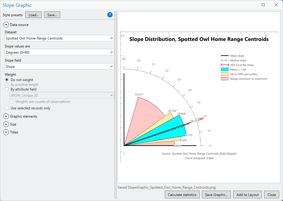
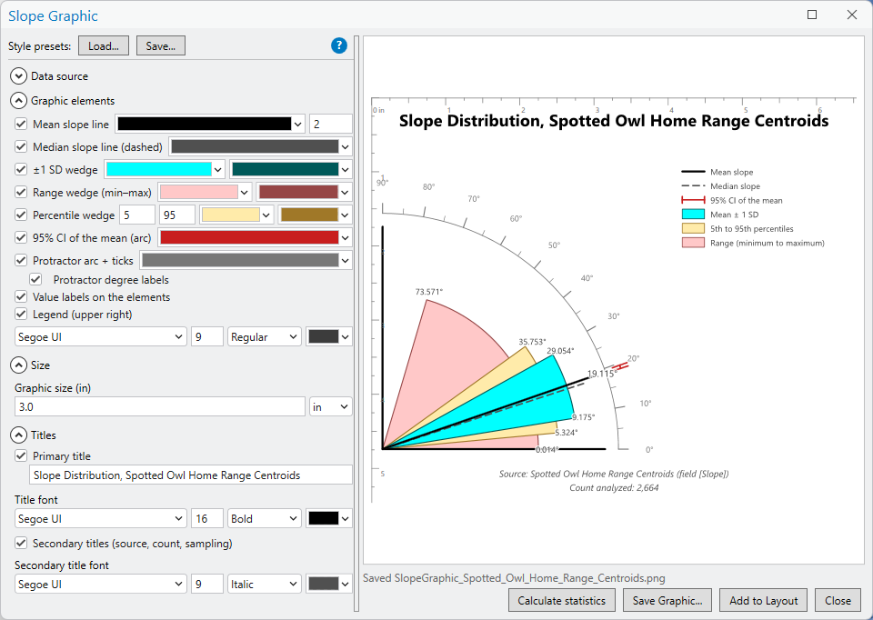
The settings sit on the left in collapsible groups, Data source, Graphic elements, Size and Titles, with the Style presets buttons and the blue ? button that opens this page above them, and the preview fills the right side, with rulers in the size units you choose; the rulers are for the preview only and are not exported. A progress bar and a status line below the preview report the raster read, the count of values analyzed, any excluded values and any sampling. The buttons along the bottom open the statistics report, save the graphic as a PNG or SVG file, and add it to a layout.
The statistics report
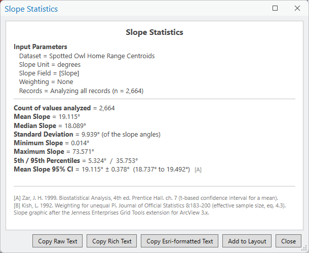
Calculate statistics opens a separate, resizable report listing the input parameters (the dataset, the unit, the field, the weighting, whether all the records or only the selected ones were used and how many, and how many were left out) and then the count of values analyzed (and the total weight and the effective sample size, when records are weighted by something other than a count), the mean, median, standard deviation, minimum, maximum, 5th and 95th percentiles (always these two, whatever percentiles the wedge uses), and the 95% confidence interval of the mean. Values are given in the source unit with the degree equivalent beside them, and the standard deviation and the half-width of the interval in degrees. For a unit other than degrees the report adds a note that the mean, standard deviation and confidence interval were computed on the angles. The confidence interval uses the t value for the sample size (Zar 1999, chapter 7). Four buttons copy the report as plain text, as rich text for Word or PowerPoint, as text carrying ArcGIS formatting tags for a layout text element, or place it directly on a layout as a text element at the center of the page, with the layout chosen the same way as for the graphic.
Saving and placing the graphic
Save Graphic writes the graphic, exactly as previewed, to a PNG image at 300 dots per inch on a white background, or to a scalable SVG vector file; the format is chosen in the Save as type list of the save dialog. Add to Layout places it as a grouped graphic on a layout, centered on the page and sized exactly as previewed. If a layout is the active view it is used; otherwise the tool asks which of the project's layouts to use, and a project with only one layout uses it without asking. A project with no layout gets a message asking you to create one first, with New Layout on the Insert tab. Every piece remains an ordinary graphic element, so the group can be ungrouped and any part restyled or moved by hand.
A style, meaning every setting that affects appearance and none
that affects the data, can be saved as a named preset and loaded
again later with the Style presets buttons at the top of the
window. Presets are JSON files kept in your user profile, under
JennessEnterprises\WildlifeTools\slope_graphic_styles in
the local application data folder.
Case study: spotted owl home ranges
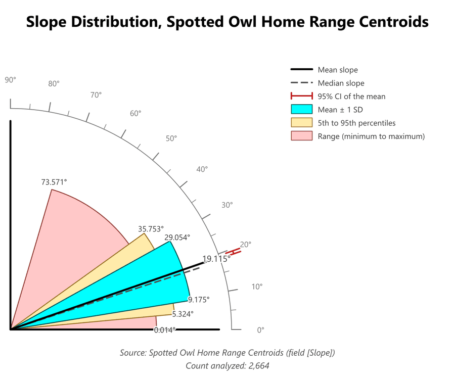
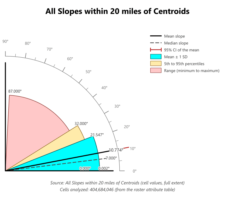
Spotted owls are associated with steep ground. The recovery plan for the Mexican spotted owl describes its nesting and roosting habitat as typically occurring “either in well-structured forests or in steep and narrow rocky canyons,” notes that the forest map units most strongly associated with owl use “generally occurred on steep slopes containing rocky outcrops,” and describes one habitat model that defined nesting and roosting habitat in part as forest “on steep slopes (>12 degrees)” (U.S. Fish and Wildlife Service 2012, pp. 249, 189 and 190). Do the home ranges in this example, in California, Arizona, Utah and New Mexico, sit on steeper ground than the country around them? The first graphic summarizes the slope at the centroids of 2,664 spotted owl home ranges (unpublished data), read from a Slope field on the centroid points. The second summarizes every slope cell within 20 miles of those centroids, 404,684,046 cells in all, from a slope raster in whole degrees.
| Statistic | Home range centroids | All slopes within 20 miles |
|---|---|---|
| Count | 2,664 | 404,684,046 |
| Mean | 19.1° | 10.8° |
| Median | 18.1° | 7.0° |
| Standard deviation | 9.9° | 10.8° |
| 5th / 95th percentiles | 5.3° / 35.8° | 0.0° / 32.0° |
| Minimum / maximum | 0.0° / 73.6° | 0.0° / 87.0° |
| 95% confidence interval of the mean | ±0.38° | ±0.001° |
The two graphics answer the question before any number is read. The mean line of the centroids leans at 19.1°, nearly twice the 10.8° of the landscape around them, and the wedges behind it sit higher as well. The standard-deviation wedge of the centroids runs from 9.2° to 29.1°, where the landscape's runs from 0° to 21.5°, and their percentile wedge runs from 5.3° to 35.8°, where the landscape's runs from 0° to 32.0°. Only the range wedges tell a different story. Both reach nearly flat ground, and the landscape's reaches the steeper extreme, 87.0° against 73.6°, as 404 million cells will: they include every cliff within 20 miles, where 2,664 points are unlikely to land on the steepest of them. The range is set by two single values, which is why the percentile wedge is the better guide to where the bulk of each distribution lies. The medians say the same thing more sharply: half of the ground within 20 miles is gentler than 7°, while only one centroid in twenty is gentler than 5.3°. The landscape graphic also shows the shape of its distribution. Its dashed median line sits well below its mean line, the mark of a skewed distribution in which a great deal of gentle ground is pulled up, on average, by fewer steep places; at the centroids the median and the mean nearly coincide. The 12° threshold of the habitat model above falls between the two medians, 7.0° for the landscape and 18.1° for the centroids.
One caution about the numbers. The landscape raster was made from a floating-point slope raster with Int, which truncates rather than rounds, so each cell is recorded up to a degree below its true slope and the landscape's statistics run roughly half a degree low (the advice under Where the slope values come from is to round instead). That narrows the gap between the two means from about 8° to about 7.5°; it does not change the comparison.
Reading 404 million cells. The landscape raster has a raster attribute table, one row for each slope value from 0° to 87° with the number of cells that hold it, and the tool read that table instead of the cells: at most 88 rows instead of 404 million values, which takes a moment rather than minutes. The secondary title and the report both say so (from the raster attribute table). Because the table gives every value and its exact count, the mean, the standard deviation, the minimum and the maximum are exact for all 404,684,046 cells, not estimates from a sample. A raster without a table, such as a floating-point slope raster, is read cell by cell; Auto sampling reads every cell up to about 100 million and, past that, every 2nd, 4th or coarser cell in each direction, and the status line and the report say which (see Where the slope values come from).
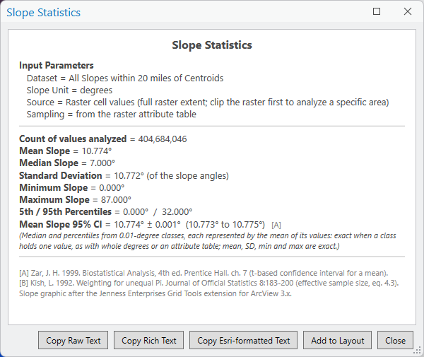
The confidence intervals. The landscape's interval, 10.774° ± 0.001°, should not be read at all, for two reasons. The smaller one is autocorrelation: neighboring cells have nearly the same slope, so 404 million cells carry far less independent information than their number suggests, and any interval computed as if they were independent is far too narrow (see the Slope Zonal Statistics as Table page). The larger one is that there is nothing to estimate. These cells are not a sample of the ground within 20 miles of the centroids; they are the ground within 20 miles of the centroids, every cell of it. The mean slope of that landscape has been measured, not estimated, and apart from errors in the DEM it simply is 10.774°. A confidence interval answers the question of where the mean of a larger population might lie, and here there is no larger population. The owls' interval, ±0.38°, is a different matter: it treats the 2,664 centroids as a sample of spotted owl home ranges in general, which is a question worth asking, but neighboring home ranges share the same terrain, so it too is best read as a lower bound.
Controls
| Control | Effect |
|---|---|
| Style presets: Load / Save | Loads or saves the appearance settings as a named JSON preset. |
| Dataset | The feature layer, table or raster layer holding the slope values. |
| Slope values are | The unit of the data: Degrees (0–90), Percent slope (rise/run × 100), Rise:run ratio or Gradians (gons). Set automatically for rasters whose history records it. |
| Cell sampling (rasters) | Auto (recommended), Every cell, or every 2nd, 4th, 8th or 16th cell. |
| Slope field (tables and features) | The numeric field holding the slopes. |
| Weight | Do not weight (the default), By polyline length (polyline layers only), or By attribute field with a field to choose. Weights are counts of observations treats each weight as a number of identical observations; checked automatically for a field whose name contains Count. |
| Use selected records only | Analyzes the current selection; all records when nothing is selected. A definition query is always honored. |
| Mean slope line | On by default; color and width in points. |
| Median slope line (dashed) | On by default; color. |
| ±1 SD wedge | On by default; fill and outline colors. |
| Range wedge (min–max) | On by default; fill and outline colors. |
| Percentile wedge | Off by default; lower and upper percentiles (5 and 95 by default), fill and outline colors. |
| 95% CI of the mean (arc) | On by default; color. |
| Protractor arc + ticks | On by default; color, and a separate box for the degree labels. |
| Value labels on the elements | On by default; font, size, style and color. |
| Legend (upper right) | On by default; names each element drawn, in the label font. |
| Graphic size | The length of the mean line, 3.0 by default, in inches or centimeters; switching units converts the value. |
| Primary title | Off by default; the text (Slope Distribution) and its font. |
| Secondary titles | Off by default; automatic lines giving the dataset, the count analyzed and any raster sampling, and their font. |
| Calculate statistics | Opens the statistics report. |
| Save Graphic | Saves the graphic as a PNG image (300 dpi) or an SVG vector file. |
| Add to Layout | Places the graphic on a layout: the active layout if a layout is showing, the only layout if the project has one, or, from a map, the layout you pick when asked. |
The Slope Graphic is an interactive window and has no geoprocessing or Python interface. For slope statistics by zone in a script or a model, use Slope Zonal Statistics as Table, which computes the same angle-space statistics. Two small differences: its median and percentiles come from 0.02° classes, so they can differ from the graphic's by about a hundredth of a degree, and by default it treats negative slopes as positive, where the graphic leaves them out.
Recommended citation
Credits and references
By Jeff Jenness, Jenness Enterprises (www.jennessent.com). The graphic follows the Slope Graphic of the Jenness Enterprises Grid Tools extension for ArcView 3.x (Jenness 2006).
- Jenness, J. 2006. Grid Tools (Jenness Enterprises) v. 1.7 (grid_tools_jen.avx) extension for ArcView 3.x. Jenness Enterprises. jennessent.com/arcview/grid_tools.htm
- Kish, L. 1992. Weighting for unequal Pi. Journal of Official Statistics 8:183–200. scb.se. Accessed on 29 September 2026.
- U.S. Fish and Wildlife Service. 2012. Final Recovery Plan for the Mexican Spotted Owl (Strix occidentalis lucida), First Revision. U.S. Fish and Wildlife Service, Albuquerque, New Mexico. 413 pp. ecos.fws.gov
- Zar, J. H. 1999. Biostatistical Analysis, 4th edition. Prentice Hall, Upper Saddle River, New Jersey. Chapter 7 (the t-based confidence interval for a mean).
Licensing information
Works at every ArcGIS Pro license level (Basic, Standard, Advanced). No extension licenses are required; the statistics are computed inside the window, without Spatial Analyst.
Related tools and pages
- Slope Zonal Statistics as Table — the same angle-space slope statistics, per zone, as a table.
- Aspect Zonal Statistics as Table — circular statistics of aspect, per zone.
- Split Lines into Topography Segments — per-segment slope fields, a vector source for this graphic.
- Topography along Lines — slope fields on polylines, a vector source for this graphic.
- Polar Plots — the companion graphic for directions, such as aspect.