

About Hillshades and the Swiss Method
Summary
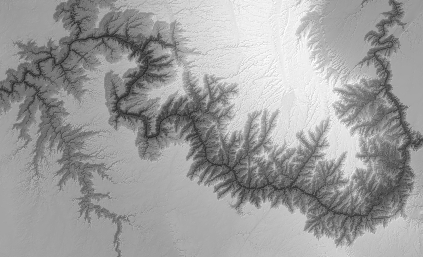
Hillshades show the shape and texture of the land. I personally love looking at them, and can get almost hypnotized looking at the mountains and canyons that hillshades reveal. Then I often get lost in daydreams of hiking in and exploring those landscapes. I even use them in most of my visual presentations, such as the background images on these tool help pages.
A hillshade is basically a picture of a landscape lit by an imaginary sun. It is usually made for aesthetic purposes rather than for actual analysis, although there are exceptions to that rule. And the ArcGIS Pro “Hillshade” tool makes a perfectly good basic hillshade. The tools offered here add a few aesthetic variations that the ArcGIS tool does not, though. These tools make hillshades that are correct on latitude/longitude DEMs without projecting them first, hillshades lit from several directions at once, hillshades with the low country darkened as if seen through haze, hillshades with cast shadows that keep some detail inside them, and hillshades that have been deliberately softened. The last four are the parts of what cartographers call the Swiss method, the style of relief shading perfected by hand in Switzerland and first automated by Kurt Brassel in 1974. This page explains what a hillshade is, where the Swiss method came from, and which of the five tools does which part of it.
What a hillshade is
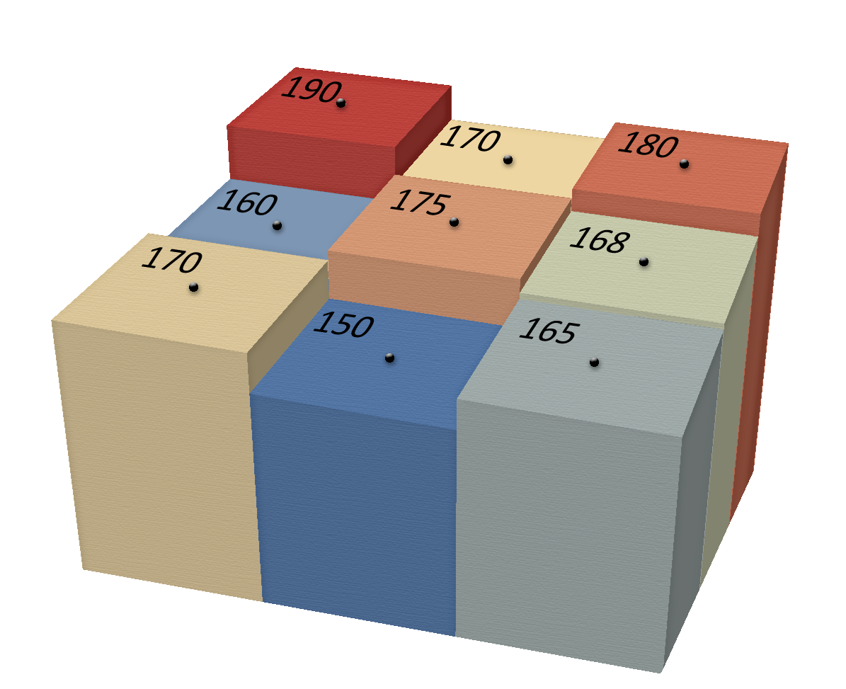
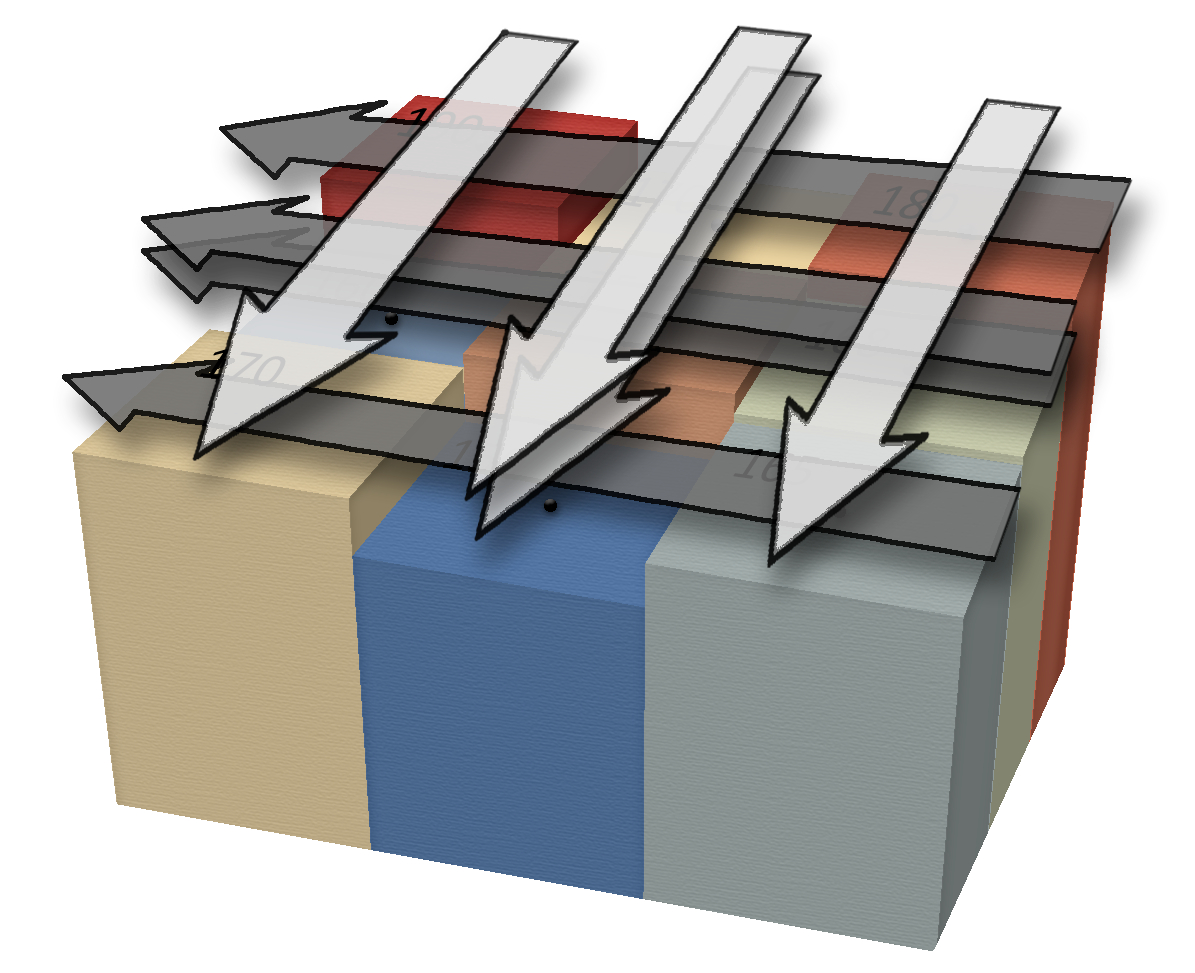
Put a sun somewhere in the sky, at a compass direction (the azimuth) and a height above the horizon (the altitude or inclination). For every cell of the DEM, work out which way the ground faces and how steeply, and ask how squarely that little patch of ground faces the sun. Ground that faces the sun directly is brightest; ground tilted away from it is darker; ground that faces away from it altogether gets no light at all. That is the whole idea. The standard formula, which is the one Horn (1981) gives and the one Esri's Hillshade tool uses, is
where Z is the sun's zenith angle (90° minus its altitude), S is the slope of the cell, and the two A's are the azimuth of the sun and the aspect of the cell. The result runs from 1 for ground that faces the sun squarely down through 0 for ground lit exactly edge-on, and it goes negative for ground facing away; the negative values are just set to 0. Esri's tool multiplies that number by 255, to give the familiar hillshade that runs from 0 to 255. The tools here divide the 0-to-1 range into as many equal gray levels as you ask for, numbered from 0, so the default of 256 levels gives the same 0 to 255. Every hillshade tool in this group uses this formula. What they change is where the suns are, how many there are, and what is done to the result afterward.
The slope and aspect of each cell come from the elevations of its eight neighbors, using the weighted-difference equations that Horn (1981) described and that Esri's Slope and Aspect tools also use. The neighbors on the east side, weighted 1-2-1, are compared with the neighbors on the west side to get the east-west gradient, and the north and south rows are compared the same way. A cell on the edge of the raster, or beside a NoData hole, has no complete ring of neighbors and gets NoData in the output.
Why the sun is always in the northwest
Every hillshade tool defaults to a sun at 315° (northwest) and 45° above the horizon, and the reason why is interesting because this isn't a place the sun normally sits, and especially not that high in the sky (at least in the Northern hemisphere). In the northern hemisphere the sun mostly shines from the south, with short exceptions in the early morning and late evening. A hillshade lit from the south, though, where the sun actually sits, is a well-known optical illusion: most people (though not everyone) see the relief inverted, with canyons rising as ridges and mountains sinking into pits. Light the same ground from the northwest and the illusion goes away. Therefore we often use a fake sun location, situated in the north, to both make the map look more “realistic” and also to avoid confusing our audience. You are free to put the sun anywhere; the tools here accept any azimuth and any altitude. Just look at the result and make sure it reads the way you expect.
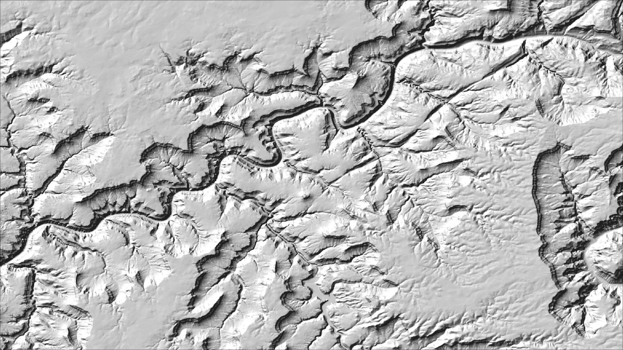
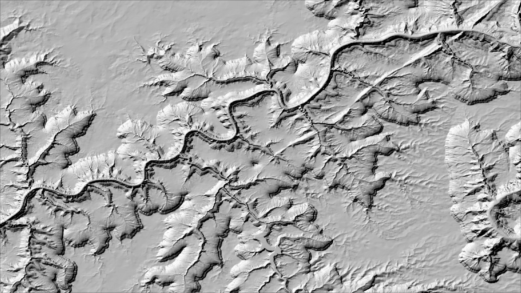
There is actually an interesting body of literature discussing this phenomenon, which cartographers call relief inversion or the terrain reversal effect. The basic issue probably has something to do with the fact that humans are just used to having light shine from above. When we're looking at a hillshade, our brains just assume light is coming from the top of the image, which is usually oriented north on a map (Ramachandran 1988; Kleffner and Ramachandran 1992; Liu and Todd 2004 review the long history of the idea). So when we see the landscape illuminated from south (from the bottom of the image), we misinterpret the direction that the shadows and bright spots on the image are facing.
Notice that “above” here means the top of the image as it falls on the eye, not north and not even up. Kleffner and Ramachandran (1992) had people lie on their sides, and the assumed light turned with their heads. That gives a simple cure for an image that is lit from the south: turn it upside down. Ramachandran (1988) makes the point with shaded disks, which reverse when the page is turned over. Bernabé-Poveda and Çöltekin (2015) tested it on satellite images, which in the northern hemisphere are lit from the south: rotating the images 180° raised the share of correct answers from 40% to 72%, and rotating southern-hemisphere images, which read correctly to begin with, dropped it from 76% to 28%. The image below is the south-lit hillshade from above, turned upside down and otherwise untouched.
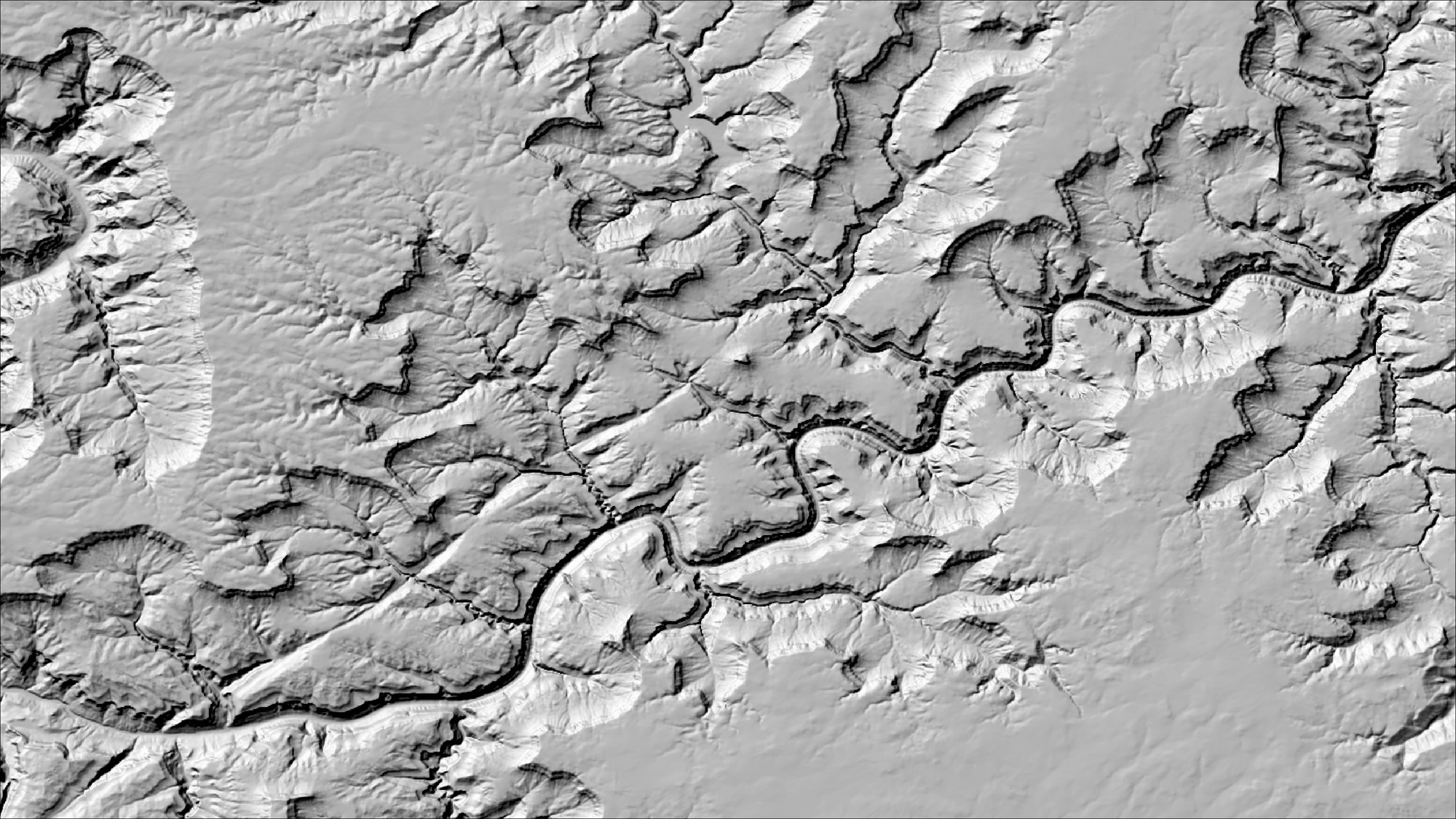
Of course, if you're going around turning your maps upside down, make sure you add a North arrow so people know which way is North!
It's not just a matter of light from above vs. light from below, either. Why do we default to northwest (315°)? It turns out that “west” in general is not always the best choice. Smith et al. (2015), in a test with shaded spheres rather than maps, show how the direction you normally read influences how you perceive this shading, and placing the sun in the northwest is actually best for people who read left-to-right. People who read right-to-left, on the other hand, tended to perceive the shape a little quicker if the illumination was put in the northeast (the difference for those readers fell just short of statistical significance). And Biland & Çöltekin (2017) take it farther, arguing that an angle of 337.5° actually reduces misinterpretation better than any other sun angle they measured, including the standard 315°: 96% of their participants' answers were correct at 337.5° and 80% at 315°. They don't say what direction their test subjects read, but the experiment was run at the University of Zurich, Switzerland, with local participants working in German or English, so the odds are they read left-to-right.
Morgenstern et al. (2011) and Liu and Todd (2004) argue that there is a lot more to human perception of depth than just an assumed illumination angle, which is not surprising. Morgenstern et al. found that the light-from-above assumption is a weak one, which gives way as soon as the image holds real evidence of where the light is coming from, such as cast shadows. Liu and Todd found that their observers leaned more strongly toward seeing bumps than dents than they did toward any direction of light. But the fact remains that a large proportion of the population experience this optical phenomenon.
What proportion of the population experiences this optical illusion? For a plain hillshade, the evidence says nearly everyone. Biland and Çöltekin (2017) had 27 people say whether a marked landform was a valley or a ridge on hillshades lit from 16 directions. With the light anywhere from 112.5° to 225°, no more than 10% of the answers were correct, and the participants were as confident of their wrong answers as of their right ones. In a second experiment with 33 hillshades lit from the south-southeast, the mean accuracy was only 2%, and the authors concluded that “it is likely everyone experiences the illusion when photographic cues are not present” (Çöltekin and Biland 2019). Marking the direction of the light on the image did not help. On satellite images people do somewhat better. In an online survey of 535 people, 40% of the answers on south-lit images were correct (Bernabé-Poveda and Çöltekin 2015), and in the laboratory 15% to 18% (Çöltekin and Biland 2019). Those who get the right answer seem to do it by reading the rivers, the snow and the vegetation, and people who work with satellite images often are the ones who benefit most from such clues. A bare hillshade has none of them. None of these studies puts a number on the share of people who are immune to the illusion, if anyone is. Çöltekin and Biland (2019) say more evidence is needed “to establish what portion of the population can indeed bypass the illusion,” and Liu and Todd (2004), who found large differences among their seven observers, warn that it is “dangerous to generalize to the entire population.”
On a personal note, I have shown the hillshade below of Oak Creek Canyon, in northern Arizona, with illumination from the southeast, to my Forestry GIS classes at Northern Arizona University for several years, and consistently roughly 3/4 of my students report seeing this as a ridge instead of a canyon. I include myself in that group, even though I know exactly what this hillshade is showing.
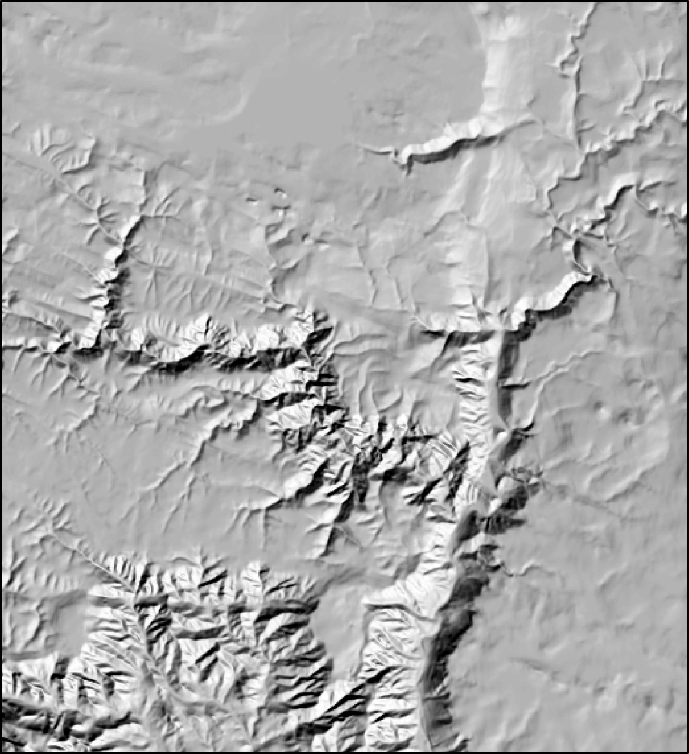
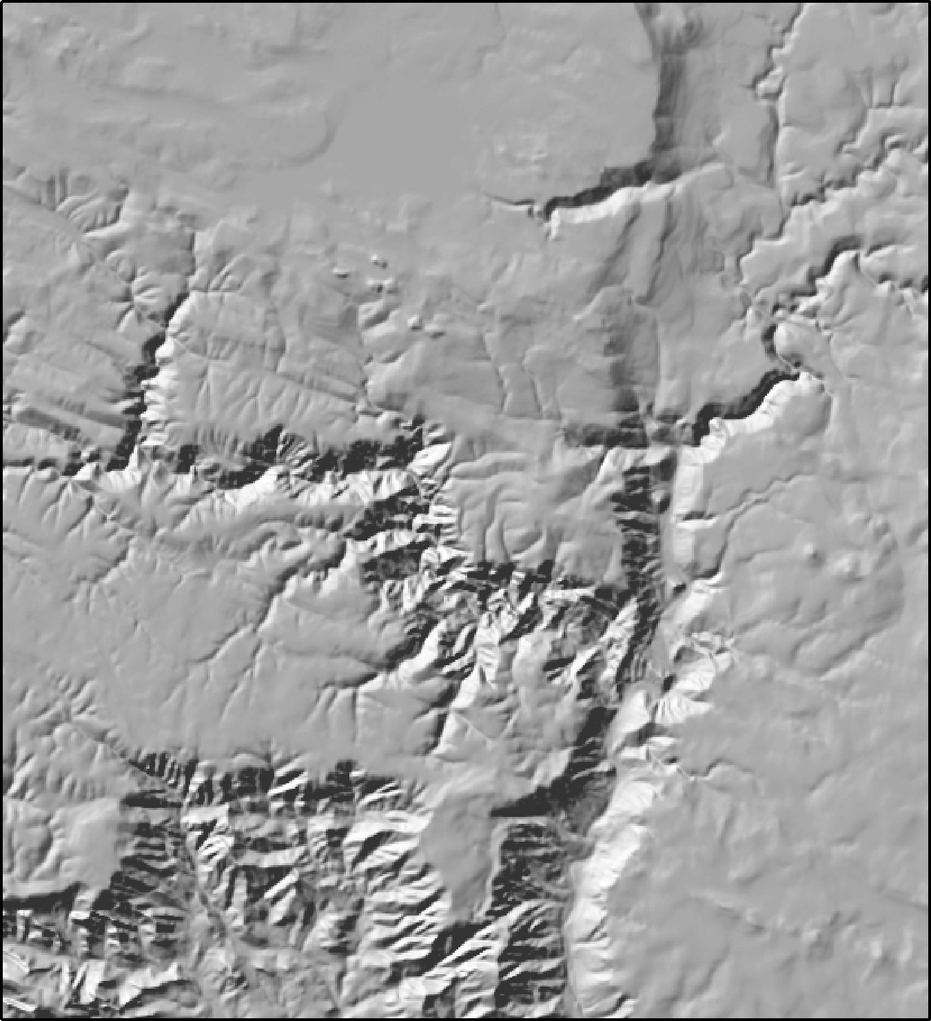
On a tangential note, people have commented on this optical illusion for centuries. I really love reading the manuscript by D. Rittenhouse from 1786, where he ponders why the pits and cracks on the bricks on his chimney-hearth appear inverted when he looks at them through a pair of lenses that turn the image upside down, and depending on how he directs the light onto them. Somehow manuscripts from that time are just warmer and friendlier than today. For example, “Though I was well satisfied of the truth of this explanation, I resolved nevertheless to bring it to the test of experiment...”. It feels more like reading Charles Dickens or J. R. R. Tolkien than it does a scientific manuscript. His explanation is essentially the modern one: we judge relief by rules “imperceptibly formed in the mind, and confirmed by long experience,” rules we rely on “even without knowing that we do so,” and they mislead us when the light is not where we take it to be.
Rittenhouse also noticed that the illusion can be broken, and that once broken it tends to stay broken. No effort of the mind would do it; but if he touched a finger or a pen to the bricks while looking, “the deception vanishes in a moment,” and “after the mind has been undeceived by these means once or twice, it does not readily admit of the imposition again.” My own experience with hillshades is a little different. I can overcome the illusion while I am looking at an image, but it is not broken forever. It returns on a fresh look. The modern studies touch on this only in passing. Ramachandran (1988) remarks that shaded shapes “can sometimes be perceptually reversed” by the viewer. About 70% of the participants of Çöltekin and Biland (2019) said the terrain flipped between valley and ridge for them at least once, though only about 4% of the time, and the experienced users of satellite images were the ones who most often got past the illusion, which the authors take as a sign that the skill is learned. None of these papers tested whether a person who has once seen a particular image correctly keeps seeing it that way.
A poor-man's insolation
A hillshade can also be a poor-man's map of sun exposure. Since you can set the sun to any position, you can set it where the sun really is at a particular place, date and hour (NOAA's solar calculator, in the references, will tell you), and the hillshade then shows roughly how much direct sun each slope receives at that moment. It is a rough estimate, and working out the sun position for a season rather than a moment is tedious; Pro's solar-radiation tools do that job far better. But for a quick look at which slopes catch the winter afternoon sun, a hillshade with a real sun position is a reasonable start.
Hillshades from latitude/longitude DEMs
Esri's Hillshade tool assumes the cells are square and the same size everywhere, in the same units as the elevations. On a DEM in geographic coordinates, where a cell is a fraction of a degree wide and its ground width shrinks toward the poles, neither is true, and the usual advice is either to project the DEM first or to fudge a Z factor that converts meters of elevation into something like degrees so the result at least looks plausible. The four hillshade-producing tools here take a different route: for a geographic DEM they compute the true ground dimensions of the cells for every row of the raster from the spheroid, so the gradients, and therefore the shading, are correct at every latitude with no projection and no fudge factor. Projected DEMs are handled with the ordinary constant-cell formulas, which are faster. The tools also read the elevation units from the DEM's vertical coordinate system when it has one, assume meters for a geographic DEM that does not say, and ask you to choose between meters and feet only when the DEM gives them nothing to go on. If you would rather project the DEM anyway, the Projecting Rasters page explains why the resampling method matters.
The Swiss method
Various authors have suggested improvements to the basic hillshade. The most influential set of ideas is usually called the Swiss method, after Eduard Imhof and the Swiss school of relief cartographers, whose hand-painted shaded relief set the standard for the twentieth century. Strictly, the Swiss method is a manual method: the cartographer paints the shading by hand, adjusting the light locally to bring out each landform, softening the tones in the lowlands to mimic haze, and reserving the strongest contrasts for the high country. Imhof (2007) devotes a whole book to it, and he was frankly skeptical that a computer could do the job; in his chapter on early computer shading he lists the difficulties, and concludes that the machine's output should be treated as a working draft for a competent cartographer to finish.
Kurt Brassel, working in Zurich with a line printer, was the first to automate the parts that could be automated (Brassel 1974). Three of his suggestions have become the recognized components of a computer Swiss-style hillshade, and each of them corresponds to one or two of the tools in this group.
Light from more than one direction. A single sun shows the shape of the land well only where its light strikes the slopes from the side, and washes out everything else: a ridge running straight toward the sun shows as an even gray on both sides, and a slope facing squarely away from it is a featureless black. Brassel's remedy was to let the light direction vary from cell to cell, swinging it a certain number of degrees to either side of the main direction according to the aspect of the cell, and to let the sun's height vary as well. Imhof (2007, p. 211) suggested a simpler version: make a second shading with the light moved 10° or 15° to one side of the first, and combine the two images photographically. In this toolbox the Multi-Sun Hillshade does the direct thing, averaging hillshades from two to eight suns you choose.
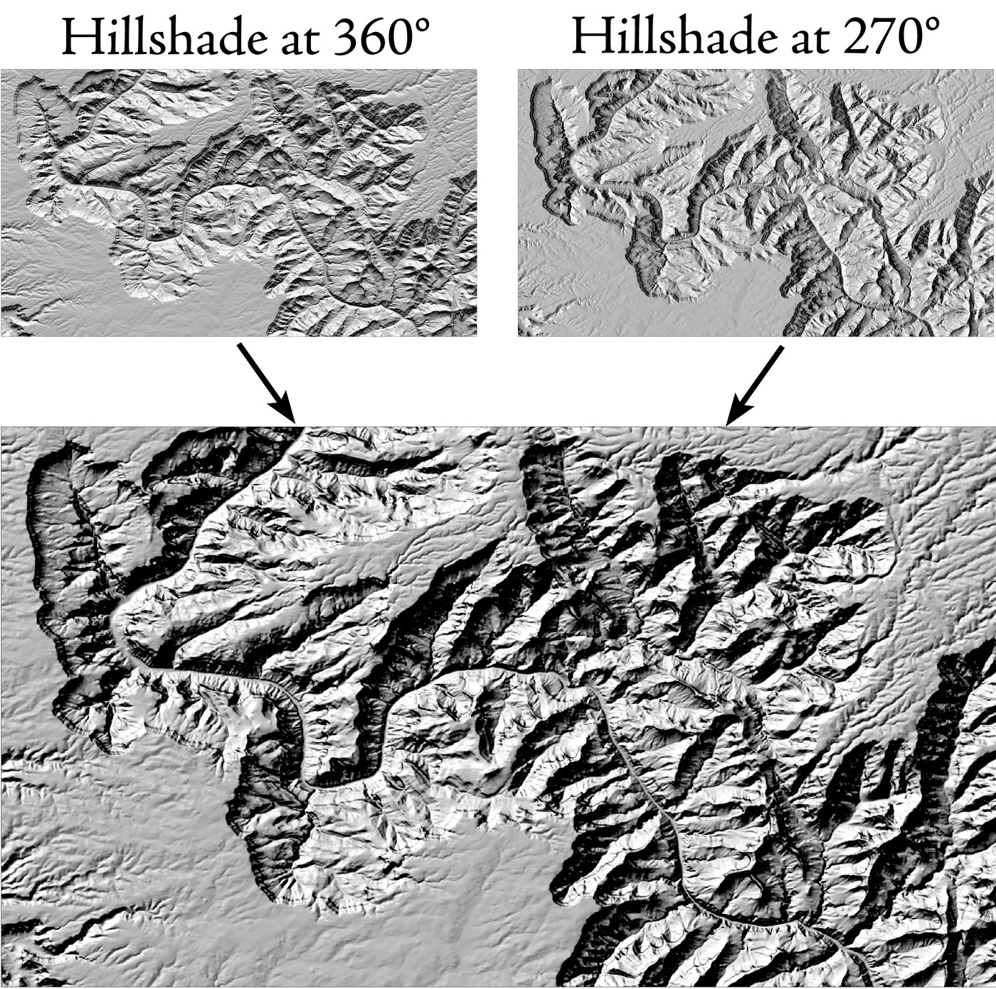
The MDOW Hillshade does a cleverer thing, devised by Robert Mark of the USGS (Mark 1992). It computes four hillshades, with the sun fanned around a primary direction, and blends them cell by cell, giving each sun a weight that depends on the aspect of the cell: no weight when the cell faces straight toward that sun or straight away from it, and full weight when the sun is at right angles to the way the cell faces. Every slope is therefore lit mostly from the side, which is the direction that shows its shape best.
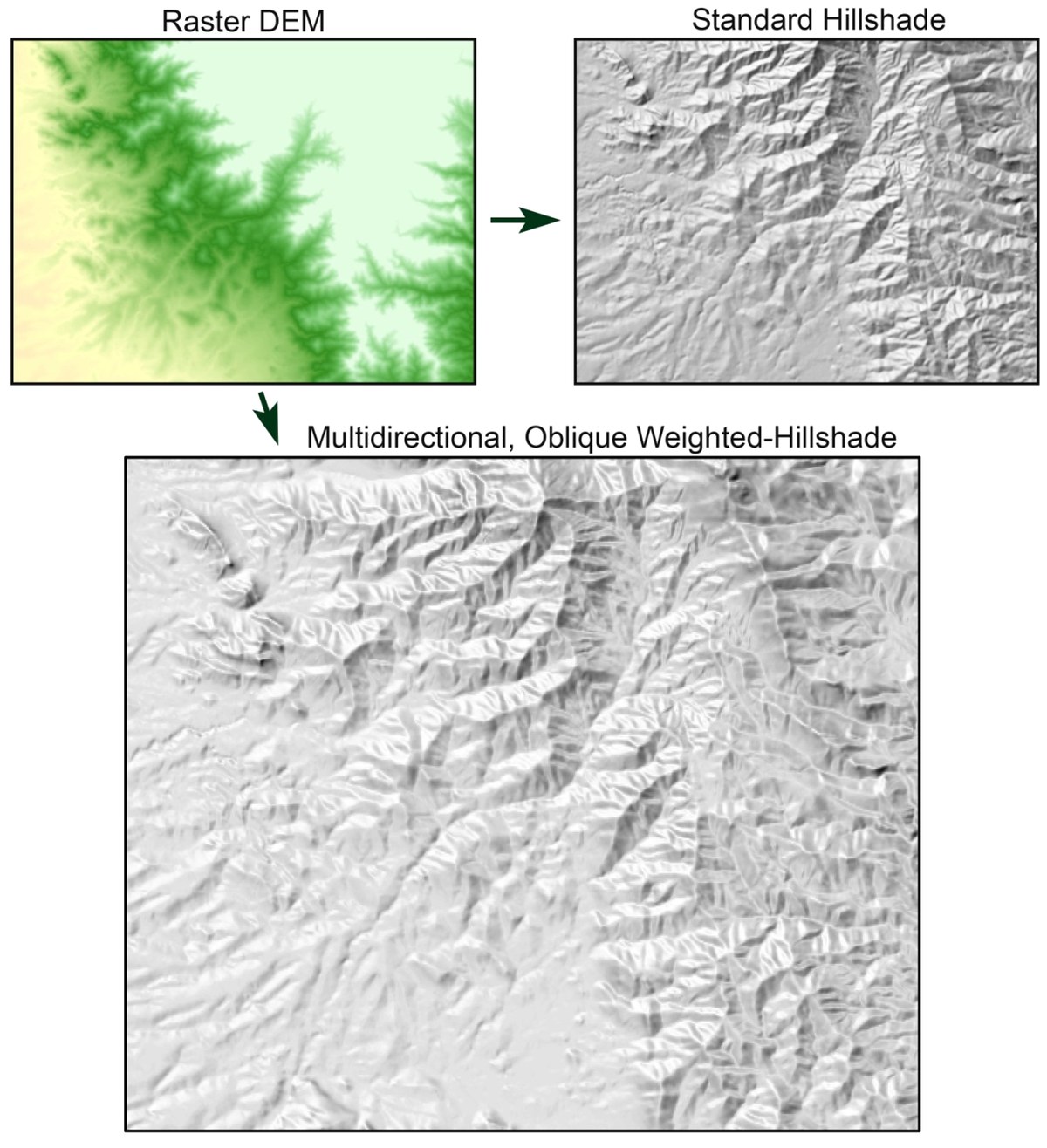
Atmospheric perspective. In a real landscape seen from above, the low country is farther away and seen through more air, so its relief looks softer and less contrasty than the peaks. Brassel built that into his model: he strengthened the contrast of the shading on the heights, reduced it in the lowlands, and added a slight general darkening of the low country, which he called “obscuring.” Here the Apply hypsometric shading option in each of the four hillshade tools darkens the low elevations inside the output raster, and the Simple Hypsometric Shading tool gets a similar effect with layers alone, draping a half-transparent black-to-white elevation layer over any hillshade you already have.
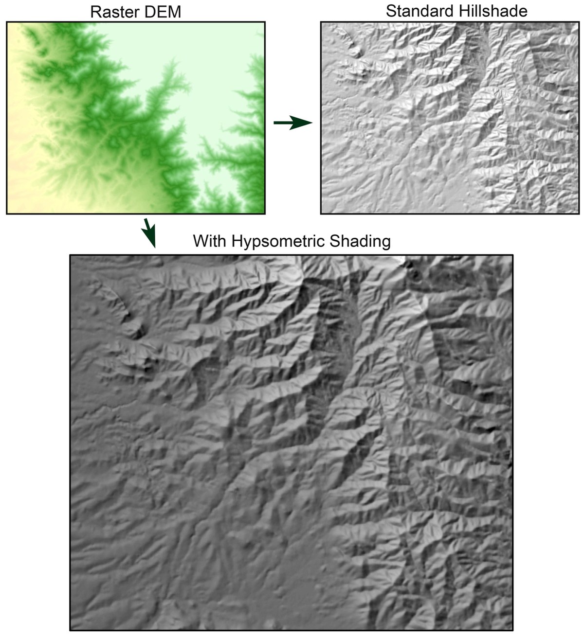
Softening. Brassel argued that the smallest terrain features carry too little information for their shading to be trusted; their light and shade, he wrote, tend to be “fictive” or “creative,” and so they should be blurred to de-emphasize them. He was also printing on a line printer, and blurring the output photographically made it a good deal easier on the eye. The USGS uses a softened hillshade under its topographic maps for a related reason: a crisp hillshade competes with the contours and the roads, while a soft one stays in the background, and Buckley and Barnes (2004) recommend smoothing on the same grounds. The Blurred Hillshade tool is this component.
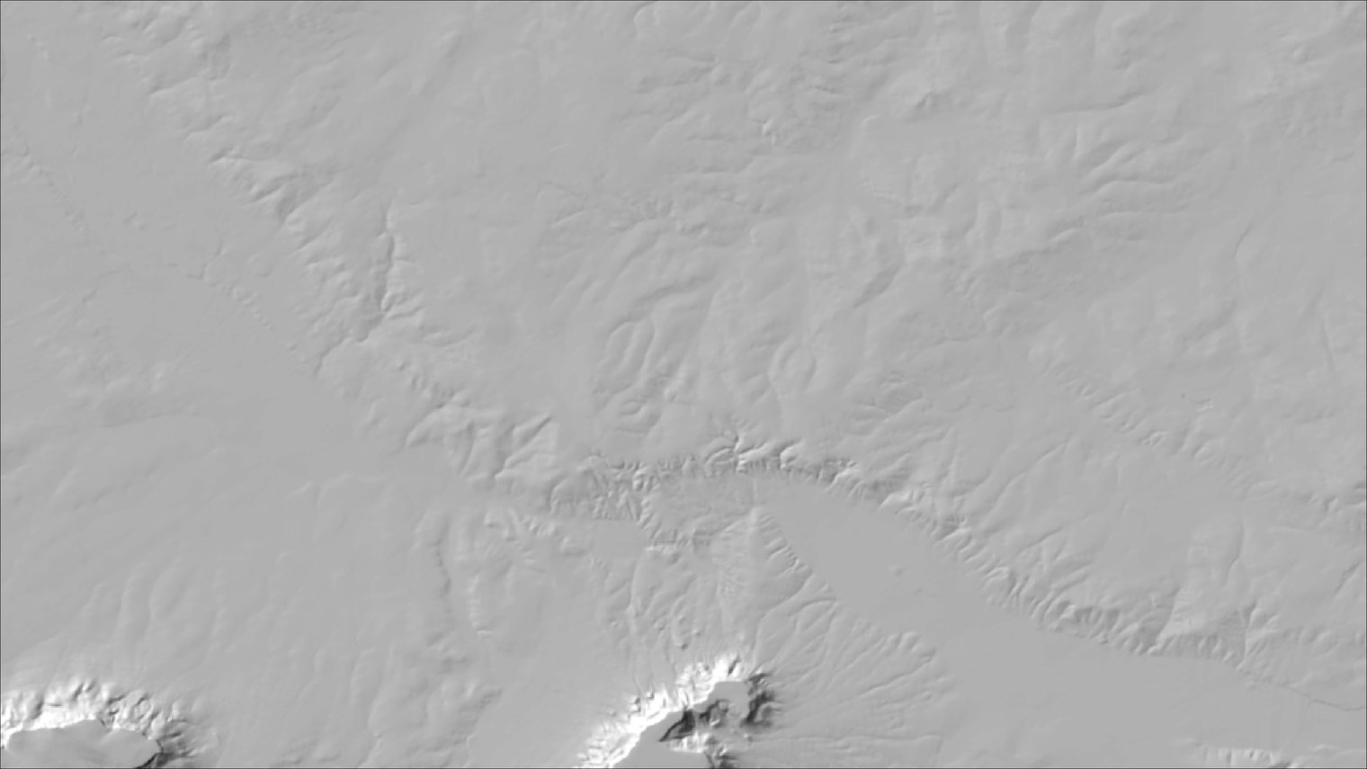
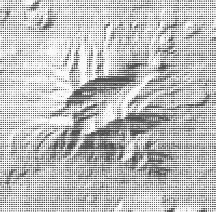
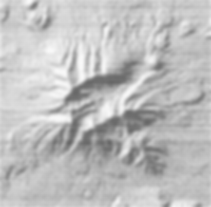
Brassel's point about blurring is easy to illustrate. The first image below is a hillshade drawn the way Brassel's modified line printer would have printed it: one dot per square cell, in a 13-step scale from a pinpoint to solid black (remember we're talking about 1974; this was what a university computing center could offer back then). The second is the same image blurred, much as he blurred his own prints photographically. (These two images were made for this page to illustrate the idea. They are not Brassel's own figures.)
Choosing among the five tools
| Tool | What it adds to the basic hillshade | Reach for it when |
|---|---|---|
| Enhanced Hillshade | One sun, as in Pro's tool, but correct on geographic DEMs; any number of gray levels; hypsometric darkening; vertical exaggeration; cast shadows that keep detail inside them. | You want an ordinary hillshade from a latitude/longitude DEM, or you want shadows that are not solid black. |
| MDOW Hillshade | Four suns fanned around a main direction, blended cell by cell so that each slope is lit by the suns most oblique to it (Mark 1992). | A single sun is hiding the structure of ridges and valleys that run toward it; you want the fullest detail in every orientation. |
| Multi-Sun Hillshade | A weighted average of ordinary hillshades from two to eight suns you position yourself, with optional per-sun shadows. | You want direct control over where the light comes from, or the classic two-sun look of the lab exercise. |
| Blurred Hillshade | Everything the Enhanced Hillshade does, plus a circular blur of the DEM before shading or of the hillshade after it. | The hillshade is competing with the map on top of it, or the fine texture of the DEM is noise you would rather not draw. Or, you just like the look of gentle, soft hillshades. |
| Simple Hypsometric Shading | No new raster at all: a group layer with the DEM, black at the bottom and white at the top, laid half-transparent over an existing hillshade. | You already have a hillshade you like and want the atmospheric-perspective effect as an adjustable layer rather than baked into a file. |
The tools combine. A common recipe is an MDOW or Multi-Sun hillshade with hypsometric shading turned on, and if the result is still too busy, the same settings in the Blurred Hillshade, which accepts every Enhanced Hillshade option.
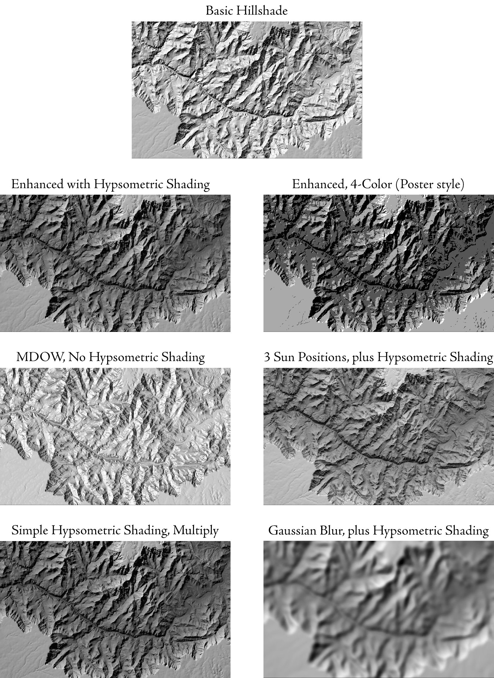
The gallery below shows the same stretch of the Grand Canyon through each of the tools. The basic hillshade is at the top. The second row is the Enhanced Hillshade with hypsometric shading, at 256 gray levels and again as a four-tone poster. The third row is the MDOW hillshade without hypsometric shading, and a three-sun Multi-Sun hillshade with it. The fourth row is the Simple Hypsometric Shading group layer with its blend mode set to Multiply, and a Gaussian Blurred Hillshade with hypsometric shading.
What the four raster tools share
The Enhanced, MDOW, Multi-Sun and Blurred hillshades are built on one engine, so they behave alike.
- Output. An integer raster running from 0 (fully shaded) up to one less than the number of gray levels you ask for: 0 to 255 at the default of 256 levels, which is Esri's range. NoData where the DEM is NoData and around its outer edge. Statistics, a histogram and bilinear pyramids are written with it, and when Pro adds the output to the map it arrives with a black-to-white stretch in which white is the highest value actually present, so the brightest slope on your map is white whatever the sun position. An output with 32 or fewer gray levels arrives in unique values instead, one gray for each level.
- Hillshade gray levels. The number you enter is the number of tones in the output, each covering an equal share of the range from fully shaded to fully lit. A small number, say 4 or 8, gives a posterized, poster-like hillshade with visible bands of tone; ask for 3 and you get exactly three tones, valued 0, 1 and 2. A large number gives a smoother one, though beyond 256 the difference is unlikely to show on screen. An output with 32 or fewer levels also gets a raster attribute table that lists each gray level and the number of cells it covers.
- Hypsometric shading. Darkens the low elevations. At a strength of s percent the brightness multiplier runs from (100 − s) percent at the lowest cell in the DEM up to 100 percent at the highest, in a straight line with elevation. At the default 50 the valley floors are half as bright as they would otherwise be.
- Vertical exaggeration. Multiplies the elevations before shading. Values above 1 make gentle country look more dramatic; values below 1 calm down mountains.
- Cast shadows (Enhanced, Multi-Sun and Blurred only). Ground hidden from the sun behind higher terrain is dimmed to a percentage of its unshadowed value: 0 percent gives the solid black shadows of Esri's Model shadows option, and the default 20 percent keeps the relief faintly visible inside them. The shadows are found with a single sweep across the grid away from the sun rather than by tracing a ray from every cell, so the option is fast, but it needs the whole DEM in memory at once. On a geographic DEM the sweep uses the mean cell dimensions, an approximation the tool notes in its messages; the hillshade itself stays exact.
- Environments. By default the output matches the input grid exactly. Processing Extent, Snap Raster, Cell Size and Output Coordinate System are honored as finishing steps: the shading is always computed from the full-resolution DEM first, and the finished hillshade is then clipped, resampled or reprojected, so edge cells carry true values and resampling smooths the picture rather than recomputing it on a coarser grid. The Mask environment is not honored. Pyramids are always bilinear.
- Memory. The shading itself runs in strips, so a large DEM is no problem. Cast shadows and blurring are the exceptions; both read the entire DEM into memory.
- Remembered settings. Each tool remembers your last choices with the project, so rerunning it on another DEM starts from the settings you last used.
Credits and references
By Jeff Jenness, Jenness Enterprises (www.jennessent.com). The Enhanced and MDOW hillshades are ports of the hillshade functions in the author's DEM Surface Tools for ArcGIS (Jenness 2013); the Multi-Sun and Blurred hillshades grew out of the lab exercises in the references. The gradient in all four is Horn's (1981).
- Bernabé-Poveda, M.-A., and A. Çöltekin. 2015. Prevalence of the terrain reversal effect in satellite imagery. International Journal of Digital Earth 8:640–655. doi.org/10.1080/17538947.2014.942714
- Biland, J., and A. Çöltekin. 2017. An empirical assessment of the impact of the light direction on the relief inversion effect in shaded relief maps: NNW is better than NW. Cartography and Geographic Information Science 44:358–372. doi.org/10.1080/15230406.2016.1185647
- Brassel, K. 1974. A model for automatic hill-shading. The American Cartographer 1:15–27. doi.org/10.1559/152304074784107818
- Buckley, A., and D. Barnes. 2004. ArcGIS cartography: creating advanced effects for cartography in ArcMap. Technical session, 2004 Esri International User Conference, San Diego, California. content.esri.com/mappingcenter2007/resources/presentations/uc04_creatingadvancedeffectswitharcmap.pdf Accessed on September 30, 2026.
- Çöltekin, A., and J. Biland. 2019. Comparing the terrain reversal effect in satellite images and in shaded relief maps: an examination of the effects of color and texture on 3D shape perception from shading. International Journal of Digital Earth 12:442–459. doi.org/10.1080/17538947.2018.1447030
- Horn, B. K. P. 1981. Hill shading and the reflectance map. Proceedings of the IEEE 69:14–47. doi.org/10.1109/PROC.1981.11918
- Imhof, E. 2007. Cartographic relief presentation. Esri Press, Redlands, California. (Reprint of the 1982 English edition, edited by H. J. Steward, Walter de Gruyter, Berlin; first published in German in 1965.)
- Jenness, J. 2013. DEM Surface Tools for ArcGIS (v. 2.1.375). Jenness Enterprises. jennessent.com/arcgis/surface_area.htm
- Jenness, J. Raster and surface analysis in ArcGIS Pro, Episode 3: Insolation, hillshades and curvature. Lecture video, GIS training courses, Jenness Enterprises. youtu.be/h4eqsvrM7AI
- Jenness, J. Raster labs 3 and 10–13: Calculating hillshades from a DEM; Hillshades with Swiss Method effects in ArcGIS Pro (hypsometric shading, multiple sun positions, MDOW, blurring). Lab exercise videos, GIS training courses, Jenness Enterprises. youtu.be/Eduy5QAoLE0, youtu.be/iymM__vq9QE, youtu.be/qVh5LPrv78g, youtu.be/DP309q778Vw, youtu.be/SJ6S0KgKlJQ
- Kleffner, D. A., and V. S. Ramachandran. 1992. On the perception of shape from shading. Perception & Psychophysics 52:18–36. doi.org/10.3758/BF03206757
- Liu, B., and J. T. Todd. 2004. Perceptual biases in the interpretation of 3D shape from shading. Vision Research 44:2135–2145. doi.org/10.1016/j.visres.2004.03.024
- Mark, R. K. 1992. A multidirectional, oblique-weighted, shaded-relief image of the Island of Hawaii. U.S. Geological Survey Open-File Report 92-422. doi.org/10.3133/ofr92422
- Morgenstern, Y., R. F. Murray, and L. R. Harris. 2011. The human visual system's assumption that light comes from above is weak. Proceedings of the National Academy of Sciences 108:12551–12553. doi.org/10.1073/pnas.1100794108
- National Oceanic and Atmospheric Administration. NOAA solar calculator. Global Monitoring Laboratory. gml.noaa.gov/grad/solcalc/ Accessed on September 30, 2026.
- Ramachandran, V. S. 1988. Perception of shape from shading. Nature 331:163–166. doi.org/10.1038/331163a0
- Rittenhouse, D. 1786. Explanation of an optical deception. Transactions of the American Philosophical Society 2:37–42. doi.org/10.2307/1005164
- Smith, A. K., I. Szelest, T. E. Friedrich, and L. J. Elias. 2015. Native reading direction influences lateral biases in the perception of shape from shading. Laterality 20:418–433. doi.org/10.1080/1357650X.2014.990975
Related tools and pages
- Enhanced Hillshade — one sun; geographic DEMs, levels, hypsometric shading, exaggeration, soft cast shadows.
- MDOW Hillshade — Mark's four-sun, aspect-weighted blend.
- Multi-Sun Hillshade — a weighted average of two to eight suns you place.
- Blurred Hillshade — the softening component.
- Simple Hypsometric Shading — the atmospheric-perspective effect as a group layer.
- Projecting Rasters — these tools work on geographic DEMs directly; if you project a DEM first, use bilinear interpolation.
- About Aspect — the aspect that the MDOW weights depend on, and why it is a circular quantity.