

Projecting Rasters: Why the Resampling Method Matters
Vector data project cleanly. A point, a polyline or a polygon is a set of precisely defined vertices, and each vertex can be transformed into a new coordinate system and back again without changing. Rasters are different. A raster is a set of rows and columns, and when it is projected it has to become a different set of rows and columns, with (almost always) square cells, laid out horizontally and vertically in the new coordinate system. The new cells do not line up with the old ones, so every new cell has to be handed a value by some rule, and the choice of rule — the resampling method — decides whether your projected raster is faithful or quietly corrupted. Project a raster out and back, and you will almost never get the original raster.
This page condenses a topic Jeff teaches at more length in the Projections and Datums module of his GIS training course, where the lab exercises let you watch a raster change as it is projected out and back.
Two grids that do not line up
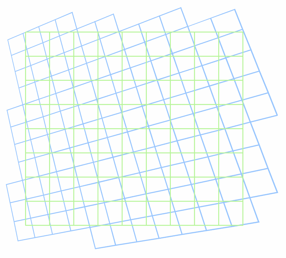
The green grid below is the original raster; the blue grid is the same ground after projection into a coordinate system whose axes point a little differently. Each blue cell overlaps several green cells, and no blue cell overlaps exactly one. The question every projection has to answer is: what value goes in each blue cell?
Four ways to fill the new cells
It is easier to think about with each cell drawn as a dot at its center. Green dots are the original cell centers; blue dots are the centers of the new cells. ArcGIS offers four rules for assigning a value to each blue dot.
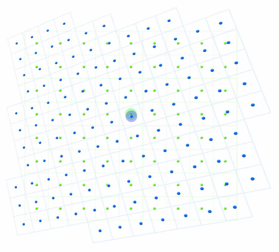
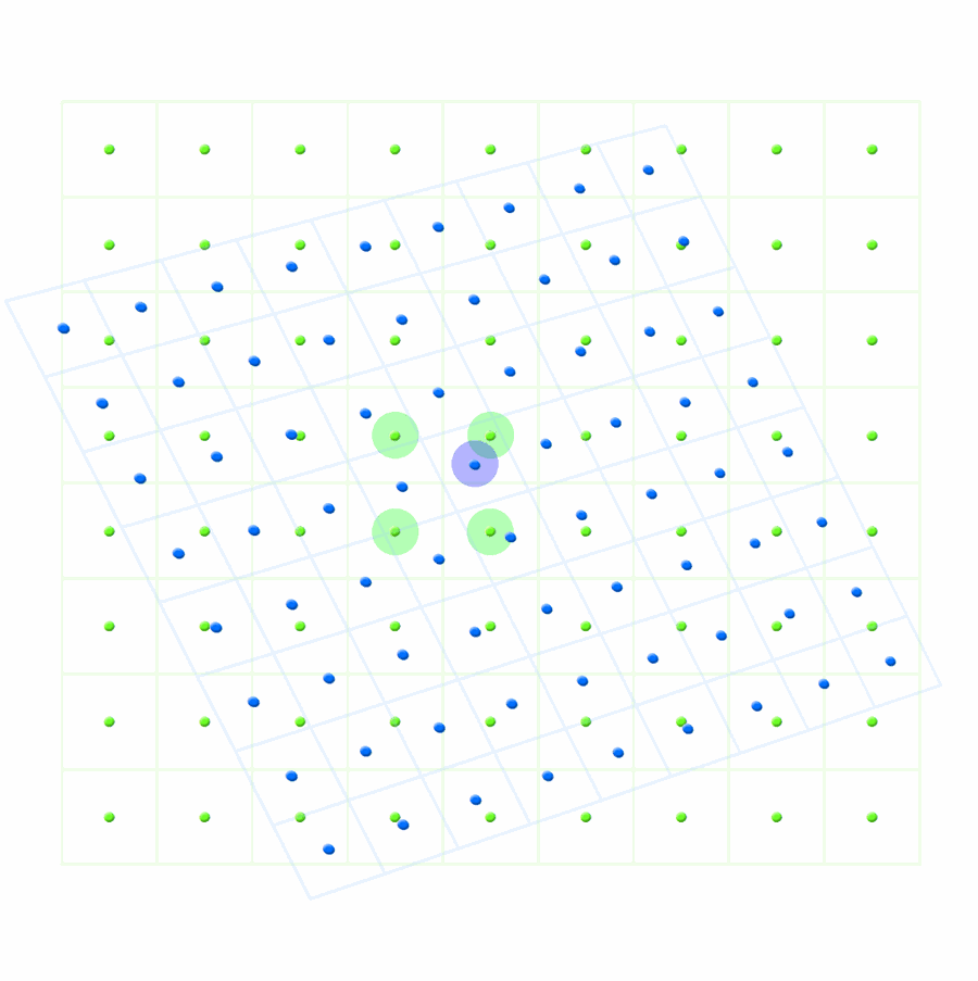
The other two are variations on these. Cubic convolution averages the sixteen nearest original cells instead of four, which suits continuous surfaces but smooths them noticeably. Majority looks at a 4 × 4 block of original cells and takes the most common value, which, like nearest neighbor, guarantees the new raster holds only values the original had, and so is a second good choice for categorical rasters.
The nearest-neighbor problem: repeats and skips
Nearest neighbor is the default in many tools, and for a categorical raster it is the right default. The trouble comes when it is applied to a continuous surface. Look again at the two dot grids. Because the blue grid is slightly rotated or slightly differently spaced, there are places where two blue cells share the same nearest green cell, and places where a green cell is nearest to no blue cell at all. The original values get repeated in some new cells and skipped in others, and because the two grids drift in and out of phase, the repeats and skips fall on a regular cycle across the raster.
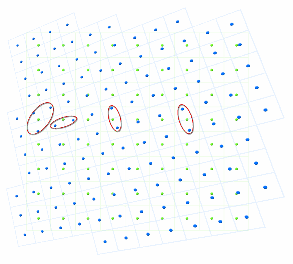
For a categorical raster this is harmless; a land cover class repeated in one extra cell is still that class. For an elevation surface it means the projected DEM contains a faint but perfectly regular lattice of little terraces: pairs of identical cells where the ground should have been rising, and small jumps where a value was skipped. The elevations themselves are barely affected. A nearest-neighbor pull can move a value by at most half a cell diagonal, about 21 m on a 30-m grid, which in steep ground is a few meters of elevation and in gentle ground is nothing. If all you need is elevation, you will never notice. But slope is the difference between neighboring cells, and a difference of zero followed by a double-sized jump is exactly what the repeats and skips produce.
Why the DEM looks fine and the slope does not
Here is the effect on real data. The 30-m DEM from the Corridor Design Tutorial was projected from UTM Zone 12N to the North America Albers Equal Area Conic system twice, once with nearest neighbor and once with bilinear interpolation, and slope was then computed from each projected DEM.
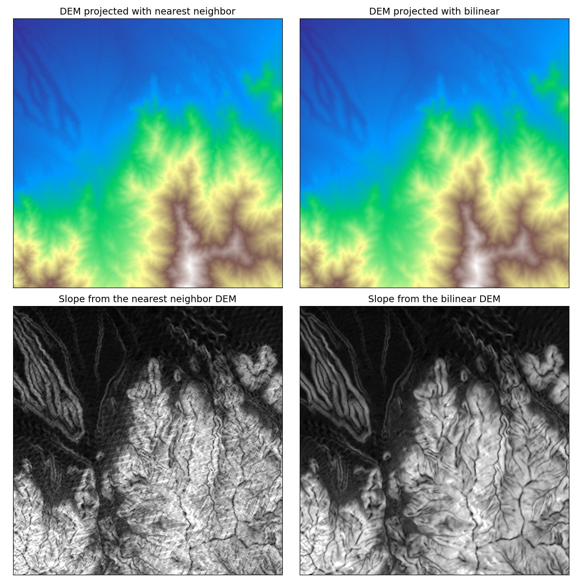
Everything derived from the surface inherits the lattice: aspect, curvature, the topographic position index, hillshades, and every roughness measure, all of which are built from differences between neighboring cells. Some of them, such as curvature and the ruggedness indices, amplify it, because they are differences of differences. A slope-position or landform classification made from such a DEM will carry stripes of “steep slope” and “ridge” marching across flat valley floors, and a habitat model built on that factor will carry them too.
Hydrology suffers in a different way. The lattice of little terraces and jumps acts like a network of shallow channels laid across the surface, and flow-direction and flow-accumulation tools, which send each cell's water to its lowest neighbor, will follow those channels. Streams modeled from a nearest-neighbor DEM run in straight lines along the artifact grid, turn at right angles, and pool in places where no water would ever pool, and the topographic wetness index and every watershed delineation built on top of them go wrong with them.
What to do
- Categorical raster (land cover, soils, a classification, a patch map): nearest neighbor or majority. Never bilinear or cubic, which would invent class codes that mean nothing.
- Continuous surface (elevation, distance, density, a suitability model): bilinear. Cubic convolution is also legitimate if you are content with a smoother surface.
- Project first, derive second. Get the DEM into the analysis coordinate system with bilinear interpolation once, then compute slope, aspect, topographic position and roughness from the projected DEM. Never project a derivative; recompute it.
- Project once. Every projection resamples, and every resampling loses a little. Pick the analysis coordinate system at the start and bring each dataset into it one time.
- Put every raster on one grid. Set the output cell size and the Snap Raster to your reference raster so the factors line up cell for cell. In Esri's Project Raster tool the cell size is a parameter and the snap raster is an environment setting.
Credits
Adapted from the Projections and Datums module of Jeff Jenness's GIS training course, where the dot-grid diagrams above are used to teach resampling and where a lab exercise has students project a land cover raster out to geographic coordinates and back again to watch how much of it changes. The slope demonstration was computed for this page from the corridor tutorial's DEM.
Related pages
- About Hillshades and the Swiss Method — the hillshade tools work on geographic DEMs directly, with no projection at all
- Clip Data to Analysis Area — batch clipping and projection, nearest neighbor only
- Corridor Design Tutorial — where this question first comes up in the corridor workflow
- Slope Position Classification — a DEM derivative that inherits any resampling artifacts
- Topographic Wetness Index — flow paths are the first casualty of a nearest-neighbor DEM