
TPI Neighborhood Sampler
Summary
Over the years, the most common question I get regarding TPI is what neighborhood size would work best. The second most common is whether someone should use raw TPI values to classify landforms, or if they should use neighborhood standard deviations. I've always had to respond that I don't know of any foolproof way to do it, so they should just find some topographic feature they know that they want classified a particular way, and try lots of variations until that feature is classified correctly.
This tool attempts to help implement that in a way that is much faster than running the tool a bunch of times. You can take a snapshot of an area you know you want classified a certain way, then use an interactive window with sliders to test different neighborhood sizes and class threshold values. In order to make the tool quick and responsive, it currently only offers circular neighborhoods (not annuli), and it only tests the raw TPI and neighborhood standard deviation methods (not percentiles or full DEM standard deviations). It also might be working from a coarser copy of the source elevation data than the DEM you are using, but it will still give you a good illustration of the consequences of a wide range of settings.
The settings found here go straight into the Topographic Position Index tool, the Slope Position Classification and Landform Classification tools, and the thresholds of a system built in the Classification System Builder. The window adds nothing to the map and writes nothing to disk: the snapshot lives in memory and is gone when the window closes.
How it works
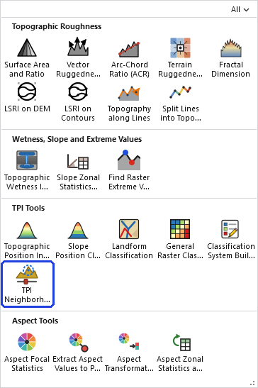
Zoom the map to a piece of terrain that holds a feature you know how you want classified, a hill that should come out as a hill or a drainage that you want classified as a valley, with enough of the surrounding landscape in view to hold the largest neighborhood you might try. Then click TPI Neighborhood Sampler in the TPI Tools row of the Topographic Analysis Tools gallery.
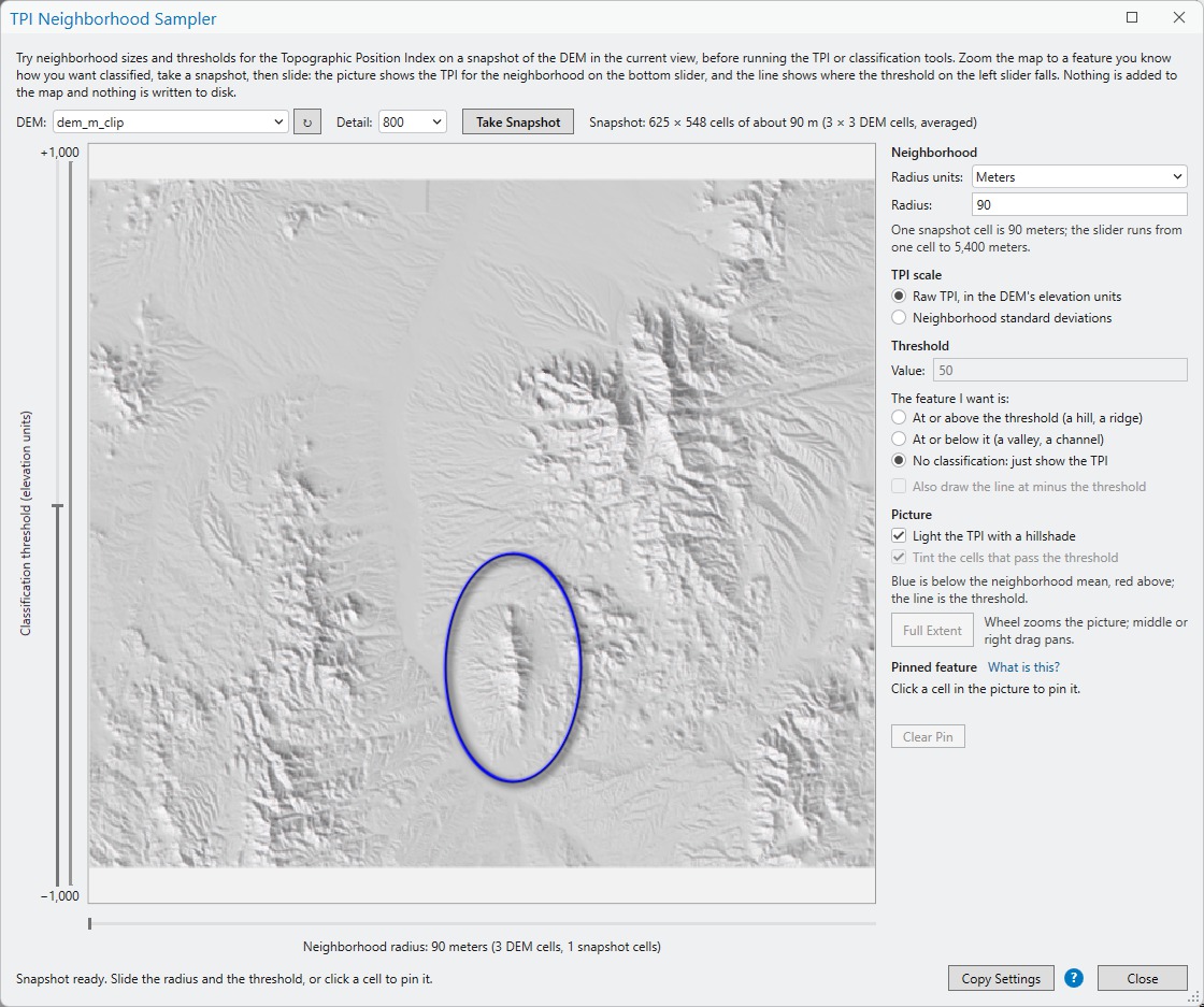
- Take a snapshot. Choose the DEM from the map's raster layers, pick a snapshot resolution (either 200, 400 or 800 pixels on the longest edge) from the Detail box, and then click Take Snapshot. The tool reads the part of the DEM inside the view into a coarse grid of that size, computes the TPI for the smallest and the largest neighborhoods to set the scales, and paints the picture. The line of text beside the button says what the snapshot is: for instance 400 × 300 cells of about 90 m (3 × 3 DEM cells, averaged).
- Slide the neighborhood. The slider under the picture is the neighborhood radius. Each step is half a snapshot cell, and the picture repaints as the slider moves, showing the TPI for that neighborhood over the whole snapshot. The grids for every step are computed in the background right after the snapshot, so the slider never waits. Type an exact radius in the Radius box to use a value between the steps.
- Slide the threshold. The slider standing on the left is the classification threshold. The black line in the picture is drawn where the TPI equals it, and the cells on the side you chose under The feature I want is are tinted yellow. Move both sliders until the feature you have in mind is tinted and the things that should not be are not.
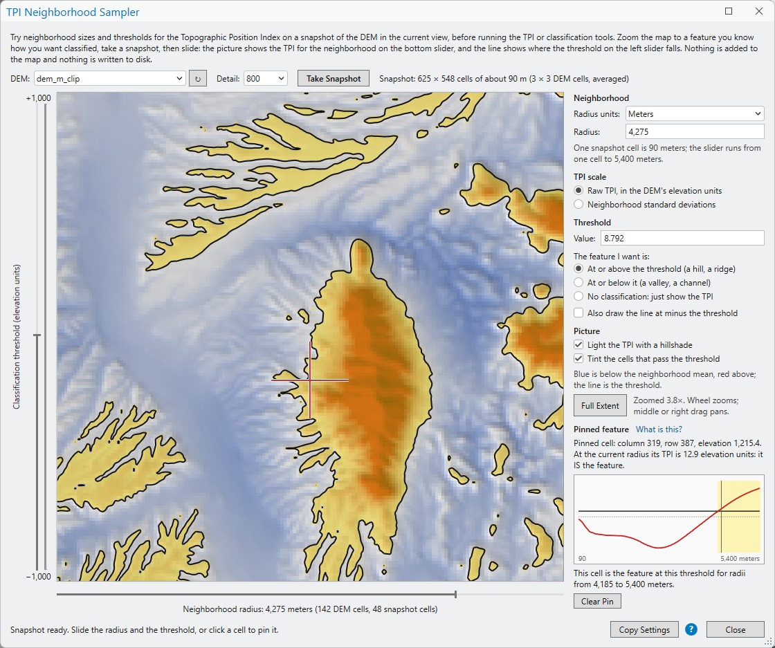
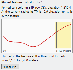
- Pin the feature. Click the feature in the picture, zooming in with the mouse wheel first if the feature is small. A crosshair marks the cell, and the Pinned feature panel plots that cell's TPI against the neighborhood radius, with the threshold as a line across the plot and the radii that classify the cell as the feature shaded. A sentence under the plot says the same thing in words: This cell is the feature at this threshold for radii from 720 to 5,400 meters.
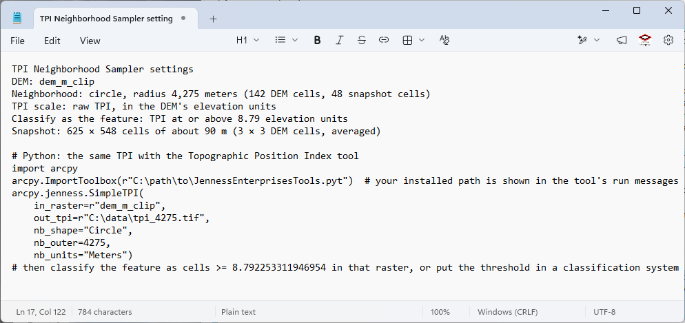
- Copy the settings. Copy Settings puts the neighborhood, the TPI scale and the threshold on the clipboard as text, followed by the Python call that computes the same TPI with the Topographic Position Index tool.
Pan or zoom the map and click Take Snapshot again for a new piece of terrain; the window stays open.
An example: a small mountain
Suppose I want a slope position classification that captures a particular small mountain I have in mind. I can see it in my map, but I can also see it in the TPI Neighborhood Sampler window by selecting the DEM, taking a snapshot with the hillshade turned on, and turning the neighborhood radius all the way to the left, where the picture is nearly all hillshade. I have circled the hill I want to capture:
I can turn off the classification line initially and explore the effect of the neighborhood radius alone:
Then I can turn on the classification threshold and try some variations:
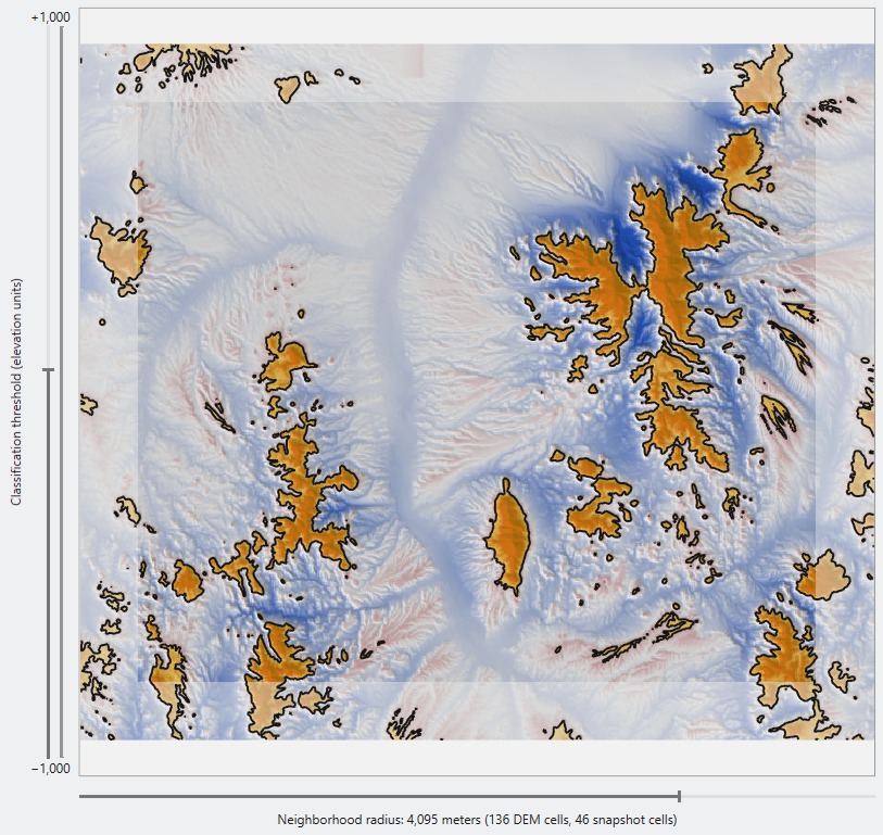
Better yet, I can roll my mouse wheel to zoom in and set a pin at about the place where I want the terrain to transition into my class, and set my threshold and neighborhood radius so that the pinned cell is just inside it:
Then I click Copy Settings and paste it into Notepad, and follow the instructions in that message:
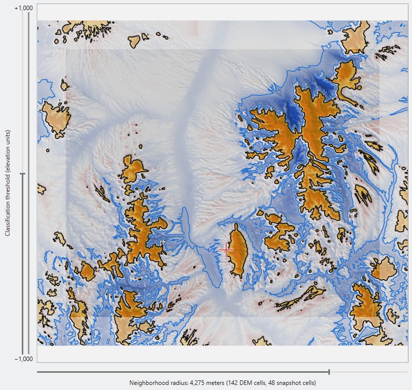
You can also draw the symmetric opposite threshold, the negative of the current number, with Also draw the line at minus the threshold. The dashed blue line shows where the same rule would classify valleys, so both sides of a symmetric classification can be seen at once:
The window
| Control | Meaning |
|---|---|
| DEM | The elevation raster to sample, from the raster layers of the active map. A raster layer selected in the Contents pane when the window opens is chosen to start with. The refresh button beside the list reads it again after a layer is added. The active view must be a map, not a layout. |
| Detail | The snapshot's size in cells along its longer side: 200, 400 or 800. More detail shows smaller features and takes a little longer to read and compute. Zooming the map in is the other way to get finer cells. |
| Take Snapshot | Reads the DEM inside the current view and paints the first picture. |
| Threshold slider | Standing on the left of the picture. Its reach is set from the snapshot: a round number at or above the largest TPI found at the smallest and the largest neighborhoods, so it does not change as the radius moves. In the standard deviation scale it runs from −3 to +3. |
| Neighborhood radius slider | Lying under the picture, from one snapshot cell to 60 snapshot cells or a third of the snapshot's shorter side, whichever is less, in steps of half a cell. The label under it gives the radius in the chosen units, in DEM cells and in snapshot cells. |
| Radius units | Cells, Meters, Kilometers, Feet or Miles, the same list the TPI tools offer. Cells are the DEM's own cells, not the snapshot's. Changing the units keeps the same radius on the ground. |
| Radius | The radius as a number, for typing an exact value. Press Enter; the slider follows. A value more than one and a half times the slider's end is trimmed, with a note to zoom the map out and take a larger snapshot. |
| TPI scale | Raw TPI, in the DEM's elevation units: the cell's elevation minus the mean elevation of its neighborhood, what the Topographic Position Index tool writes to its first output. Neighborhood standard deviations: the raw TPI divided by the standard deviation of elevation within the same neighborhood, the tool's standardized at neighborhood scale output and the sd units of a classification system. Each scale remembers its own threshold. |
| Threshold value | The threshold as a number. Press Enter; the slider follows. A value beyond the slider's reach is allowed. |
| The feature I want is | At or above the threshold tints the cells whose TPI is at or above it, for hills and ridges. At or below it tints the cells at or below, for valleys and channels. The line is the same either way. No classification draws no line and no tint, so the picture shows only the TPI colors as the radius changes; the threshold controls rest until a side is chosen again. |
| Also draw the line at minus the threshold | Draws a second, dashed blue line where the TPI equals the negative of the threshold. Ridge and valley thresholds are usually chosen together, and Weiss's classes are symmetric. |
| Light the TPI with a hillshade | Shades the colors with a hillshade computed from the snapshot, for a sense of the terrain under the TPI. |
| Tint the cells that pass the threshold | The yellow tint. With it off only the line is drawn. |
| Zooming the picture | The mouse wheel zooms the picture about the pointer, up to 32 times, so a pin can be placed on exactly the cell wanted; the cells show as blocks when zoomed in. Drag with the middle or the right mouse button to pan. Full Extent shows the whole snapshot again, as does a new snapshot. |
| Pinned feature | The pinned cell's column, row and elevation, its TPI at the current radius and whether that makes it the feature, the plot of TPI against radius, and the sentence naming the radii that classify it as the feature. Clear Pin removes the pin, and What is this? beside the heading opens a short explanation of the panel and of zooming the picture. |
| Copy Settings | The settings and the matching Python call, to the clipboard. |
Reading the picture
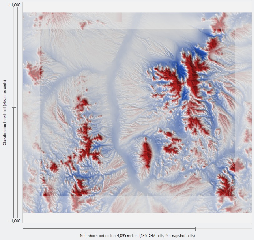
The colors are the TPI: white at zero, deepening to red for cells above their neighborhood mean and to blue for cells below it. The colors saturate at a round number near the top of the range found in the snapshot, so a very tall hill and a merely tall one are both full red, and the same color means the same TPI at every radius. The black line is the threshold, traced through the cells by linear interpolation. The yellow tint marks the cells on the chosen side of it. Cells with no data are left blank.
A band along the edge of the snapshot, as wide as the radius, is drawn faded. The neighborhoods of those cells run off the snapshot, so their TPI is computed from what is inside and may not match what the full DEM would give. As the radius grows, so does the band; if the feature of interest sits in it, zoom the map out and take a new snapshot with more room around it. The last figure of the example above shows the faded band, the threshold line and the dashed line at minus the threshold together.
The pinned feature
The sliders show what happens to the whole snapshot; the pin answers the question for one place. Click the crest of the hill you have in mind, and the plot on the right shows its TPI at every radius the slider can reach, from one snapshot cell to the end of the slider. The threshold is the horizontal line, the current radius the vertical one, and the radii that classify the cell as the feature are shaded. A small sharp hill rises above the threshold at a modest radius and stays there; a hill on the flank of a larger ridge rises and then falls again as the neighborhood grows to take in the ridge, and the shaded span shows exactly where. Pin the places that must come out one way, then the places that must come out the other, and the settings that satisfy both are the ones to use.
The snapshot and its cells
The snapshot is coarser than the DEM so that the arithmetic is quick enough to follow a slider. Its cell is a whole number of DEM cells on a side, chosen so the longer side of the view fits the chosen detail: a view 1,200 DEM cells wide at a detail of 400 gives snapshot cells of 3 × 3 DEM cells. Each snapshot cell is the mean of its block of DEM cells, which is the right aggregation for a quantity defined by neighborhood means. A view of more than about 36 million DEM cells is sampled at the center of each block instead of averaged, and the readout says so. A block that is more than half NoData is NoData.
Radii are converted through the true ground size of a snapshot cell, so a radius of 1,500 meters is 1,500 meters whatever the detail. On a DEM in geographic coordinates the cells are measured on the spheroid: the east-west radius in cells changes from row to row with the latitude, so that the neighborhood is a circle on the ground, the same convention the Topographic Position Index tool uses. The neighborhood itself is the tool's circular neighborhood, cell for cell, at the snapshot's resolution.
What the coarse cell costs is detail. Relief smaller than a snapshot cell is averaged away, so a narrow knob reads a little lower than it would at full resolution, and a thin channel a little shallower; the raw thresholds found here may want a small adjustment when the full tool runs on the native DEM, while the neighborhood size transfers as it is. Zoom the map in, or raise the detail, when the feature of interest is only a few snapshot cells across.
What it does not do
- Annulus neighborhoods. Only circles. An annulus is a circle with a hole, and the TPI tools offer it, but a circle is the shape nearly everyone uses, and the sampler is built for speed.
- Percentile TPI and DEM-scale standardization. The percentile form compares each cell with every cell of its neighborhood one by one, which is too slow to follow a slider; the DEM-scale form depends on the whole DEM, which a snapshot does not have. The two scales offered, raw and neighborhood standard deviations, are the two the classification tools compute on the fly and the two that classification systems name as raw and sd units.
- Slope. The slope-position and landform systems also use a slope threshold to split flat ground from the middle slopes. The sampler tests the TPI part of the rule only.
- Two scales at once. Landform classification uses a small and a large neighborhood. Test them one at a time, pinning the same feature for each.
Taking the settings to the tools
Copy Settings writes something like this to the clipboard:
TPI Neighborhood Sampler settings
DEM: Coconino_30m
Neighborhood: circle, radius 1,500 meters (50 DEM cells, 16.7 snapshot cells)
TPI scale: raw TPI, in the DEM's elevation units
Classify as the feature: TPI at or above 12.5 elevation units
Snapshot: 400 × 300 cells of about 90 m (3 × 3 DEM cells, averaged)

# Python: the same TPI with the Topographic Position Index tool
import arcpy
arcpy.ImportToolbox(r"C:\path\to\JennessEnterprisesTools.pyt")  # your installed path is shown in the tool's run messages
arcpy.jenness.SimpleTPI(
    in_raster=r"Coconino_30m",
    out_tpi=r"C:\data\tpi_1500.tif",
    nb_shape="Circle",
    nb_outer=1500,
    nb_units="Meters")
# then classify the feature as cells >= 12.5 in that raster, or put the threshold in a classification system
In the Topographic Position Index tool, the neighborhood shape, radius and units are the same three settings, and the raw scale is the first output, the standard deviation scale the second. In the Slope Position Classification and Landform Classification tools, enter the radius and units in the on-the-fly neighborhood and choose Raw or Neighborhood SD as the TPI type. The threshold belongs in a classification system: open the Classification System Builder, give the class a criterion on the TPI input in raw or sd units with the value found here, and the tools apply it.
Recommended citation
Credits
By Jeff Jenness, Jenness Enterprises (www.jennessent.com). The Topographic Position Index and its neighborhood-scale standardization are described on the About TPI page, with the references.
Licensing information
Works at every ArcGIS Pro license level (Basic, Standard, Advanced). No extension licenses are required.
Related tools and pages
- About TPI — the index, scale, and how to choose a neighborhood and a threshold.
- Topographic Position Index — compute the TPI raster with the settings found here.
- Slope Position Classification — classes from one TPI plus slope.
- Landform Classification — classes from TPI at two scales plus slope.
- Classification System Builder — where the threshold goes.