
About Kernel Density Analysis
This page covers the ideas shared by the three Kernel Density tools — Kernel Density Enhanced, KD to Proportion Surface, and KD Probability Contours — so each tool's page can concentrate on its own controls. The teaching sequence is adapted from the wildlife GIS lab Jeff has taught for years; the About LoCoH page compares this method with its local-hull alternative.
Kernel density, plainly
Kernel density surfaces are definitely more abstract than MCPs, but they are also fairly intuitive once you understand them. In truth, one of the most confusing things about the entire concept is the name: the word “kernel” actually refers to a mathematical equation that defines a 3-dimensional bell-shaped curve. Like many things in GIS, this concept could probably have been given a more intuitive name.
Kernel density analysis takes vector input data (points), performs a raster analysis, and produces a raster output representing the density surface. A proper understanding should start with a simpler type of analysis — point density — before moving on to the kernel version.
Point density: similar, but simpler
The goal of any density analysis is to describe the landscape in terms of how densely points are distributed across it. For example, we may be interested in how many water sources there are, per square mile, in the desert of southwestern Arizona — places with a high density of water sources might be more likely to support various vertebrate and invertebrate populations than places with low water source density.
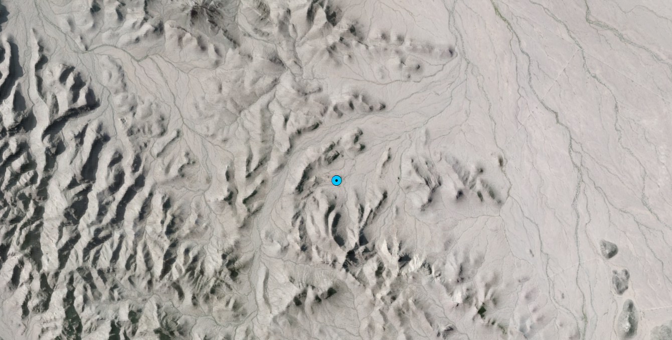
Suppose we know of one spring on the landscape, at the blue dot below, and we generate a point density surface around it:
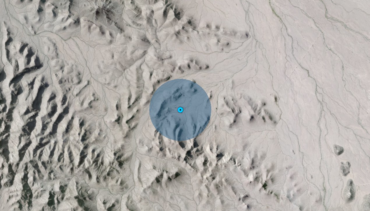
The simple point density surface looks like the circle below, which happens to enclose exactly 1 square mile. Any place inside that circle has a density value of 1 water source per square mile; any place outside has a density of 0:
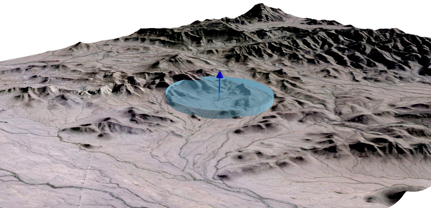
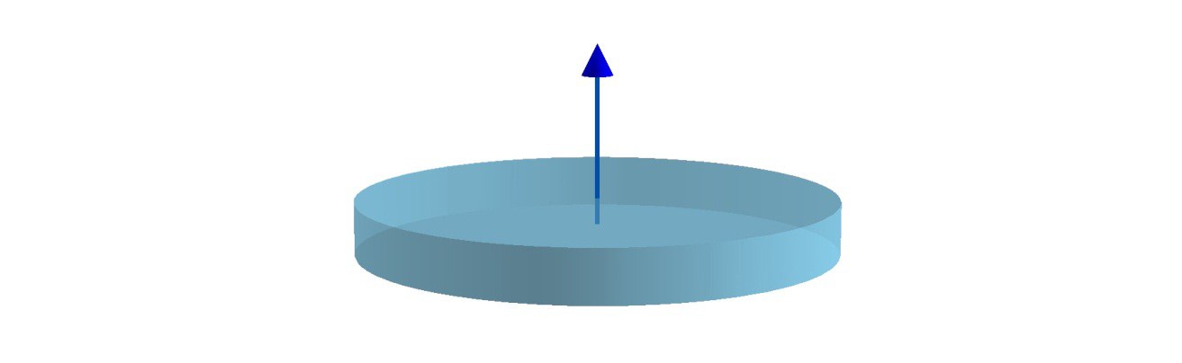
It helps to view this in 3-D, where the density region rises like a disk lying on the landscape — a perspective that becomes especially useful when disks overlap, and even more so when comparing simple point density to kernel density:
An important point: the density value inside the disk is based on the size of the disk — the “search radius,” one of the tool's parameters. A neighborhood twice as large (2 square miles) holds the same one point, so the density inside drops to 0.5 points per square mile:
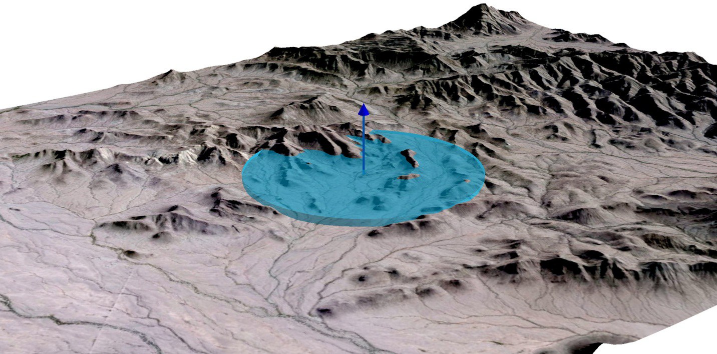
A neighborhood half as large (½ square mile) gives 2 points per square mile — a smaller, taller disk:
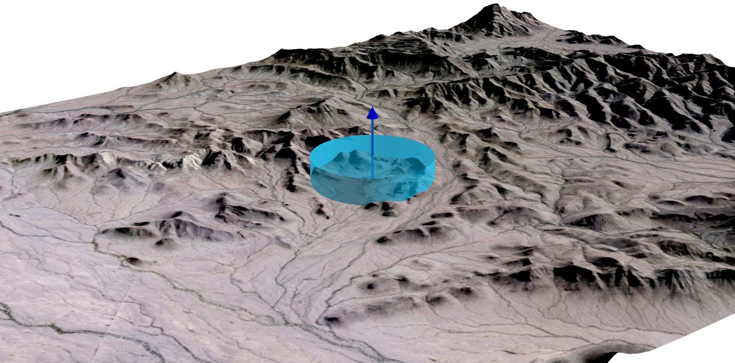
Note: a value of 2 water sources per square mile may seem odd given that there is only one water source on the landscape, but that is the nature of density analysis. It does not tell you how many points there are; it is a ratio of points per area, scaled to your area unit.
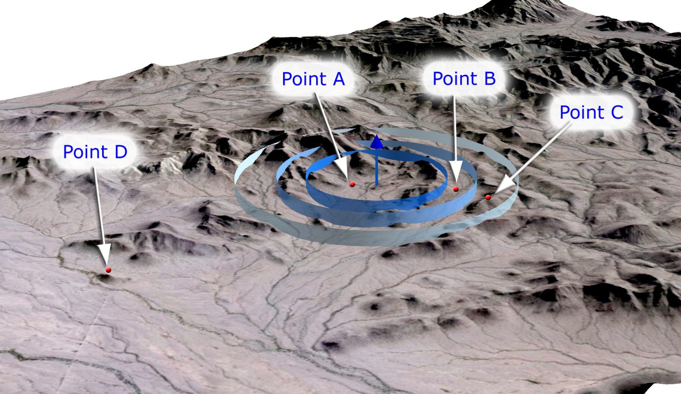
So what is the water source density at some random spot on the landscape? It depends on two factors: how many water sources are within the search radius of that spot, and the search radius you used to generate the surface. In the illustration below, point A is inside the disks at all three neighborhood sizes; B is outside the ½-square-mile disk but inside the others; C is inside only the 2-square-mile disk; D is outside all three:
| Density (Water Points per Square Mile) at 4 Sample Locations on the Landscape | |||
|---|---|---|---|
| Test Location | Circle Size Used to Generate Density Surface | ||
| ½ square mile | 1 square mile | 2 square miles | |
| Point A | 2 | 1 | 0.5 |
| Point B | 0 | 1 | 0.5 |
| Point C | 0 | 0 | 0.5 |
| Point D | 0 | 0 | 0 |
Please make sure you understand the numbers in this table, and how the density value at any spot on the landscape changes when a different neighborhood size generates the surface.
A clarification of the method. At this point you may be thinking that point density is calculated by drawing circles around the water locations — the output certainly looks like that. But this is a raster operation, computed cell-by-cell: the software steps through every cell of a blank output raster and counts how many water sources lie within the search radius of that cell. The search radius is applied to every raster cell, not to the water sources! One source in range gives the cell a value of 1 (scaled to the area unit); two give it 2; and so on. (Happily, the two ways of picturing this — disks stamped around the sources, or counts gathered around each cell — give exactly the same surface, because a cell is within the radius of a source precisely when the source is within the radius of the cell. Picture whichever one helps.)
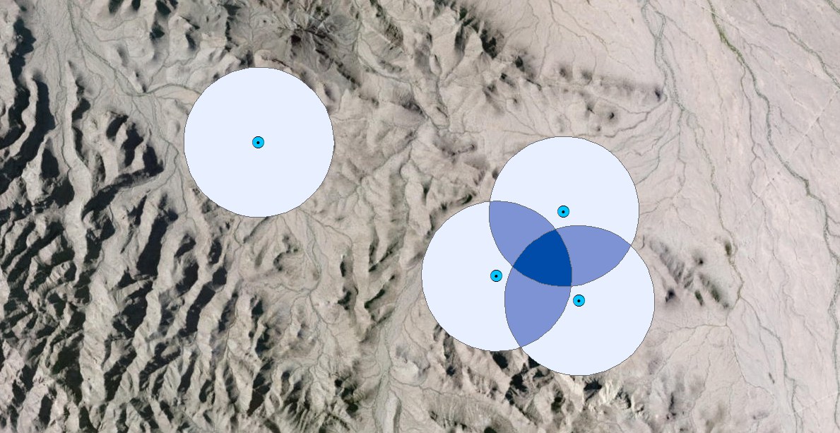
This causes an interesting thing to happen when points sit close enough to produce overlapping disks. Suppose we had four water sources:
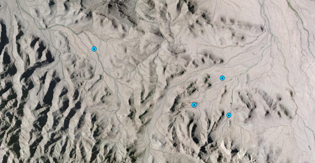
With a 1-square-mile circle, three of the disks overlap — and much like a Venn diagram, some ground is covered by one disk, some by two, and the dark region in the middle by all three. The density anywhere equals the number of overlapping disks times the per-disk density:
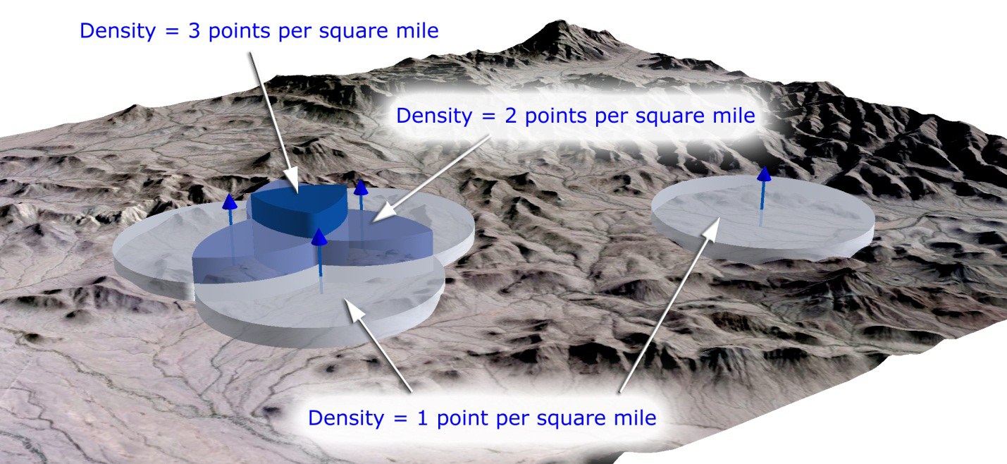
An important point: because of these stacked disks, point density values tend to be constant over large areas and then change abruptly at sharp edges. You are either inside the radius of a point or you are not — there is no adjustment for how far from a point you are.
Kernel density
Kernel density is very similar to simple point density. The difference is the shape of the density region around each point. Simple point density produces a disk, where the entire neighborhood shares one density value:
Kernel density instead produces a bell-shaped curve around each point:
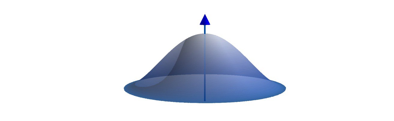
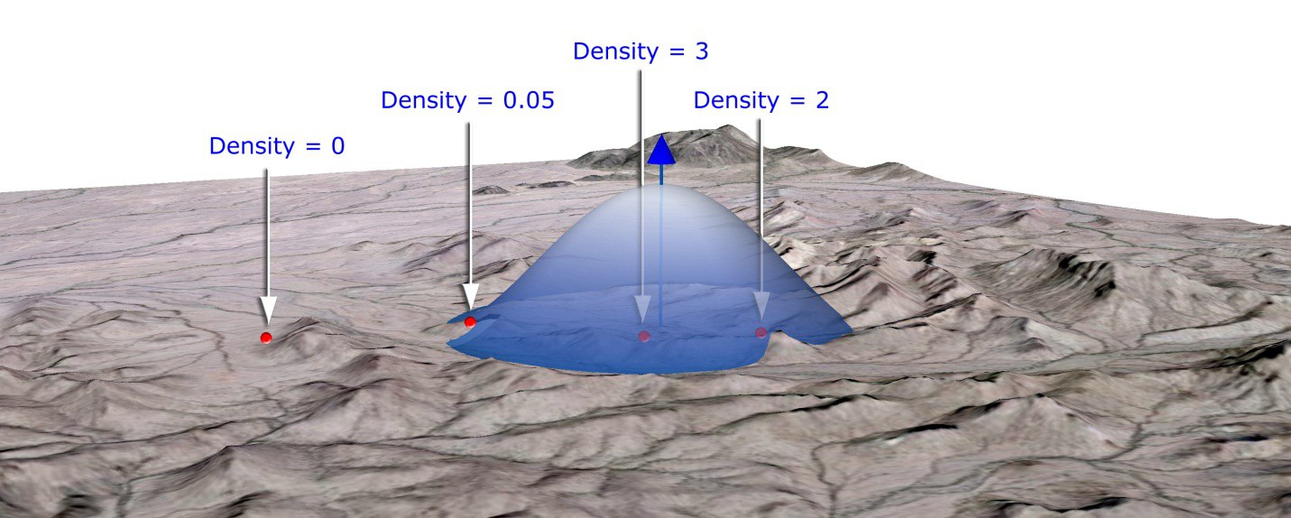
The word “kernel” is the name given to the mathematical function that produces this bell shape. Its effect is to weight the density at any location by how close that location is to an actual point: the closer you are to a water source, the higher the density. As with point density you specify the neighborhood by a search radius — in kernel density, the distance at which the bell drops to zero. You will see this size called the search radius, the kernel size, or the bandwidth.
Important: density values are interpreted exactly as in simple point density — points per your area unit, a ratio rather than a count. Also important: the volume under the curve stays the same regardless of the search radius, so a larger radius produces a flatter overall curve — just as the larger disk had the lower density:
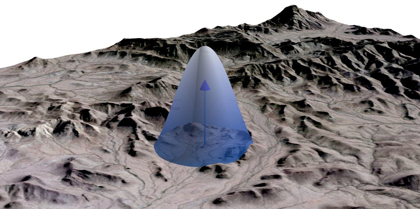
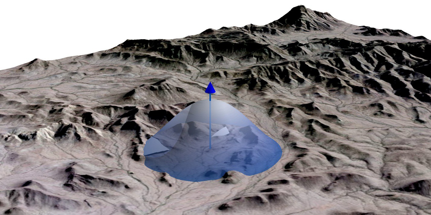
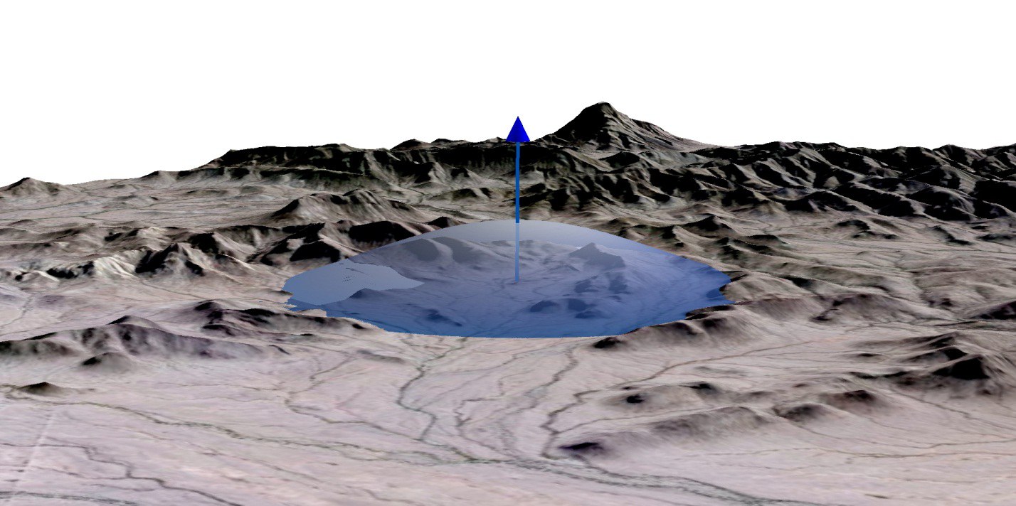
A nice feature of kernel density surfaces is that the value changes with proximity to a point — areas closer to a water source weigh more than areas farther away, which is more reasonable for most environmental phenomena. Animals (like people) usually care more about things when they are closer.
Kernel density with multiple points
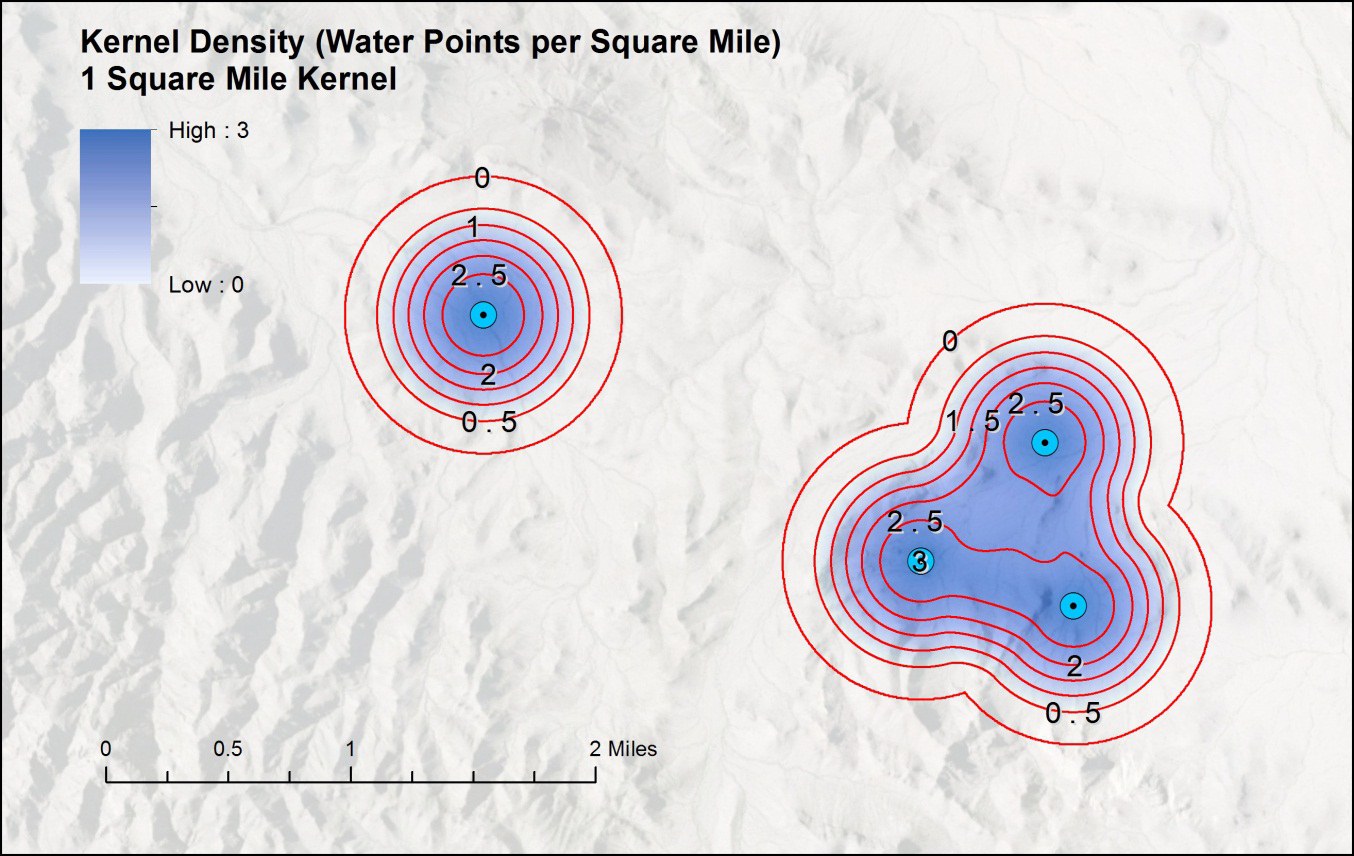
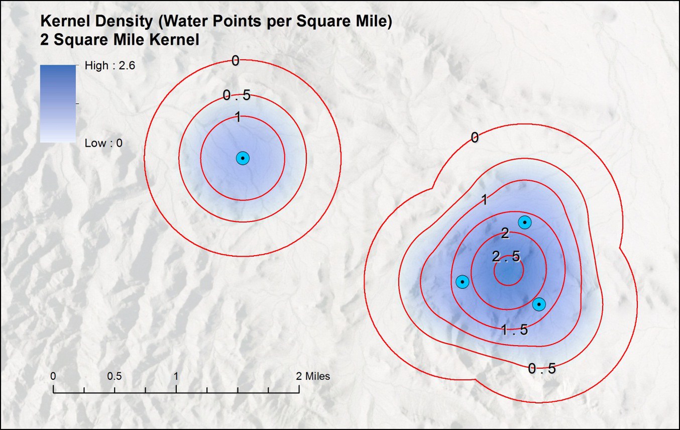
With multiple points, the bell curves stack just as the disks did — but smoothly. Using the same four water sources, here are the surfaces at neighborhood sizes of 0.5, 1, and 2 square miles:
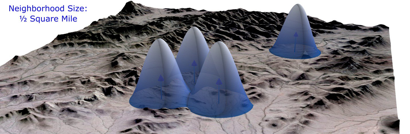
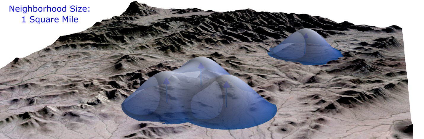
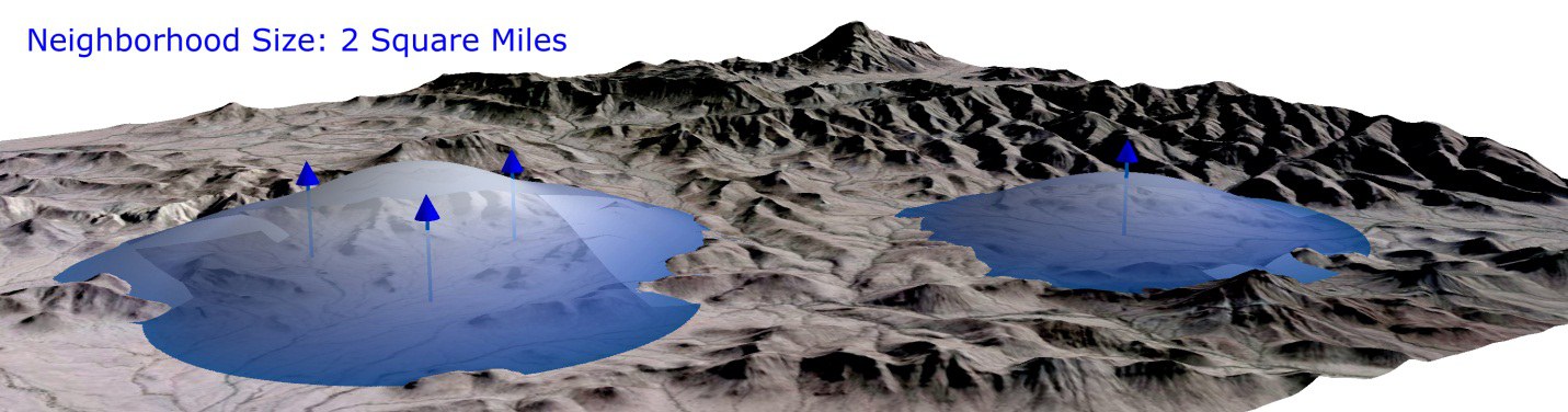
Notice that with the 2-square-mile circle, the density close to the cluster of three points is higher than is possible anywhere near the single point on the right:

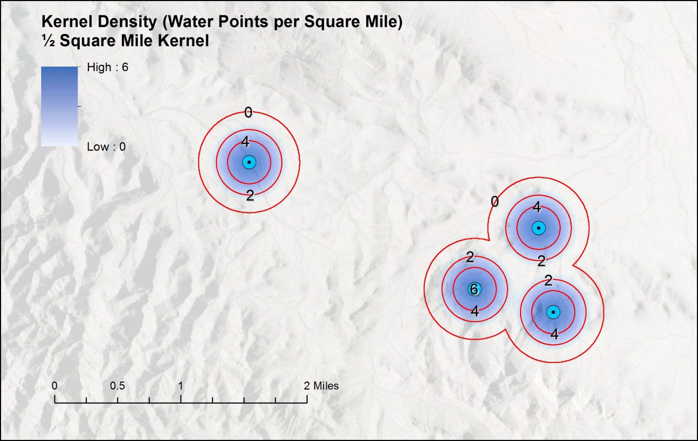
Notice also how kernel density values change gradually over the landscape rather than breaking sharply as simple point density did. The neighborhood size again plays the critical role: larger circles smooth the data into generalized density regions, while smaller circles reveal detail over shorter distances:
How do you know what kernel size to use?
This, unfortunately, can be a very difficult question to answer, and can lead to some fairly sophisticated statistical analysis (Silverman 1986 is the classic reference). Some people follow a rough rule of thumb based on contour lines like those above: try progressively larger kernel sizes until the outermost contours join into a single polygon containing all the locations. That method may or may not be appropriate for your particular project. If you specify nothing, the tool sets a default for you — the same default Esri's tool uses — described next.
The default has the appearance of being reasonable and defensible — but remember it is only a best guess. The software knows nothing about your dataset or what the points represent; it knows only their spatial distribution. Gather a second set of points on the same animal and you will almost certainly get a different default. Treat it as a starting value, and don't be shy about specifying your own.
That said, the default is sometimes useful and reasonable when you have nothing better. The method — adapted from Silverman's rule of thumb (Silverman 1986, pp. 44–48, which presents the one-dimensional original) — is based on the distances from each point to the centroid of all points. From that population of distances come two statistics: the standard distance,
and the median distance Dm — simply the median of the distances to the centroid. The default bandwidth is then:
Conceptually: take the smaller of the standard distance and the scaled median distance (√(1/ln 2) ≈ 1.20), then shrink it by a factor of 0.9 and by n to the −1/5 power — so the bandwidth shrinks as the number of points grows. When a population field weights the points, the statistics use their weighted versions. Kernel Density Enhanced implements this rule exactly — matching the Esri default — including the weighted variants, and computes it correctly for geodesic analyses of projected data.
From density surface to home-range polygon
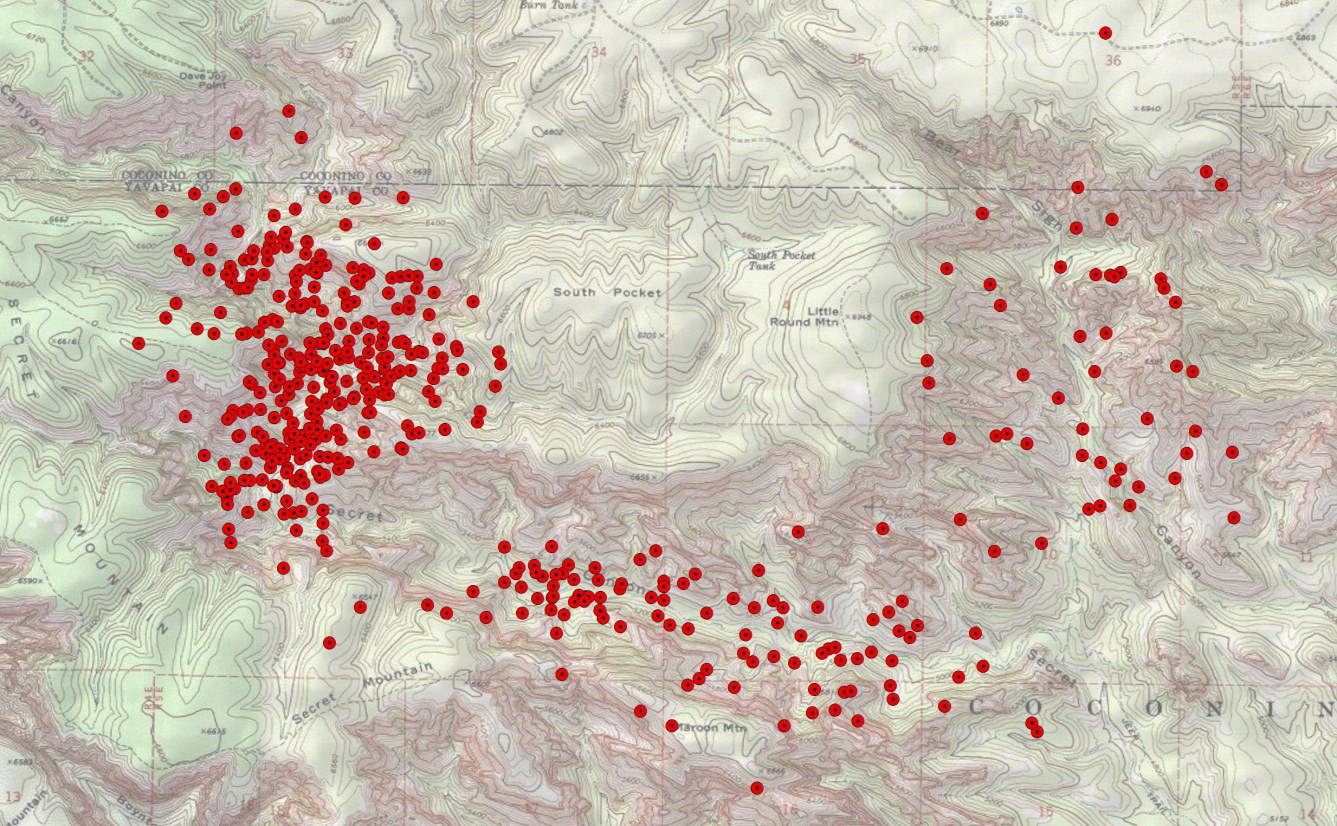
Once you have a density surface, the next step is to decide which part of it represents the animal's home range. The guiding assumption: areas with higher location densities are more important to the animal, on the logic that the animal chooses to spend the most time in the areas most important to it. Suppose we have a GPS-collared animal in the Secret Canyon area north of Sedona:
From these points we generate a kernel density surface (500 m kernel, densities in points per square kilometer, ranging 0 to 189):
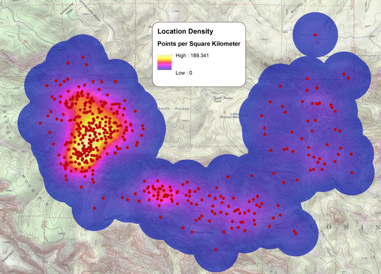
Now, what part of this map is the home range? We could take everything with density > 0 — conservative, and guaranteed to capture every location you observed — though as always, the unsampled parts of the true range come with no guarantees. It also risks delineating more area than necessary. And the stakes are real: if you are writing a land management plan and define a home range larger than the animal needs, you may block management actions unnecessarily; define one too small and the animal itself may be threatened. If you are studying the animal, a wrong threshold means including or excluding land erroneously and learning the wrong habitat associations. This problem — estimating the true area used by an animal from insufficient data — is common in wildlife analysis.
To choose a threshold, it helps to draw contour lines on the density surface — here at every 5-points-per-km² increment:
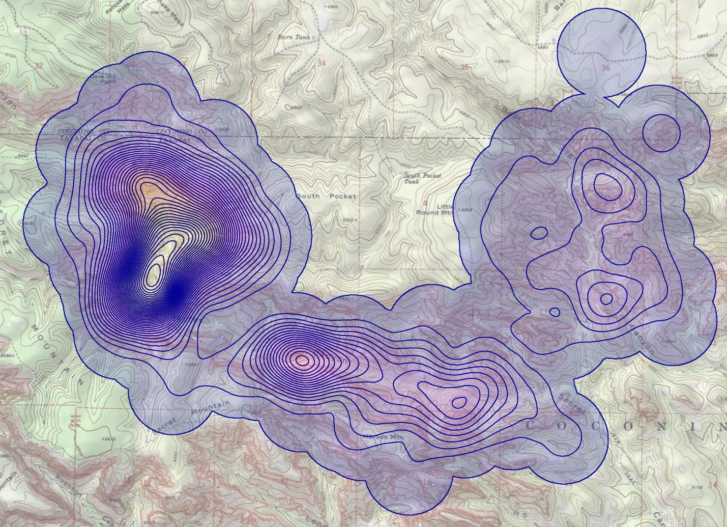
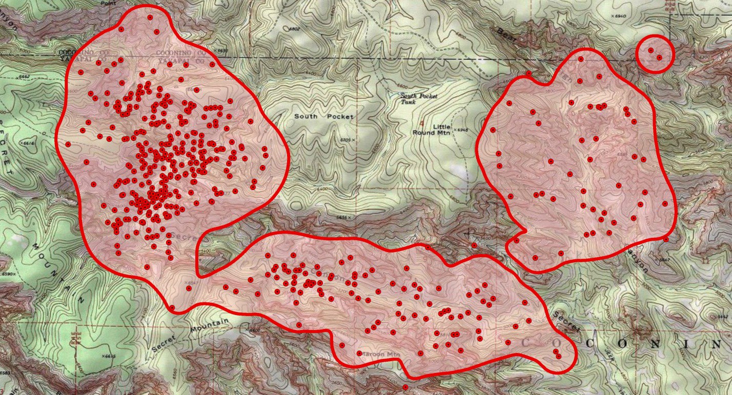
Based on a visual examination we might decide everything at or above 5 pts/km² represents the home range, and isolate that polygon:
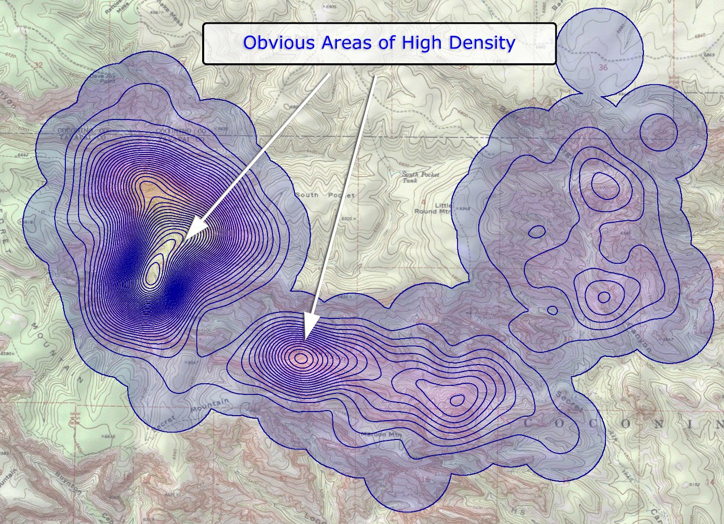
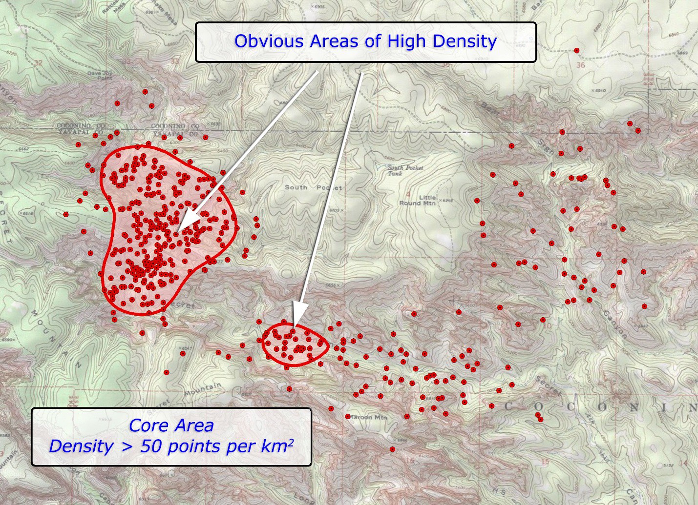
A kernel density bonus: finding areas of highest use. Unlike the MCP, a kernel home range specifically excludes areas the animal avoids even when they sit inside the overall extent of the points — and better yet, the same method marks out the core areas where the animal spends the majority of its time. These high-intensity areas are probably exceptionally important to the animal for some reason; for a threatened or endangered species, management plans might protect them specifically. The procedure is identical, just with a higher threshold — say 50 pts/km²:
A step farther: from densities to probabilities
The problem: the major downside of kernel density analysis is that density units — points per area — are difficult to work with. The distribution of density values will rarely be the same between two animals, or even between two runs on the same animal with different parameters. There was nothing special about our thresholds of 5 and 50 pts/km² above; a different sample size or a different bandwidth would have demanded different thresholds to identify equivalent regions.
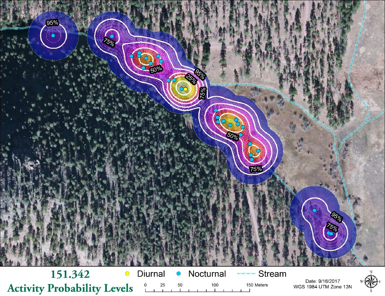
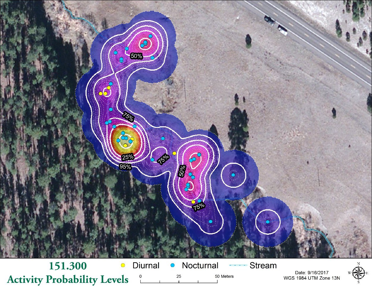
The solution: rescale the density values into proportion-of-volume-under-the-curve values — probabilities, in effect, of the animal being inside an area, or equivalently the proportion of its observed time spent there. Now we can mark out the area where the animal would be 95% of the time, or 90%, or whatever level we want — home ranges based on consistent activity levels rather than guesses at arbitrary density thresholds.
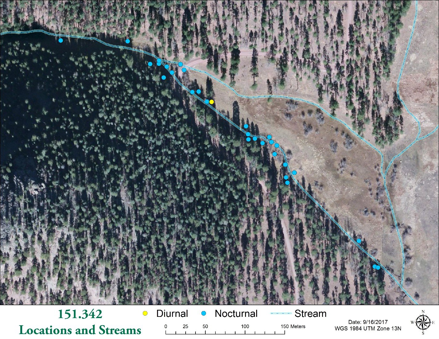
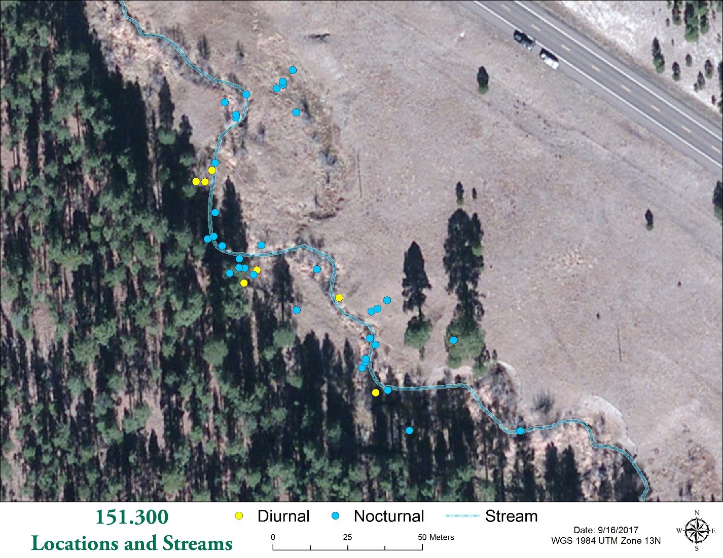
This also makes comparing animals possible. Dr. Carol Chambers has been studying home ranges of New Mexico meadow jumping mice. Kernel densities map where each mouse spends its time beautifully — but each mouse has a different number of observations spread over a differently-sized area, so their density distributions differ wildly, and no single density level identifies equivalent home ranges for both:
Rescaled to probability levels, the 95% highest-use area of each mouse extracts directly — habitat use compared at a constant activity level:
When this walkthrough was first written for the wildlife GIS lab, this step came with a warning: “this section describes functions that are only available in custom code or 3rd-party tools.” These tools are that custom code, ready-made: KD to Proportion Surface rescales any kernel density raster into the 0-to-1 proportion surface, and KD Probability Contours draws the isopleths — the 95% home range, the 50% core — directly, from either form of raster. Kernel Density Enhanced can even produce the proportion surface in one step, straight from the points.
Beyond the standard kernel: what these tools add
The story above describes the standard kernel density analysis that any GIS can produce. The Kernel Density Enhanced tool reproduces Esri's tool exactly when asked — same quartic kernel, same Silverman default bandwidth — and then goes further:
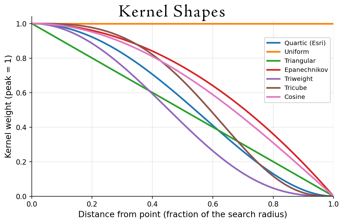
Seven kernel shapes. The bell can fall off gently or sharply: quartic (the Esri shape), uniform, triangular, Epanechnikov, triweight, tricube, and cosine — all with finite support, reaching exactly zero at the search radius (infinite-tailed kernels like the Gaussian are deliberately not offered because these types of kernels don't actually have a clearly defined search radius/bandwidth).
True geodesic distances. An explicit planar/geodesic choice, with geographic (latitude–longitude) inputs always analyzed geodesically — densities remain honest at any latitude.
Three kinds of cell value. Classic densities (points per area unit), expected counts (cell values sum to the number of points), or the proportion-under-curve surface directly — the “step farther” above, in a single run.
No cut-off edges. By default the output extent is the extent of the points plus the bandwidth distance, so every kernel runs all the way out to zero. Esri's tool only generates the surface within the extent of the points, cutting the raster off at the edges unless you remember to set an analysis extent environment yourself.
The full environment set. Output Coordinate System, Cell Size, Processing Extent, Snap Raster, and Mask are all honored, with the surface computed natively in the target coordinate system rather than resampled into it.
No extension licenses. Esri's Kernel Density tool requires the Spatial Analyst extension; this suite runs at every ArcGIS Pro license level.
References
- Silverman, B. W. 1986. Density estimation for statistics and data analysis. Monographs on Statistics and Applied Probability, Vol. 26. Chapman and Hall, London.
- Worton, B. J. 1989. Kernel methods for estimating the utilization distribution in home-range studies. Ecology 70:164–168. doi.org/10.2307/1938423
Related tools and pages
- Kernel Density Enhanced, KD to Proportion Surface, and KD Probability Contours — the three tools this page underpins.
- About LoCoH home-range analysis — the local-hull alternative, with a discussion of when each method is the better fit.
- Concave Hull — one clean footprint polygon, when the question is the outline rather than the utilization distribution.